
article
begin page 36 | ↑ back to topBlake’s 1812 Exhibition
William Blake’s exhibition of 1809 and the Descriptive Catalogue he wrote for it are well-known chapters in his life.*↤ I am indebted to Jonathan Rendell of Christie’s New York for bringing the Jerusalem print to my attention, to Joseph Viscomi for his generosity in supplying crucial information about the printing and dating of Blake’s relief etchings, and to Thomas V. Lange for his bibliographic assistance. I am grateful to the following institutions for allowing me to inspect works in their collections: British Museum, Fitzwilliam Museum, Huntington Library, Pierpont Morgan Library, Victoria and Albert Museum, Yale Center for British Art. Research for this essay was supported in part by a grant from the Academic Senate, University of California, Riverside. Surprisingly, the fact that only three years later he exhibited three of his most important tempera paintings and pages from his greatest illuminated book has been largely ignored. In 1812, the annual show sponsored by the Associated Painters in Water-Colours included Blake’s Jeffery Chaucer and the Nine and Twenty Pilgrims on Their Journey to Canterbury, The Spiritual Form of Pitt Guiding Behemoth, The Spiritual Form of Nelson Guiding Leviathan, and, as the last item in the exhibition catalogue, “Detached Specimens of an original illuminated Poem, entitled ‘Jerusalem the Emanation of the Giant Albian [sic].’”1↤ 1 Associated Painters catalogue 24, no. 324. The temperas are nos. 254, 276, and 280 in the 1812 catalogue; nos. III, II, and I in the 1809 exhibit (Blake, Complete Poetry 530-40); and Butlin 1: 472-76, nos. 653, 651, 646. Bentley, Blake Records 230-31, quotes the relevant entries from the 1812 catalogue. This major public display of Blake’s works deserves a closer look. Who were the Associated Painters and what was the nature of Blake’s involvement with them?
The establishment of societies dedicated to the promotion and exhibition of water colors played a prominent role in the development of British art in the early decades of the nineteenth century.2↤ 2 Basic historical facts related here about the societies are taken from Bayard 1-14, Hardie 2: 111-23, Pye 305, Pyne 30-36, and Roget 1: 201-71. The fullest discussion of the evolution in water-coloring techniques outlined here is Bayard 15-24. Water colors had long been executed and categorized as tinted drawings structured by an underlying outline in pencil or pen and ink. This placed them one step above hand-colored prints, but clearly below true paintings—that is, oil paintings—in the hierarchy of the pictorial arts. The Royal Academy allowed the exhibition of water colors, but they were shunted into secondary rooms and hung in a slapdash manner. To overcome this limited status, many water colorists began to move away from tinted drawings and create a related but separate form, water-color painting. The new genre distinguished itself from the old through several features, including greater size, less attention to strong underdrawing, more painterly freedom in the handling of the medium, and the use of gouache or body color (the addition of chalk to water colors) to attain something of the opacity and intensity of oils. The water-color societies promoted these shifts in technique and taste, even through such means as the way they framed works. In the late eighteenth century, as is the case today, both prints and water colors were usually mounted in a window cut in a mat intervening between the image and the frame itself. The societies and their members framed water colors to the edge of the image, as with oil paintings both then and now.3↤ 3 Bayard 26-28, Hardie 1: 40-41. See the print facing 25 in Pyne (reproduced in Bayard 28) of the 1808 “Exhibition of Water Coloured Drawings” in which all the works are shown framed to the edge of the image. Blake himself may have used this style at a much earlier time. According to Gilchrist 1: 57, Blake’s “three Joseph drawings [Butlin 1: 59-60, nos. 155-57] turned up within the last ten years in their original close rose-wood frames. . . .” If these were indeed the “original” frames, then the water colors were framed “close” (i.e., to the image) when exhibited at the Royal Academy in 1785, nos. 455, 462, and 449. What might be dismissed as merely a change in the decorative art of framing was part of a larger cultural program to reconfigure the production and consumption of pictures.
The first organized group was the Society of Painters in Water-Colours founded by 10 members, including John Varley, at a meeting on 30 November 1804. Their inaugural exhibition, held the next year, was a resounding success. The Society’s policy, enforced during its early years, that only members and a few carefully-chosen associate members could display pictures in the annual exhibits, provided a rationale for excluded artists to form a rival group for the purpose of sponsoring exhibitions with less restrictive policies. This happened in June 1807 when 18 artists established the New Society of Painters in Miniature and Water-Colours. The name was changed to the Associated Artists in Water-Colours before the first annual exhibition in 1808, and was again revised, probably to emphasize the evolution of drawing into painting, to the Associated Painters in Water-Colours for their fifth and final exhibit in 1812.
Blake became a member of the newer organization in the year of its final show. Although this fact has been pointed out before (Roget 1: 270; Bentley, Blake Records 230), the full evidence for it has not been cited. None of the earlier catalogues of the Associated Painters makes any mention of Blake, but the 1812 publication includes the following entry in its list of “Members”: “W. Blake, 17, South Molton Street.”4↤ 4 Associated Painters catalogue 4. Bentley, Blake Records 231n2, wrongly states that “‘W. Blake’ is the only one of the fourteen ‘Members’ without an address.” There are two copies of the 1812 catalogue in the Victoria and Albert Museum, which also houses a collection of letters and other manuscripts related to the Associated Painters from its founding to June 1811. None of these manuscript documents contains a reference to Blake. The inclusion of the address where the Blakes lived between 1803 and 1821 makes the identification certain.
Unfortunately, the two societies had divided their audience to their mutual detriment during a period of general economic disruption caused in part by Britain’s Peninsular Campaign against Napoleon. The Associated Painters, in an attempt to attract more purchasers, allowed oil paintings to be shown. But the 1812 exhibition was a disaster and the group could not pay the rent on its showrooms, 16 Old Bond Street. According to Solly, “many of the exhibitors [i.e., exhibited works] were seized to pay the rent of the gallery” (19). David Cox, president of the Associated Painters since 1809 and a major exhibitor in 1812, had “the whole of his year’s work . . . taken from him and sold without compensation” (Hardie 2: 117). Once again, Blake had become embroiled in an artistic project ending in a financial disaster.
Blake may have thought of the 1812 exhibition as a last-ditch effort to overcome the results of his 1809 display—no sales and only a single, damning review in which Robert Hunt accused Blake of being “an unfortunate lunatic” (Bentley, Blake Records 216). The annual exhibition of the Associated Painters would command a larger audience than Blake’s one-man show had been able to attract. Since the group permitted oil paintings, Blake could display three of his finest begin page 37 | ↑ back to top “temperas,” which probably looked like oils to most contemporaries. To this he could add some examples of a forthcoming work. Perhaps one or two would find a purchaser. But instead of recompense, Blake had merely shifted from a personal setback to a communal failure, at least in economic terms. We do not know if his works were caught up in the landlord’s attempt to recover his losses, although the fact that Blake’s friends Thomas Butts and Samuel Palmer are recorded as the first owners of the three paintings strongly suggests that these works were returned to Blake even if seized. What, after all, could the landlord gain by holding unsalable goods? Or did Blake have to pay a ransom? Even if he avoided this worst-case scenario, the whole affair must have fed Blake’s sense that the worlds of public taste and commerce were allied against him in what Morris Eaves has recently called a “counter-arts conspiracy.” The 1812 exhibition can be added to the catalogue of experiences that lie behind Blake’s later attacks on “The Use of Money & its Wars” (“Chaucers Canterbury Pilgrims,” fourth state; Blake, Complete Poetry 687) and his bold declaration in the Laocoön inscriptions that “Where any view of Money exists Art cannot be carried on, but War only” (Blake, Complete Poetry 275).
The identity of Blake’s three temperas in the 1812 exhibition is established by the catalogue itself. But specifically what were the “Detached Specimens” from Jerusalem? The recent appearance at auction of the print reproduced in color on our cover prompts me to attempt some speculative answers.
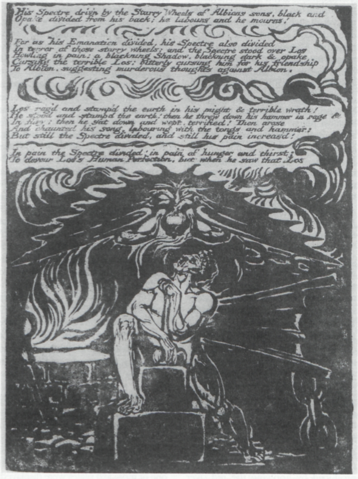
Since the print in question is the only known separate impression of Jerusalem plate 6, it can be identified with the picture recorded by William Michael Rossetti in his 1863 “Annotated Lists of Blake’s Paintings, Drawings, and Engravings” published in the first edition of Gilchrist’s Life of Blake (2: 207, no. 49). Rossetti does not identify the work as a print, a fact perhaps hidden from him by the rich coloring, and simply describes it as “A man at an anvil talking to a Spirit . . . Published in the ‘Jerusalem’” and places it in the collection of the London dealer R. H. Evans. The print next emerges in the 1880 Blake exhibition at the Boston Museum of Fine Arts, described as “color stamped” and in the collection of Horace E. Scudder (8, no. 5). He was still the owner in 1891 when the print was again exhibited in Boston (7, no. 8b). It then passed by inheritance through the hands of three owners (see Bentley, Blake Books 262) until sold in 1966 to Richard Cole. The work was inherited by Cole’s widow, who later became Mrs. Jack Greenberg of New York; she is the final owner listed by both Bentley (Blake Books 227, 262) and Butlin (l: 442, no. 576). Ian Woodner, the great collector of Old Master drawings, purchased the print in 1984 for $75,000; it later passed by inheritance to Dian Woodner and Andrea Woodner, from whose joint collection it was offered at Christie’s New York on 11 May 1993, lot 85. The print, with a published estimate of $50,000-60,000, sold for an astonishing $156,500 (including the buyer’s premium) to a dealer acting on behalf of the American private collector who, over the last 10 years, has formed the largest collection of Blake’s illuminated books in private hands. All but a select few may not have a chance to see the print again for many years.
The last public exhibition of Jerusalem plate 6 was at the Fogg Museum of Art in 1947 (12, no item number). Since then, Bentley and Butlin have been the only Blake scholars who have commented on it. Until the color illustrations in Christie’s sale catalogue (enlarged about 10%) and in Christie’s International Magazine (reduced about 27% and with an inaccurate brown tone), the only reproduction was in monochrome in Butlin (vol. 2, pl. 810A). Our cover illustration should reveal a good deal more about the print, both its media and its stylistic qualities. The impression was cut below the final line of text and slightly into the upper elements of the design (compare illus. 1), thereby reducing the sheet of unwatermarked wove paper to 14.5 × 16.2 cm. The basic printing color is a medium to light blue that takes on a slightly greenish tint in some areas. But a good deal of the image was also printed in black. These black areas—particularly between the flames left of the man’s right shoulder, right of his head, and above the wing upper right—exhibit the reticulations typical of Blake’s color printing of the mid-1790s, and thus the medium is probably size color, in which the pigments are suspended in gum or glue, rather than oil-based ink. Blake then applied water colors over the printed base, including black, transparent washes in flesh tones on the man’s body and in the flames, a few touches of blue and two shades of opaque brown, a thickly-applied cream in the forge and flames just above it on the left, and a dense tomato-red in the flames and on the back of the winged spectre. Some of the man’s features and his fingers are outlined in black, applied either with a pen or a small, pointed brush.
Posthumous impressions of the whole plate, such as the one in copy I (illus. 1), record the etched image with greater fidelity than what we find in a color-printed and hand-colored example. Most of the design seems to have been produced through a process Blake called “Woodcut on Pewter” in his Notebook (Blake, Complete Poetry 694). The pictorial portion of the plate was covered with acid resist and the areas intended to be etched in, and thus print white, were scraped away. The image is defined either by printed plateaus emerging from a white background, as with the spectre, or by etched whites surrounded by contiguous printed areas, as with the man’s torso and right leg. The richly-colored impression suppresses these distinctions, although it retains the contrast between an illuminated human form and the darker spectre, described in the text above as a “blackning Shadow” (line 5). The printing and hand coloring begin page 38 | ↑ back to top also create a few differences in detail. The giant tongs lower left are less prominent, particularly in comparison to the carefully hand-colored impression in Jerusalem copy E, where their lower end is considerably extended. The fingers of the man’s right hand are straighter and more evenly parallel than in either the monochrome impressions or copy E. But these minor variants do not alter the basic iconography of the design and its relationship to the text. The man is of course Los at his forge, looking up to his spectrous other-self, both a helpmate in the mechanical aspects of his artistic endeavors and a constant threat to his imagination. The shape and position of Los’s hammer strongly suggest a phallus and testicles as physical correlatives to the moment of inspiration. The bat-winged spectre’s odd gestures may indicate his attempt to shut out the sounds of Los’s hammer, or perhaps to squeeze from his own head the “murderous thoughts” (line 7 in the text above) he wishes to instill in Los. Almost the identical arm and hand position appears in The Book of Urizen plate 17, showing Los bending over with “a round globe of blood” (Blake, Complete Poetry 77) descending from fibers attached to his head and body.
The impression of plate 6 in blue ink can be grouped with several other Jerusalem plates printed in shades of the same color. These include the following recorded examples, none of which shows a watermark:
Plate 4, top design only (“Jerusalem” title to chapter 1 and surrounding figures), 6.7 × 16 cm., with the top design of plate 37 (Albion falling backwards into the arms of Christ) on the verso. Both sides hand colored.5↤ 5 Comments on the coloring of plates 4/37, 18/19, and 35/28 (Sendak) are based on my fading recollections of these prints from 1977, when they were on loan to me for two weeks. Plate numbers and copy designations for Blake’s illuminated books follow Bentley, Blake Books. Collection of Paul L. Herring.
Plate 5 with plate 53 on the verso. Full plates, sheet 35.1 × 28.4 cm. Plate 53 color printed in black; both plates hand colored, including washes in text areas. British Museum, Department of Prints and Drawings.
Plate 9 with plate 11 on the verso. Full plates, sheet 35.3 × 28.9 cm. Both sides with color printing in black, hand colored, with washes in the text area on both plates. Victoria and Albert Museum. Both plates reproduced in monochrome in the Hamburger Kunsthalle exhibition catalogue, figs. 92 and 92a.
Plate 18, design only (small figures embracing between two winged figures), 4.4 × 16.1 cm., with lines 4-16 of plate 19 on the verso. Recto hand colored; slight washes on verso. Collection of Maurice Sendak.
Plate 19, full plate on sheet 31.1 × 23.6 cm. No hand coloring. Rosenwald Collection, Library of Congress.
Plate 28, top design only (two figures embracing on a giant flower), 10.4 × 15.4 cm., with the top design (Christ rising in flames, cut into at the top) and lines 1-9 of plate 35 on the verso. Plate 28 with color printing in black; both sides hand colored. Paul Mellon Collection, Yale Center for British Art.
Plate 35, lower design only (the creation of Eve from Adam’s chest), 6.7 × 16 cm., with lines 7-23 of plate 28 on the verso. Recto and marginal design on verso (some sort of sea creature) hand colored. Almost certainly cut from the same sheet as plates 28/35 above (Yale Center). Collection of Maurice Sendak.
Plate 38, full plate on sheet 31.1 × 23.6 cm. No hand coloring. Rosenwald Collection, Library of Congress.
Plate 51, with color printing in black, hand colored. Full plate, 16.1 × 22.5 cm. Keynes Collection, Fitzwilliam Museum, Cambridge. See Paley, additional pl. v, for a color reproduction.
As we will soon be learning from Viscomi’s magisterial study, Blake printed almost all his illuminated books in editions. Whenever he went to the trouble to prepare his press and acquire paper and ink, he would pull multiple impressions of each plate or take advantage of a need for printing one title to print others. Thus, the same (or very similar) inks and the same paper stock found among the same or different illuminated books can be key evidence in determining specific printing sessions. From 1804 (the date on the Jerusalem title page, and the earliest date any plates are likely to have been etched) to the end of his life, Blake printed only one complete illuminated book predominantly in blue or blue-green ink.6↤ 6 A few plates printed in blue appear in Songs of Innocence copies R and Y; these were probably printed in the same session as America copy M (Viscomi, ch. 31). Slight variations in the color of the “same” ink can be explained by differences in the thickness with which it is applied to the copperplate and printed. The reflective surface of the ink (and hence its tone) and the extent to which the paper shows through the ink and affects its color are thereby altered. Greater differences can be caused by the artist thinning the ink or by changing the color mix—a bit more green for one pull, a bit more blue for the next—during the same printing session. These factors, as well as differences in the lighting conditions under which prints are studied and the subjectivity of human color perception, give rise to the different colors (e.g., “blue,” “blue-green,” “greenishblue,” etc.) ascribed to impressions printed with the “same” (but perhaps frequently altered) batch of ink. This is copy M of America, with a 1799 watermark on five leaves, now in the Yale Center for British Art and familiar from the Blake Trust facsimile of 1963. Several of the Jerusalem impressions in blue can be further associated with America copy M because of the shared color printing in black, particularly evident on plate 10 of the latter. Unfortunately, the date of printing for America copy M is far from certain, in part because it seems to have been produced, perhaps on commission, independent of any other complete copy of an illuminated book. Indeed, Viscomi uses the Jerusalem pulls to date America (see his ch. 31), based in part on George Cumberland’s statement in the early summer of 1807 that “Blake has engd. 60 Plates of a new Prophecy” (Bentley, Blake Records 187). Unless Cumberland exaggerated the number of plates, in which case they might have been for Milton, his comment could refer only to Jerusalem. At the end of the next year, Blake told Cumberland that he could not “Engage” in his “former pursuits of printing” the illuminated books since he had “so long been turned out of the old channel into a new one” of “Designing & Painting” (letter of 19 December 1808; Blake, Complete Poetry 769-70). The accumulated evidence, graphic and documentary, leads Viscomi to conclude that the begin page 39 | ↑ back to top printing session with blue ink should be dated c. 1804-08.7↤ 7 The 1799 watermarks in America copy M provide only a terminus a quo for its printing. The frontispiece was printed in brown, black, and burnt umber, and thus may be the product of a different printing session.
If Viscomi’s dating of the blue-ink impressions is correct, then they would appear to be among the earliest extant prints from Jerusalem. All complete copies, plus the first chapter only that comprises copy B, have several leaves with watermarks, and these are dated 1818 at the earliest. The two proof-state impressions of plate 28, both in the Pierpont Morgan Library, must be earlier than the blue-ink group since the impression of plate 28 in blue (Yale Center) is in the final state. Plate 56 and the proof-state impression of plate 45, both also in the Pierpont Morgan Library, are almost certainly from the same printing session as the proofs of plate 28. All four are in the same black ink and show the same “Edmeads & Pine / 1802” watermark. The only other separate prints that may have been produced in the c. 1804-08 period are 11 impressions in raw-sienna ink that takes on a yellow-ochre hue in some examples. These are plates 1 (unique impression of the first state, Keynes Family Trust, on deposit at the Fitzwilliam Museum); 8 (Rosenwald Collection, Library of Congress); 24 (private collection); 30 (Mellon Collection, Yale Center for British Art); 70, 74, and 75 (Pierpont Morgan Library); and the designs only from plates 25, 32, 41, and 47 (National Gallery of Art, Canberra).8↤ 8 The four Canberra prints of designs only were formerly in the collection of Kerrison Preston; for monochrome reproductions, see Bindman plates 504a, 516a, 525a, 526a. Plate 1 is reproduced in color in Blake, Jerusalem, frontispiece. Plate 47, which includes one line of text below the design, is reproduced in color on the cover of the Colnaghi catalogue. The raw-sienna impression of plate 1 shows extensive color printing in black; plates 30, 32, 41, and 47 have smaller areas of black color printing, partly covered with blue washes on plates 32, 41, and 47. Blake sometimes used different inks in the same printing session, but the raw-sienna impressions were probably produced at a time distinct from the blue-ink printing. The fact that all the raw-sienna prints bear proofs of Blake’s Europe on their versos marks them as an autonomous group separate from the blue-ink cluster. Coloring also distinguishes the two groups, for the raw-sienna prints with hand coloring (plates 25, 32, 41, 47) have lighter, less sombre, hues.
The blue and raw-sienna impressions appear to have been the only colored Jerusalem prints available for the 1812 exhibition. But when were they hand colored? When and by whom were some of the impressions trimmed to the designs only? And precisely which prints from these two substantial groups were displayed in 1812? I can arrive at no firm answers, in part because a response to any one question affects speculations about the others.
What follows should be considered as nothing more than suggestions and hypotheses.
It would seem reasonable to assume that the prospect of exhibiting Jerusalem prints in 1812 prompted their coloring. If however all the hand coloring on the blue and raw-sienna impressions was specifically executed for the exhibition, then we would have to assume that all such colored prints were intended for display. It is highly begin page 40 | ↑ back to top unlikely that both sides of the recto/verso prints in blue ink were exhibited, yet all such prints with coloring on one side have at least some tinting on the other. There would have been no reason for Blake to color the backs of prints meant for exhibition. Thus, it seems probable that the blue-ink impressions were colored shortly after their printing independent of any exhibition plans. Such a chronology is supported by the similarities in tone and technique—although not precisely in palette—between the hand tinting in the blue-ink Jerusalem prints and most of the coloring in America copy M. The parallels between plate 15 in America copy M and the coloring of Jerusalem plates 9/11 among the blue-ink impressions are particularly striking.
It is tempting to surmise that the opaque pigments evident on plate 6 were added at a later date in preparation for the 1812 exhibition. Unfortunately, the coloring technique does not support this attractive hypothesis. The tomato red so striking in plate 6 also appears in the flames on plate 51, on the figure’s wings on plate 53, and, in a diluted form, in the flames in plate 35 (Yale Center) and on the fish in the right margin of plate 11. In these examples, the coloring seems to be all of a piece. On plate 51, the tomato red is fully integrated with other colors in the flames and, in several passages, even has the reticulated texture of color printing (although this could also be produced by applying the red over washes that were still damp). But even if none of the coloring on the blue-ink Jerusalem prints was executed specifically for the 1812 exhibition, Blake’s use of opaque pigments, begun in the mid-1790s, accords with the development of water-color painting promoted by both water-color societies long before the disastrous 1812 exhibit. The illuminated books printed and colored in Blake’s final decade, such as Songs of Innocence and of Experience copies Z and AA and Jerusalem copy E, with their detailed coloring and framing lines, may also owe something to the larger evolution of British water colors from drawings into paintings.
If we use size, richness of coloring, and general pictorial impact as deciding factors, then the blue-ink impressions of Jerusalem plates 6 and 51 would seem the most likely to have been among the “Detached Specimens” exhibited in 1812. Perhaps the organizers did not even recognize that these were prints because of the thoroughness of the hand coloring. The next-best candidates are the design from plate 28 in blue ink, handsomely hand colored, and the four raw-sienna impressions cut to the designs (plates 25, 32, 41, 47), with the smaller designs from plates 35 and 37 in blue ink (the latter on the verso of plate 4 in the list above) coming next.9↤ 9 Bentley, Blake Books 262-63, states that the four raw-sienna impressions trimmed to the designs were “probably” those shown in 1812 and “were probably disposed of abruptly” because of the seizure by the landlord. But the provenance of these impressions listed by Bentley—Blake, his widow, Frederick Tatham—indicates that they remained in Blake’s possession until his death. I can see no reason for selecting these four raw-sienna impressions over at least plates 6, 28, and 51 in blue as those most likely to have been exhibited in 1812. Bentley, Blake Books 262-63n1, offers a list of impressions of plates that “might have been” in the 1812 show. Plates 28 and 51 in blue ink are included, but not plate 6. The small clipping from plate 18 hardly seems large enough for an exhibition, although it and plates 4/37 and 35/28 (Sendak) were mounted together “on a single sheet” when Bentley saw them sometime prior to 1977 (Blake Books 228n11) and could have been exhibited in that fashion as a group. Plates 19 and 38 in blue ink and the working proofs in black can probably be excluded because uncolored, but what of the colored fullpage plates in blue ink with texts, 5/53 and 9/11? The Associated Painters allowed several sorts of pictures in their final exhibition, but would they have permitted prints that so clearly reveal themselves as pages from a book? If one or more text plates were displayed, Blake’s medium may have again disguised itself: the “Specimens” from an “illuminated Poem” listed in the 1812 catalogue might have been taken for leaves from an illuminated manuscript and this within the range of media acceptable to the Associated Painters.10↤ 10 According to Christie’s catalogue of 11 May 1993, “it has now been suggested by Mr. Essick and Professor Viscomi that Los and his spectre [i.e., Jerusalem plate 6] is one of twelve hand-colored plates from Jerusalem exhibited by Blake at the Royal Watercolour Society [sic] in London in 1812.” Neither Viscomi nor I can recall telling Christie’s that “twelve” plates were exhibited, although it is possible to arrive at that number through a selection of blue and raw-sienna impressions.
An answer to the final question—who cut away the texts on nine out of 21 sheets bearing the blue and rawsienna impressions?—depends almost entirely on suppositions about what was exhibited in 1812. If Blake believed that the Associated Artists would be unwilling to show book pages, then he would have trimmed the exhibited works to the designs and shown none with texts remaining. But this possibility also implies that all the trimmed impressions, including the small strip from plate 18, were in the show—unless we opt for a theory that some prints were trimmed by Blake and others from the same blue and raw-sienna groups were cut down by someone else at a later date. However, if the Associated Artists permitted Blake to display one or more full-page plates with texts, what would have been his motive for trimming the others? The most probable scenario would seem to be that no texts were exhibited in 1812 and that Blake did the trimming, with the possible exception of the small strips from plates 4, 18, and 35 in blue ink.
The theory that later owners did the cutting was pursued by Keynes and Wolf (111). They report that the London dealer James Tregaskis claimed he had sold a copy of Jerusalem to John Ruskin. In 1920, Keynes asked Arthur Severn, then the owner of Ruskin’s library, about this matter; Severn recollected such a book and added that Ruskin had “cut it up.” Keynes and Wolf suggest that the blue-ink impression of plate 28 (Yale Center) with “part of pl. 29 [apparently an error for 35] on the verso” was one such fragment. But the evidence for a complete, hand-colored copy of Jerusalem in blue ink depends on little more than hearsay. No impressions of Jerusalem plates, in any color ink, can be traced to Ruskin, Severn, or Tregaskis. Finally, only plates 4/37, 18/19, and 35/28 (Sendak) in blue ink share a common provenance, and thus the majority of trimmed prints from both the blue and rawsienna groups cannot be traced to any single owner—other than Blake and his immediate heirs—who could have cut away the texts.
The appearance of Jerusalem plate 6 at public auction has provided a few tantalizing insights into the development of Blake’s illuminated printing and coloring. As we learn more about the relationships between Blake’s begin page 41 | ↑ back to top work and the art world of London, and as we digest the full implications of Viscomi’s book, we may be in a better position to answer the difficult questions raised by this magnificent print and the 1812 exhibition.
Works Cited
Associated Painters in Water-Colours. A Catalogue of the Fifth Annual Exhibition of the Associated Painters in Water Colors. At the Society’s Rooms, No. 16, Old Bond Street. London: Printed by J. Moyes, 1812.
Bayard, Jane. Works of Splendor and Imagination: The Exhibition Watercolor, 1770-1870. Exhibition catalogue, Yale Center for British Art, 16 Sept. - 22 Nov. 1981. New Haven: Yale Center for British Art, 1981.
Bentley, G. E., Jr. Blake Books. Oxford: Clarendon P, 1977.
—. Blake Records. Oxford: Clarendon P, 1969.
Bindman, David, assisted by Deirdre Toomey. The Complete Graphic Works of William Blake. [London]: Thames and Hudson, 1978.
Blake, William. The Complete Poetry and Prose. Ed. David V. Erdman. Rev. ed. Berkeley and Los Angeles: U of California P, 1982.
—. Jerusalem. Foreward by Geoffrey Keynes. London: Trianon P for the Blake Trust, 1952.
[Boston] Museum of Fine Arts. Exhibition of Drawings, Water Colors, and Engravings by William Blake. 2nd ed. Boston: [Museum of Fine Arts], 1880.
—. Exhibition of Books, Water Colors, Engravings, Etc. by William Blake. Boston: Museum of Fine Arts, 1891.
Butlin, Martin. The Paintings and Drawings of William Blake. 2 vols. New Haven and London: Yale UP, 1981.
Christie’s. Old Master, American, Modern and Contemporary Prints and Illustrated Books. Auction catalogue, 11 May 1993. New York: Christie, Manson & Woods, 1993.
Christie’s International Magazine. May/June 1993.
Colnaghi, P. & D., & Co. Ltd. 19th and 20th Century Prints. Exhibition and sale catalogue, 30 March - 29 April 1977. [London: Colnaghi, 1977].
Eaves, Morris. The Counter-Arts Conspiracy: Art and Industry in the Age of Blake. Ithaca and London: Cornell UP, 1992.
Fogg Museum of Art [Harvard University, Cambridge, Massachusetts]. Exhibition of Water Colors and Drawings by William Blake. October - November 1947. Mimeograph handlist.
Gilchrist, Alexander. Life of William Blake. 2 vols. London and Cambridge: Macmillan, 1863.
Hamburger Kunsthalle. William Blake 1757-1827. Exhibition catalogue, 6 March - 27 April 1975. Munich and Hamburg: Prestel, 1975.
Hardie, Martin. Water-Colour Painting in Britain. 3 vols. London: Batesford, 1966-68.
Keynes, Geoffrey, and Edwin Wolf 2nd. William Blake’s Illuminated Books: A Census. New York: Grolier Club, 1953.
Paley, Morton D., ed. William Blake: Jerusalem. London: William Blake Trust/Tate Gallery, 1991.
Pye, John. Patronage of British Art. London: Longman, Brown, Green, and Longmans, 1845.
[Pyne, William Henry]. “Exhibition of the Society of Painters in Water Colours.” The Microcosm of London, vol. 2 (London: R. Ackermann, [1808]) 25-36.
Roget, John Lewis. A History of the “Old Water-Colour” Society. 2 vols. London: Longmans, Green, and Co., 1891.
Solly, N. Neal. Memoirs of the Life of David Cox. London: Chapman and Hall, 1873.
Viscomi, Joseph. Blake and the Idea of the Book. Princeton: Princeton UP, forthcoming late 1993.