
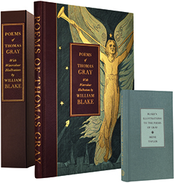
Colophon: “Reproduced from the originals held at the Yale Center for British Art … by Dot Gradations, Wickford, Essex, and printed by Appl, Wemding, Germany, on [thick, heavy, unwatermarked] Natural Evolution paper. … Bound by Zanardi, Padova, Italy, in Nigerian goatskin leather with cloth sides …; the endleaves are of Curious Metallics gold leaf backed with Nettuno Carruba.” The reproductions are housed in a fitted box (36.6 x 46.4 x 8.3 cm.) with Irene Tayler, Blake’s Illustrations to the Poems of Gray, ed. Martin Butlin (London: Folio Society, 2013).
Blake’s 116 enormous watercolors illustrating the Poems by Mr. Gray (1790) were commissioned in 1797 by “My Dearest Friend” John Flaxman as a gift for Flaxman’s wife, Nancy. The price was apparently £10.10.0G. E. Bentley, Jr., Blake Records, 2nd ed. (New Haven: Yale University Press, 2004) [hereafter BR(2)] 246. or 1s. 10d. per design. Nancy Flaxman may have shown the drawings to a few friends,The Rev. Joseph Thomas asked to see them in 1805 (BR[2] 207). and presumably they were visible when they were sold with Flaxman’s collection at Christie’s, 1 July 1828, lot 85 (£8.8.0), but none of Blake’s contemporaries save the Flaxmans is known to have seen them. They were rediscovered in 1919,H. J. C. Grierson, “Blake’s Designs for Gray. Discovery in Hamilton Palace,” Times 4 Nov. 1919: 15. They were erratically recorded by W. M. Rossetti in Alexander Gilchrist, Life of William Blake (1863) 2: 255 (114 designs) and (1880) 2: 275 (118 designs). and since then there have been a surprising number of reproductions of the whole series: 1922 William Blake’s Designs for Gray’s Poems, Reproduced Full-Size in Monochrome or Colour [six designs] from the Unique Copy Belonging to His Grace the Duke of Hamilton. With an introduction by H. J. C. Grierson. London, 1922. Illustrations full size (37.5 x 50.5 cm.) in monochrome, bound, printed on both sides of the leaf, with pp. 56, [65], [83], 90, 97, and [149] duplicated in color, printed on one side only; 650 copies. 1971 Irene Tayler. Blake’s Illustrations to the Poems of Gray. Princeton: Princeton University Press, 1971. Illustrations in monochrome, greatly reduced in size. 1971 William Blake’s Water-Colour Designs for the Poems of Thomas Gray. With an introduction and commentary by Geoffrey Keynes, Kt. London, 1971; Chicago and Paris, 1972. “A Commemorative Catalogue to accompany the exhibition arranged by the William Blake Trust” (iv). The 116 designs are reproduced in black and white, mostly reduced to four to a page, plus nineteen large reproductions in color.See G. E. Bentley, Jr., “The Accuracy of the Blake Trust Gray Catalogue,” Blake 6.4 (spring 1973): 95-96 (comments on “some serious minor” falsifications in the catalogue reproductions); Geoffrey Keynes, “The Blake Trust Gray Catalogue and the Blake Trust Facsimiles,” Blake 7.3 (winter 1973-74): 64-66 (the Gray catalogue was “hastily put together at the last moment, the color-plates being printed by a four-color offset process at another machine shop in Paris,” not by the Trianon Press); Bentley, “The Accuracy of the Blake [Trust] Reproductions,” Blake 8.3 (winter 1974-75): 88-89 (Keynes wrote that reproductions in the Gray catalogue had “no pretentions to accuracy,” though the text did not say this). 1972 William Blake’s Water-Colour Designs for the Poems of Gray. Introduction and commentary by Geoffrey Keynes, Kt. London, 1972. William Blake Trust. Illustrations full size (32.5 x 42.7 cm.), in color, not bound, printed on only one side of the leaf (not recto-verso as in the original); printed text leaves pasted on windows of leaves for the watercolors (no other edition attempts this); 518 copies. “It took about a month to obtain a satisfactory first proof of a single plate. … It took seven to nine weeks to apply the colors by hand …. To reproduce Blake’s illustrations for Gray’s poems … 18 craftsmen worked continuously for four years.”Zoe Ingalls, “The Trianon Press: A ‘Triumph of Enthusiasm over Reason,’” Chronicle of Higher Education 17 July 1991: B6-7, an account of the Blake Trust archive in Santa Cruz and the Blake Trust facsimiles. 1996 Frank A. Vaughan. Again to the Life of Eternity: William Blake’s Illustrations to the Poems of Thomas Gray. Selinsgrove: Susquehanna University Press, 1996. 116 much-reduced designs in monochrome. 2000, 2007 Blake’s Water-Colours for the Poems of Thomas Gray with Complete Texts. Mineola, NY: Dover Publications, 2000. 116 reproductions one-eighth the size of the Blake Trust reproductions (32 x 42 cm. vs. 9.2 x 16.4 cm.), which they are copying (a fact not mentioned in the text). 2005 Blake’s watercolors for Gray have been reproduced electronically in color in the William Blake Archive since 2005. 2012? The designs are reproduced electronically in color by the Yale Center for British Art.
Which of these should be given the accolade of a true facsimile? I take facsimile to mean an exact copy attempting very close reproduction of an original named copy, including size of image, color of printing (and of tinting if relevant), and size, color, and quality of paper, with no deliberate alteration as in page order or numbering or obscuring of paper defects or centering the image on the page.This statement, or one very like it, appears in the annual checklists of “William Blake and His Circle” in Blake (1994 ff.). This standard excludes the editions of 1922, 1971 (two), and 1996 because they are in monochrome, and those of 1971 (two), 1996, and 2000 because they are radically reduced in size. And there is no paper at all in the electronic versions of 2005 and 2012.
This leaves only the Blake Trust edition (1972) and the Folio Society edition (2013). In the Blake Trust edition the reproductions are printed only on one side of the leaf, unlike the originals, which are printed on both recto and verso. The Folio Society differs from the original in not printing the inset printed text on paper different from the surrounding watercolors.
In the color reproductions of 1922, 1972, and 2013, the outlines and the basic shapes seem identical. The chief differences are in the coloring.Of course every copy of the Blake Trust edition (1972) differs from the others because it was hand finished by the colorists. Presumably other copies differ from the Victoria University copy I examined. But each copy of the Grierson (1922) and Folio Society (2013) editions should be like every other copy of the same edition.
| Comparison of Color Plates in Grierson (1922) with the Blake Trust (1972) and Folio Society (2013) Editions | ||
|---|---|---|
| Blake Trust (1972) | Folio Society (2013) | |
| p. 56 | darker, especially in the blue; paper whiter; yellow in 1922 is pale brown in 1972 | the flesh of Father Thames is more pink |
| p. [65] | text paper much paler; vaults much less yellow | vaults much less yellow; text paper paler |
| p. [83] | background pink (not in 1922); flowers at bottom left gray rather than brown; many other differences | no pink in background; flowers at bottom left more gray than brown |
| p. 90 | stream of figures much less yellow; more shades of yellow on the top figure; ground at bottom much darker brown | stream of figures much less yellow; more shades of yellow in top figure; orange shade in rainbow is much more intense; ground more yellow brown |
| p. 97 | beard much less yellow; leaves different shades of green; the branch over the arm is pink, not brown; the head at bottom right is much paler | beard much less yellow; branch over arm pale brown, not dark brown; leaves at left more brown than green; head at bottom right much paler |
| p. [149] | sky is a much more vivid blue; church is brownish gray, not pale yellowish brown, and part of it is uncolored | church partly uncolored (all pale yellowish brown in 1922); sky a much more vivid blue |
I conclude that none of these printed works is a facsimile. They can be compared in images with the excellent online color reproductions of the Yale Center for British Art and the William Blake Archive, but these of course are intangible and give no sense of facing images, etc. Of the three, the Folio Society edition seems to me distinctly the most reliable. The fidelity of the Folio Society reproductions is indicated by the show-through of printed text from the other side of the leaf.
Blake’s drawings are amazingly sure—there was no room for new leaves, no spit-backs. Many of the designs represent stupendous figures such as “Father Thames” (p. 56), “the fury passions” (p. 58), “the painful family of Death” (p. 60), “the bard” (p. [95]), and “Hyperion” (p. 86) (see illus. 1).
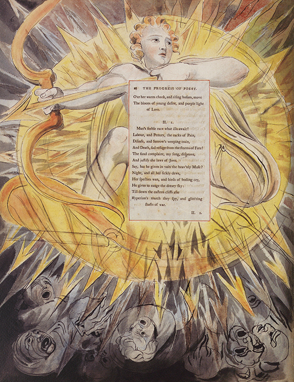
Notice that Hyperion’s finger is not guiding the arrow. In The Rout of the Rebel Angels (Thomas and Butts sets), the arrow is not guided by a finger, but in Blake’s engraving of “Gods and Titans” for Flaxman’s Hesiod (1817), the bow-finger is correctly guiding the arrow.
Yale Center for British Art, Paul Mellon Collection.
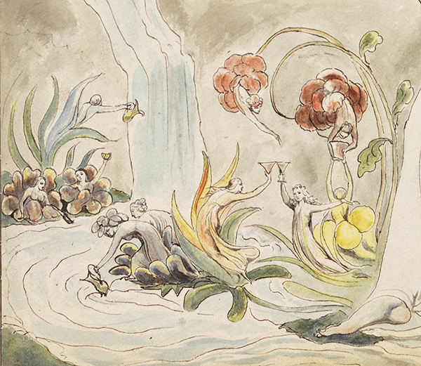
Yale Center for British Art, Paul Mellon Collection.
The Folio Society edition is full of incidental delights. On p. [158], Blake’s poem to Nancy Flaxman, across “William Blake,” are four very clear brown fingerprints,Fingerprints are formed from sweat from the endocrine glands or from ink or other viscous substances impressed from the friction ridges of fingers. Dermatoglyphics, the systematic study of fingerprints, is a creation of the late nineteenth century. In 1858 Sir William James Herschel initiated the use of fingerprint records in India, and in Mark Twain’s Life on the Mississippi (1883) a killer is identified by his thumbprint. The fingerprints are clear in the Blake Trust and Folio Society editions but barely visible in that of Grierson. They are clear but not commented on in the online reproductions of the William Blake Archive and the Yale Center for British Art. See my discussion of Blake’s fingerprints on text pages for Gray in “William Blake and His Circle,” Blake 48.1 (summer 2014): pars. 6-7 of the introductory essay and Part I, Section A, under Inscriptions on Designs. the right hand, I think, which are on top of the writing, after the writing ink had dried (see illus. 3).
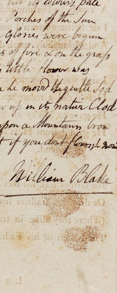
Yale Center for British Art, Paul Mellon Collection.
It is very probable that the fingerprints belong to William Blake, but Catherine is also a possibility. They make one feel very close to the artist. Morton Paley points out to me that even more interesting than the presence of these fingerprints may be their absence elsewhere. Both painters and printers handle ink, and they frequently have inky fingers. Why aren’t there more fingerprints on Blake’s works? I guess that master engravers and painters were pretty severe with apprentices who left fingerprints.
Irene Tayler. Blake’s Illustrations to the Poems of Gray. Ed. with a new foreword by Martin Butlin. London: Folio Society, 2013. 15.6 x 27.8 cm., xiv, 210 pp., one reduced monochrome illustration, no ISBN. Published to accompany the Folio Society facsimile (2013). Butlin, “Foreword” (vii-x), says that he has altered the references to Blake’s writings in the 1971 printing from the edition of Geoffrey Keynes to that of D. V. Erdman and the references to contemporary texts to G. E. Bentley, Jr., Blake Records, 2nd ed. (2004), that he has given more accessible references to reproductions of Blake’s art than in the 1971 edition, and that he has added footnotes signed “M.B.,” a “List of Works Cited” (203-05), and a “Supplementary Bibliography” (206-07). “Irene Tayler’s text is still the most satisfactory introduction to the subtleties of Blake’s illustrations to the poems of Gray” (ix).