
REVIEWS
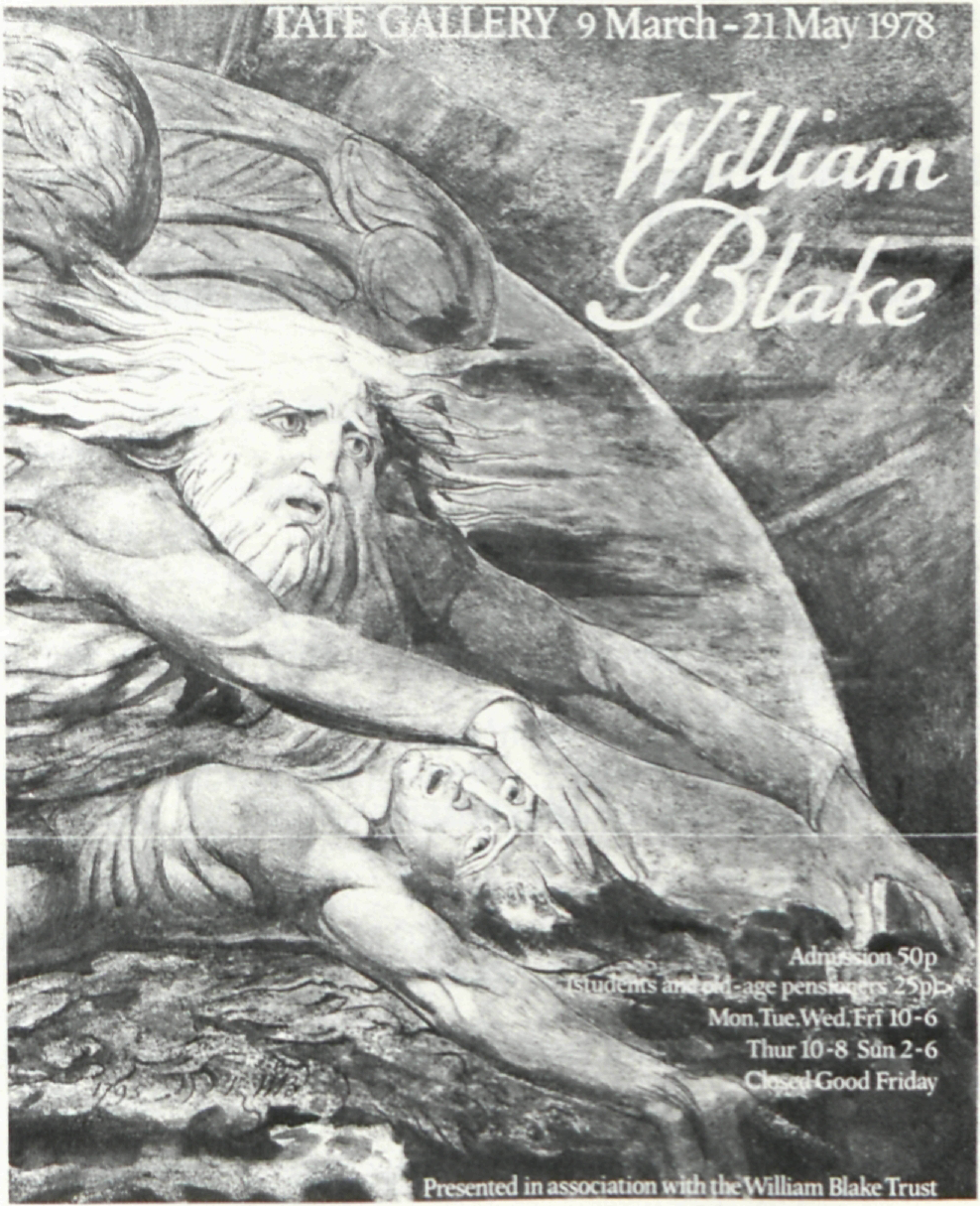
BLAKE AT THE TATE
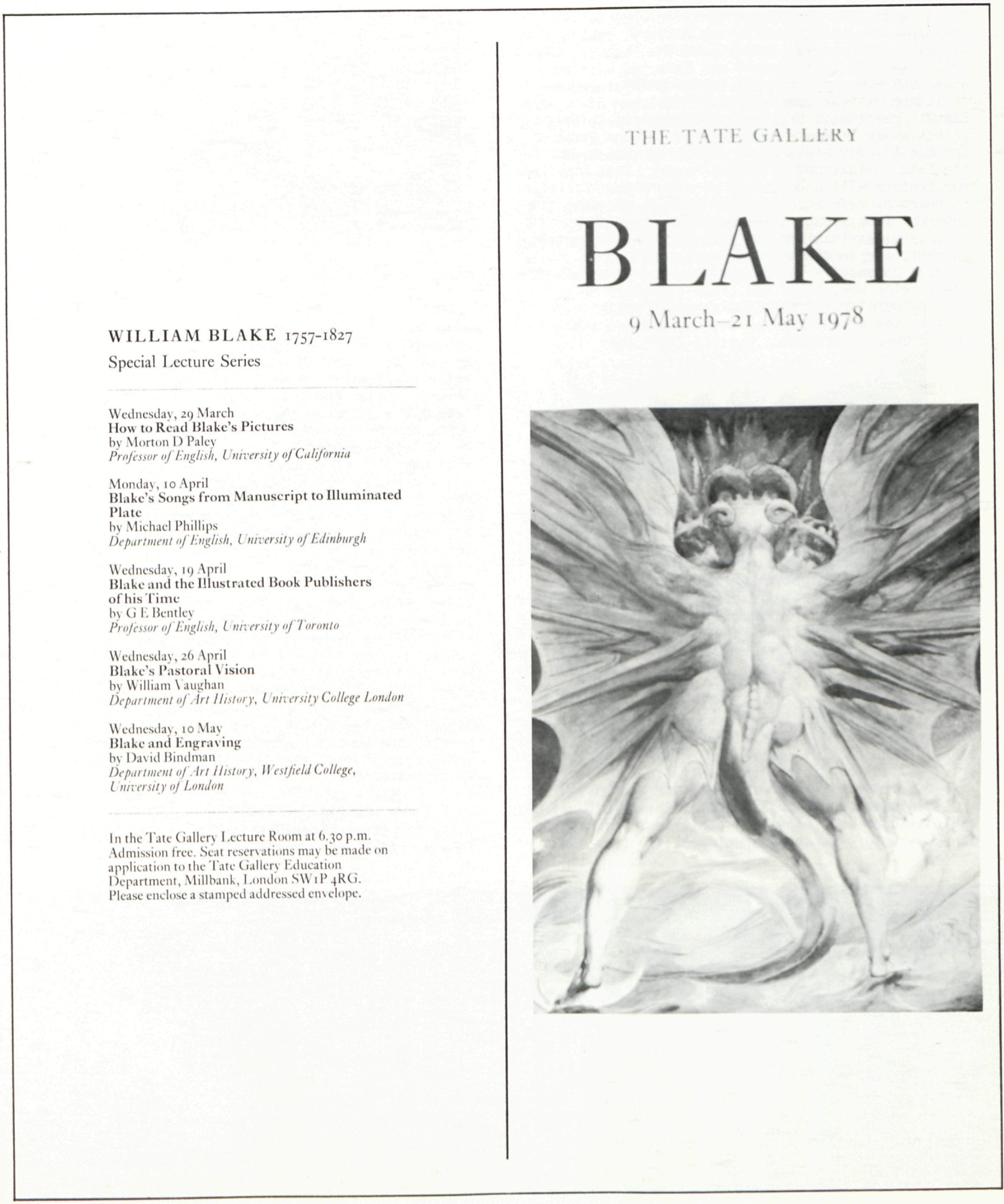
Martin Butlin. William Blake. London: Tate Gallery, 1978. Pp. 164. 339 monochrome illus. + 16 color pls. £ 1.80 softcover, £ 3.00 hardcover.
There is a contradictory quality in the middle classes which makes them suddenly produce artists, where nothing in the tastes, manners, or aspirations of such well-ordered families might warrant the spontaneous generation of personalities in no way deducible from the characters of parents or kindred. It is as if the moderation, the fear of risk, the clear-cut and well-tried beliefs, the cult of security and solidity in all its forms, were suddenly defied—and mystified—by the daemon of painting or poetry, risen among the abruptly blazed-up flames of a gentle and sleepy hearth. Beings of a singular sensibility, troubled with a restless will to expression, appear in the midst of a tranquil little world, to astonish, sometimes to annoy, and sometimes to win it over. Perhaps this should be seen as the workings of a natural law: an artist is a reaction; responding to the usual with the unheard-of, detecting what is strange in what is common, distilling purity from impurity by a mysterious process which can take place only in the presence of all that is worn out, habitual, conventional, and commonplace. Our daemon’s task is to cheat the law by which habit debases all sensation.
Paul Valéry
Laurence Binyon’s introduction to the Burlington Fine Arts Club’s 1927 William Blake Centenary Exhibition suggested that Blake was at that time respected more as a poet than as a painter. To some extent that situation prevails today, and in his introduction to the catalogue for the exhibition of Blake’s work that he recently organized for the Tate Gallery (9 March-21 May), Martin Butlin indicates that a primary purpose of the exhibition was to focus on Blake’s achievements as a visual artist as distinct from his literary achievements. To do this Butlin assembled Blake’s very best work from forty-five public and private collections plus several anonymous lenders. For the most part, lesser pieces of an essentially historical or curious nature were not included. Butlin’s long years of studying Blake served him well when he was selecting the exhibition. It was extraordinarily beautiful. The clarity which Blake emphasized as the aim of his art in his own 1809 Descriptive Catalogue was apparent throughout. The exhibition demonstrated clearly that Blake’s pictorial achievements may be appreciated even by those who have not yet memorized A Blake Dictionary (“Does he have political overtones, this William Blake?” was a query overheard from one enthusiastic viewer). In fact, Blake’s rich and complex range as an image maker is probably best communicated by the direct and comprehensive visual contact facilitated by an exhibition such as this one. Consisting of 338 works, including one by Blake’s brother Robert and two by John Linnell, the exhibition was hung in begin page 43 | ↑ back to top
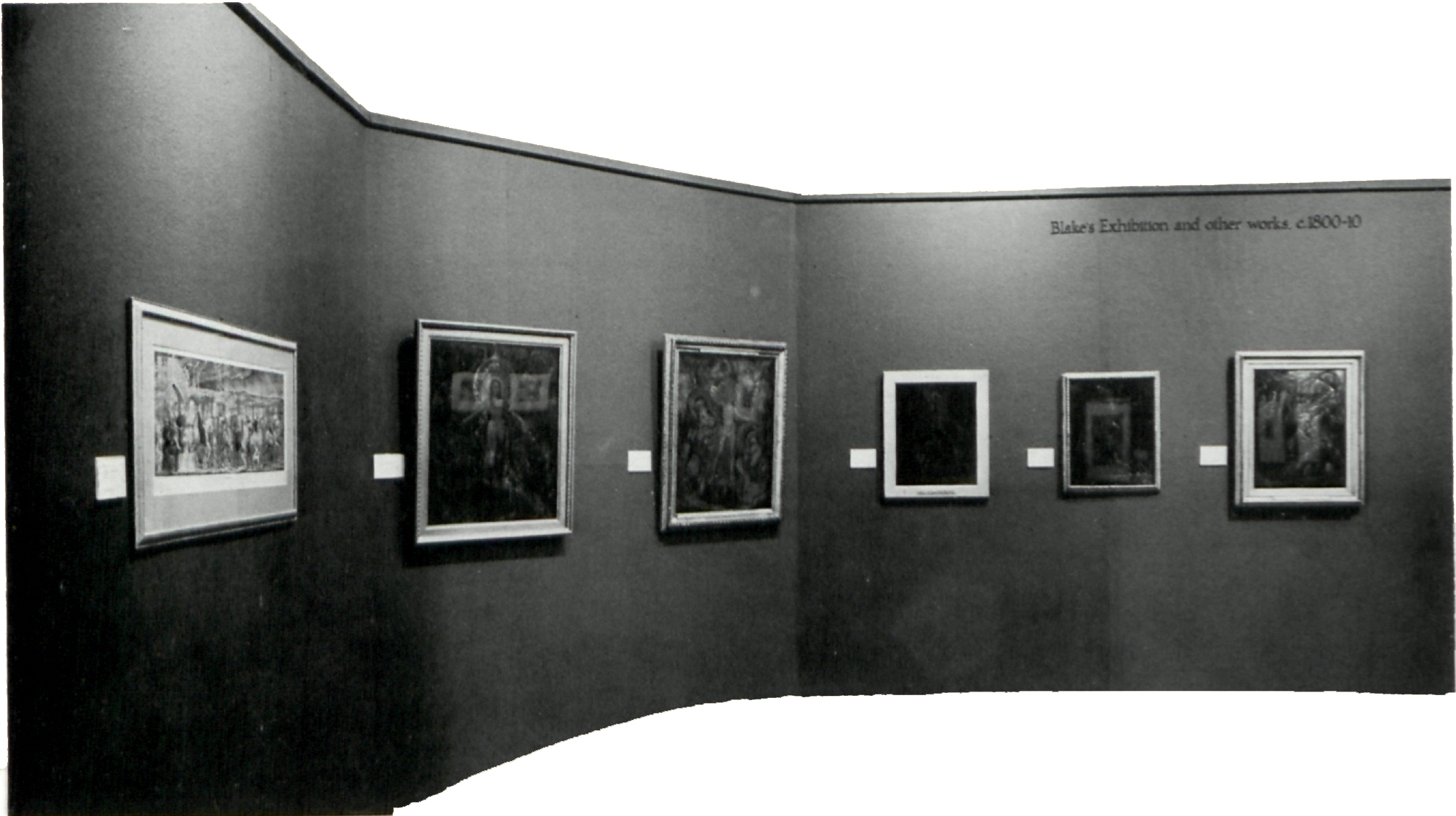
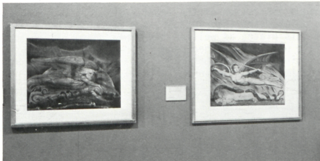
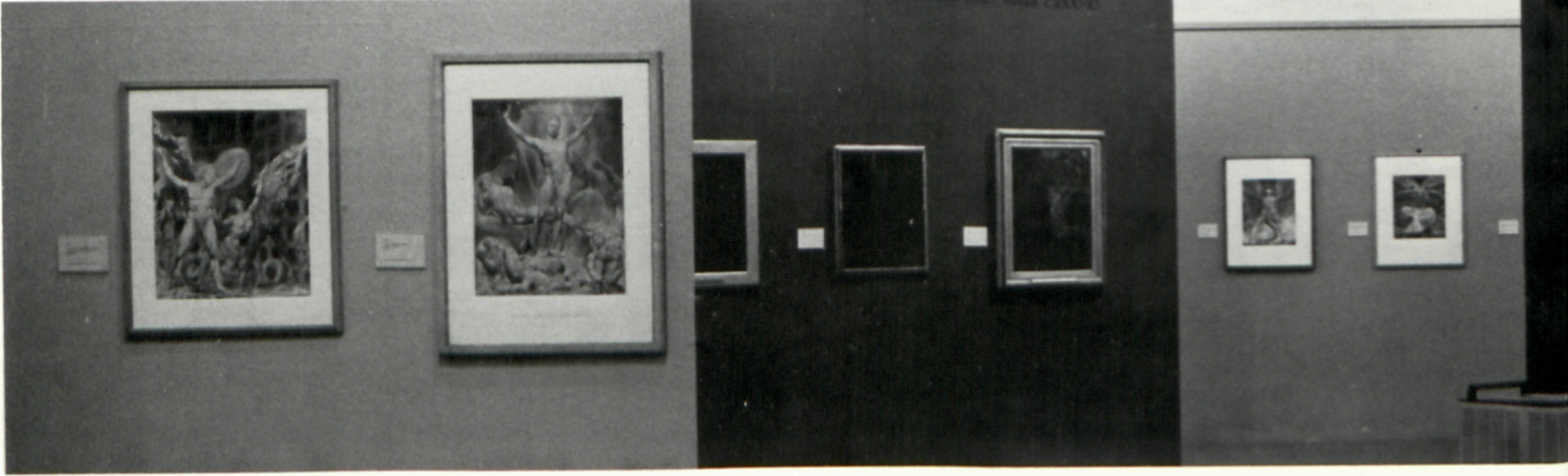
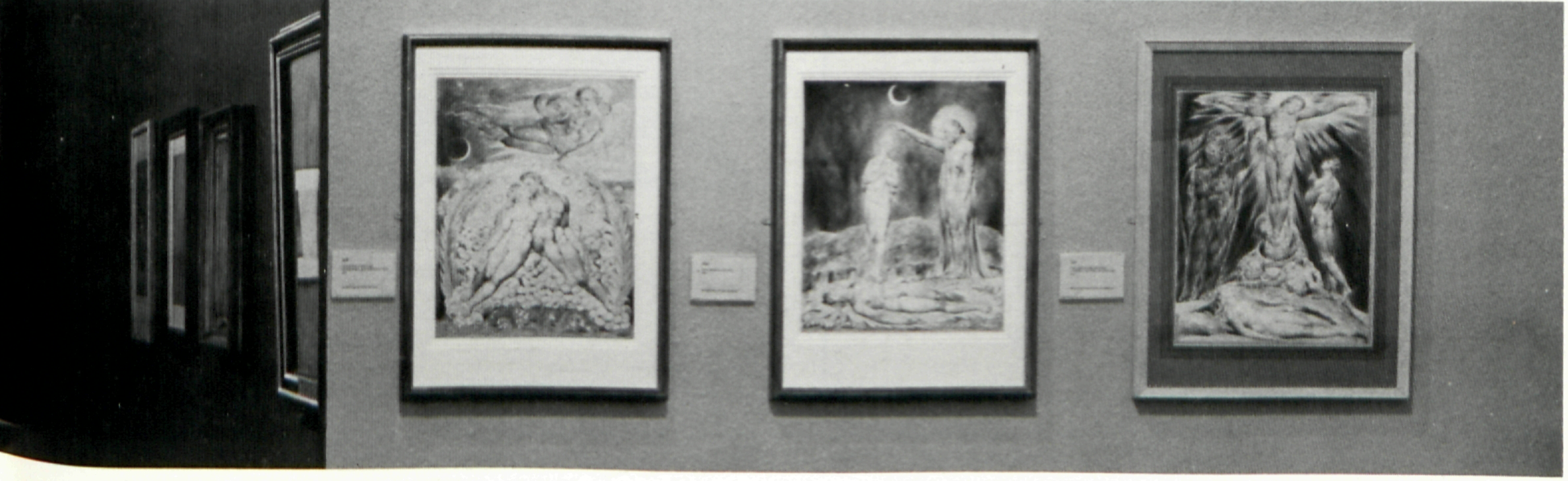
Given the large number of pieces exhibited, the many subdivisions, and the visual mix of techniques, the exhibition flowed very well. Paintings, drawings, watercolors, prints and book pages were hung in an integrated fashion with subjects, concepts, stylistic considerations, chronology, and technical distinctions all working together to reveal Blake’s truly organic development as an artist. One could walk through the show and be carried along strictly by the visual images before going back to probe the works through their many layers, attend to scholarly considerations, make comparisons, etc. The exhibition, installed under the direction of Ruth Rattenbury (also of the Tate Gallery staff), was organized in seventeen sections as follows: Apprenticeship and Early Work, c. 1775-85; Blake the Neo-Classicist, c. 1780-90; The Early Illuminated Books and Contemporary Book Illustrations, 1789-91; The Prophetic Books, 1793-96; The Large Colour Prints of 1795; The Great Book Illustrations, c. 1795-98; Blake’s First Works for Thomas Butts: Tempera Paintings of Biblical Subjects, c. 1799-1800; The Hazards of Patronage: William Hayley and “The Grave,” c. 1799-1806; Watercolour Illustrations to the Bible for Thomas Butts, c. 1800-08; Illustrations to the Book of Job, c. 1805-25; Blake’s Exhibition, “The Last Judgment” and other works, c. 1800-10; Illustrations to Milton and other Writers, c. 1807-20; “Jerusalem,” c. 1804-20; John Linnell, John Varley and the Visionary Heads, c. 1819-25; Illustrations to Thornton’s Virgil, 1820-21; Late Tempera Paintings and Other Works, 1921-27; and Illustrations to Dante, 1824-27. The hanging of the exhibition did not rigidly conform to the dates of these sub-sections, however, and works of a particular theme from various periods were often shown side by side. For example, the five versions of Pestilence: The Great Plague of London, of which the earliest dates from c. 1779-80 and the latest from c. 1805, were all grouped within “Blake the Neo-Classicist, c. 1780-90.”
As Blake’s stylistic development was made clear by instances of thematic hanging, his proclivity for working within a serial narrative framework was also to be seen, for example, in the reunion of the twelve watercolors in the 1808 set to Milton’s Paradise Lost (“Satan, Sin, and Death, Satan Comes to the Gates of Hell” was represented by a photograph). Blake’s poetic dialogue reveals his personal mythology and is paralleled in his graphic work by a dialogue of formal images. The exhibition format encouraged walking back and forth from section to section, comparing a composition, a figure, or a setting begin page 44 | ↑ back to top in one work with its counterpart in another. Often great shifts in emotional response were elicited; for example, it is one thing to cite a relationship between the figures of Abias (in the c. 1780-85 drawing after a Ghisi engraving from a Michelangelo fresco) and Newton (in the color print of 1795); it is another to look at the rather uninspired, somewhat flaccid figure in the early study and then encounter the densely formed, powerful Newton, whose reverberations of meaning within Blake’s written mythology are as important as his pictorial reverberations within Blake’s art.
What one wants to do in writing a review of an exhibition of this stature is to share, as much as possible, the experience of seeing it—of seeing, for example, The Magdalene at the Sepulchre from the Yale Center for British Art, the Petworth House Last Judgment, and The Arlington Court Picture all together under one roof. It is an experience of particular and unique intellectual, imaginative, and sensual luxury, not easily or directly translatable into words. An indirect approach aimed at accomplishing that elusive end has to suffice; therefore, the following attempts an overview of the exhibition within the framework of observations stimulated while seeing it.
Drawings comprised much of the early-apprenticeship section, including several, drawn from Westminster Abbey monuments, not heretofore exhibited as part of Blake’s oeuvre. Apart from
Among the early prints was Blake’s relief etching based on his brother Robert’s compelling, if almost humorously naive, drawing known as The Approach of Doom which hung near The Complaint of Job and The Death of Ezekiel’s Wife. These two Biblical subjects, engraved in the conventional dot and lozenge technique of the period, are composed of carefully modelled figures, with gestures and gazes of utmost importance to their powerful expressive qualities. The figure compositions are relief-like and placed within an explicit space of Neo-Classical origin. The Approach of Doom print is also a highly charged image but its drama is expressed mainly through the totality of the composition. With its more generalized form and implied spatial infinity, the relief etching stood in startling contrast to the Ezekiel and Job engravings.
The subject of Job became the focus of a later section of the exhibition that included six of the twenty-one engraved Illustrations of the Book of Job, 1823-26, and eight related watercolors of various dates, among them two versions of Job and His Family Restored to Prosperity. Three of the engravings corresponded to watercolors on exhibition while others did not, thus presenting ten of the twenty-one subjects, as well as an idea of the close relationship between the watercolor series and the engravings. The Job engravings represent the heights of Blake’s work in this medium. With Durer as his measure, Blake wielded his burin with a sureness of hand and clarity of mind yielding solidly formed images, bathed in luminosity. The narrative series ranks among the most important sequences in the history of engraving.
In addition to splendid engravings like the Job series, Blake’s output as a commercial engraver was voluminous, a part of his oeuvre which was rarely considered in the exhibition. His own begin page 45 | ↑ back to top designs for conventional book illustration were seen in the four pen and wash drawings for Mary Wollstonecraft’s Original Stories. The stipple engravings after Watteau, Morning Amusement and Evening Amusement, indicate his skill as a reproductive engraver within the confines of that tradition, as do three engravings from his own designs for the second, 1805, edition of Hayley’s Ballads. These were placed among the “Hazards of Patronage” along with Mrs. Butt’s charming needlework, Hares, the design of which is attributed to Blake. Caprices of patronage were also responsible for Schiavonetti’s engravings after Blake’s designs for The Grave. In a comparison of the unique impression of Blake’s interpretation of his design for the “Death’s Door” plate and the published one by Schiavonetti, what became most apparent was Blake’s belief in the strength of his image. Blake’s heroic sense of form and the gestures of his personal handwriting (the descriptive marks that were peculiarly his) developed the large figural tensions on which the impact of his own version is dependent. The drama is heightened by the rich black areas produced by relief printing a plate that had broad areas of unengraved surface. “Drama” and “impact” are not really appropriate terms to use in describing Schiavonetti’s interpretation. In contrast it is a rather schematic and conventional engraving of an intriguing image, but one with few dramatic formal properties.
Historically prints have offered particularly rich possibilities for comparative study, a point repeatedly demonstrated by the prints on exhibition. Some were seen in more than one state (The Complaint of Job); some were seen as studies on which Blake worked to develop, rethink, and extend his ideas (three of the four known and greatly differing touched proofs of the Europe title page, which were hung adjacent to the published version); some were seen as the pages of illuminated books, used as a base to which watercolor and color printing were applied with great variety of approach (pages from The Book of Urizen and the same images from The Small Book of Designs). Progressions like these, along with the sketches and drawings related to more finished prints and paintings (two preliminary drawings, a trial print, and one of two known finished versions of Pity), and the instances of works in more than one version (The Parable of the Wise and Foolish Virgins), added up to an exhibition that was didactic almost in spite of itself. The mind of the artist at work is always best studied through this kind of material.
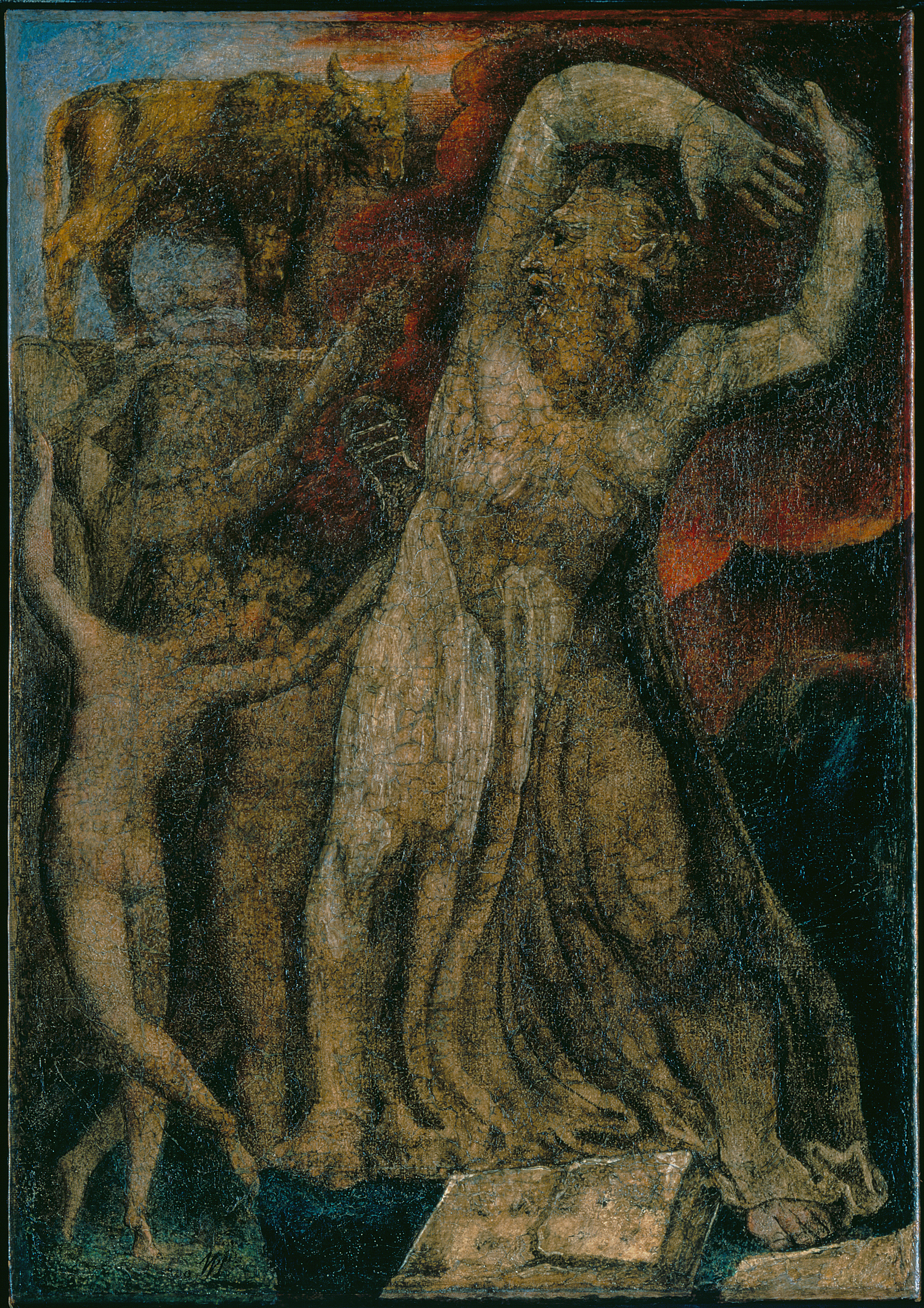
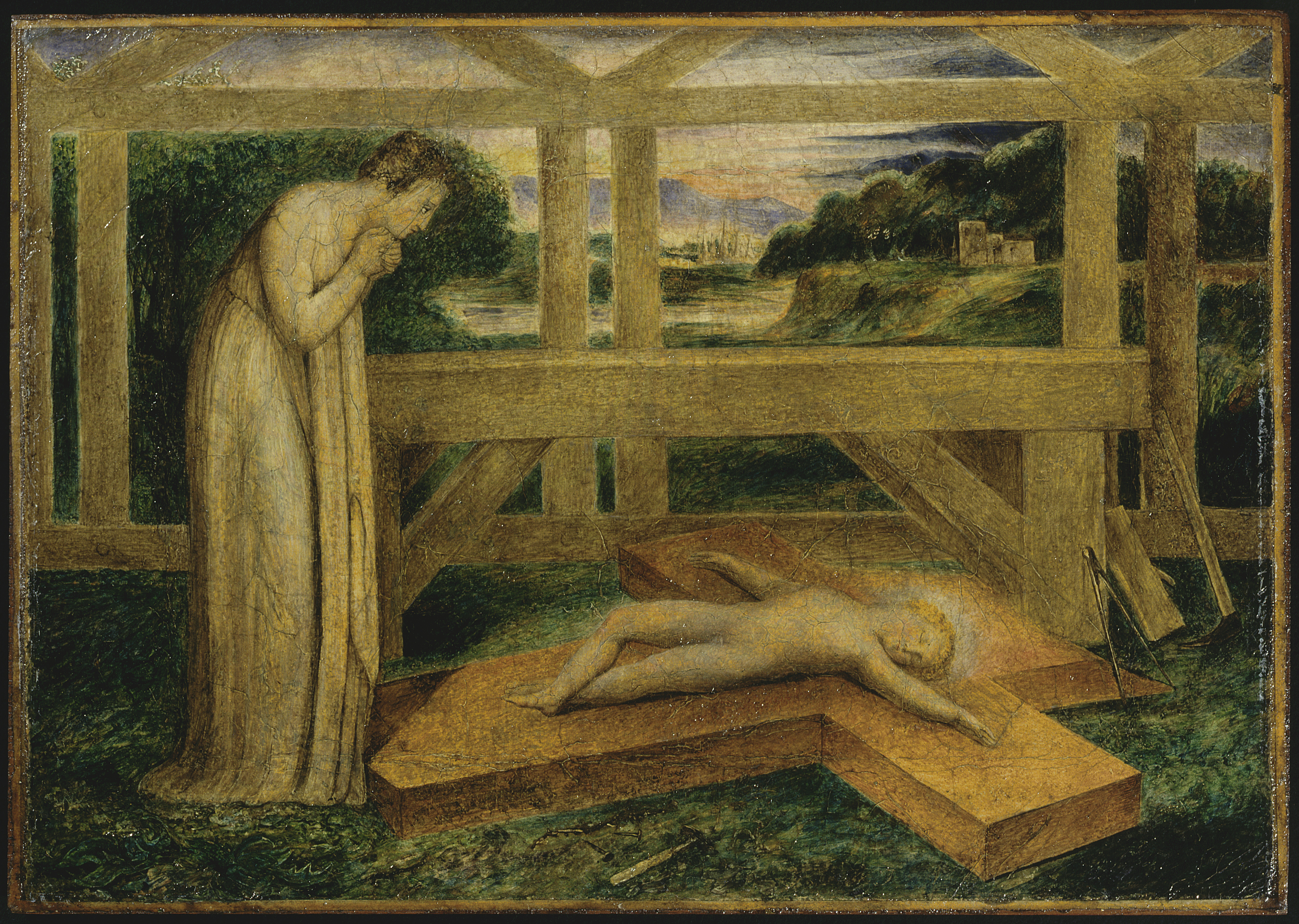
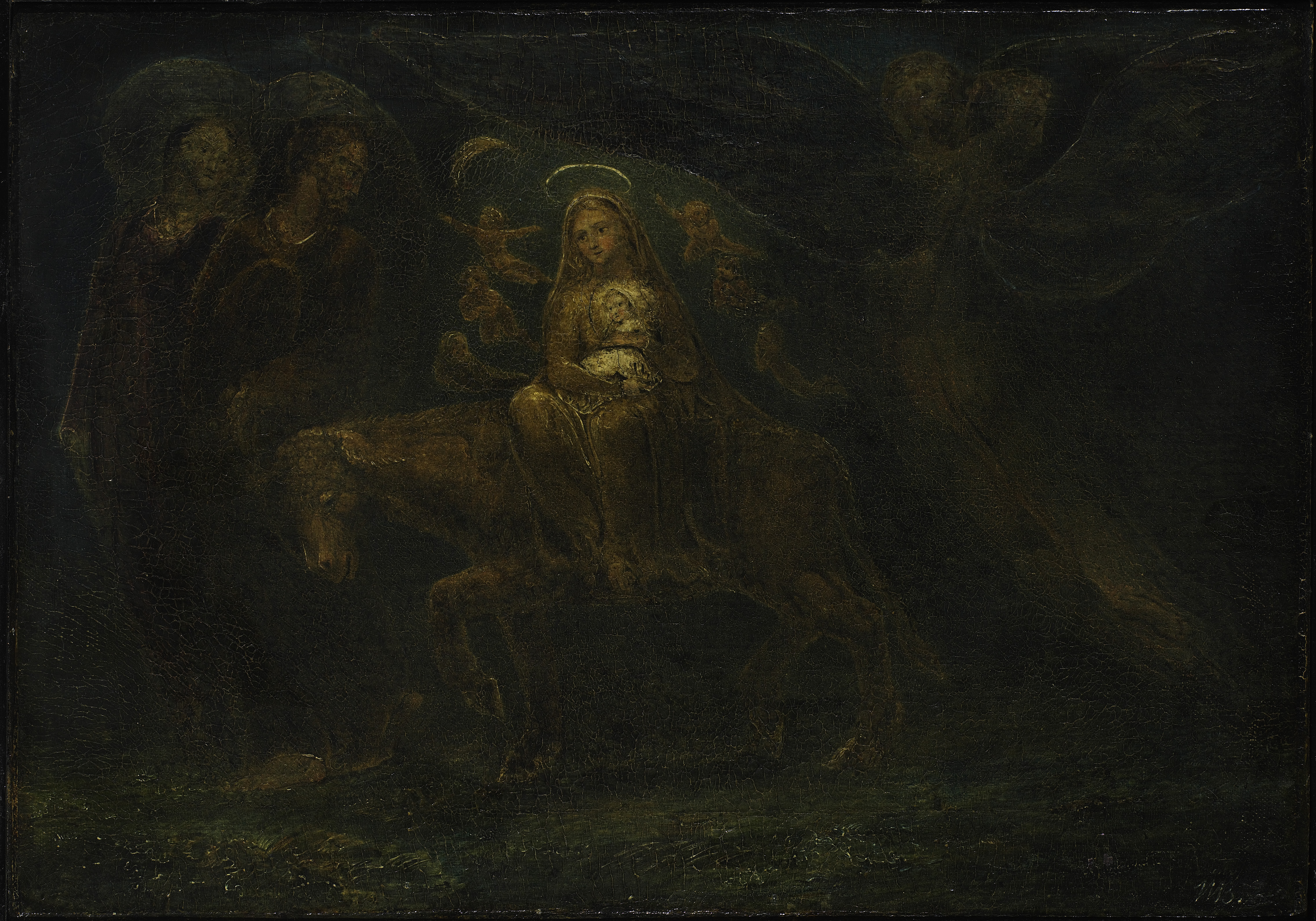
While patronage did have its hazards, the positive importance of both Thomas Butts and John Linnell is evidenced by Blake’s prodigious output during the years of their support. The Tate exhibition included seven temperas painted for Butts during the 1799-1800 period. Mainly of Biblical subjects, many of them, unfortunately, are irretrievably darkened because of Blake’s peculiar use of carpenter’s glue as a binder for his pigment. Still quite bright, however, is the very gentle Our Lady with the Infant Jesus Riding on a Lamb. Like many of Blake’s paintings of the period, it is

There was only one true landscape in the exhibition, the lovely watercolor, Landscape near Felpham (with sunlight, the light of poetic inspiration, to be sure, shining down on Blake’s cottage), but Blake’s response to the landscape could be repeatedly observed, notably in Ruth, the Dutiful Daughter-in-law and the striking, moonlit night scene of Malevolence. Blake’s landscapes were far closer to the pastoral tradition of Claude, whom he admired, than that of the heroic or sublime landscape of, for example, his contemporary De Loutherbourg. Often, as in the freely laid-in setting for the Ruth subject, the landscapes appeared to be generalized descriptions of particular places with a focus on mood; in other instances, perhaps most pointedly in the abundant landscape elements in the Milton Paradise Lost watercolors, Blake made particularized depictions of generalized natural forms.
Songs of Experience and The Book of Urizen preceded Blake’s large color prints of c. 1795. With The Book of Urizen, which contained several full-page images, designs gained importance in relation to text, and Blake became immersed in his color-printing technique. The reticulated textures of Blake’s color printing imply weight and density, pictorial qualities that are indeed sympathetic to Blake’s growing pessimism. These qualities were reduced or amplified depending upon the luminosity of particular colors, the thickness of the color layer (in this monoprint-related technique the earliest of several impressions of an image would have the thickest layer of pigment), and the number of layers of colors. Of additional importance was the way colors were placed in proximity to one another. For instance, in Elohim Creating Adam the forcefulness of the image is heightened by the rich blues which describe the background space and press the figure grouping forward. All of the color prints have additional work in watercolor and pen and ink. How much work begin page 46 | ↑ back to top

[View this object in the William Blake Archive]
[View this object in the William Blake Archive]
[View this object in the William Blake Archive]
At least one version of each of the twelve subjects was included in the exhibition, and in them the intense pessimism expressed in Urizen is given full visual form. They repay lengthy and careful scrutiny: color printing thickly and thinly applied; numerous layers of color reworked with transparent or opaque watercolors; accents of painted and/or drawn lines; textures which vary in density; highly modelled forms placed next to flat areas of color; pictorial space implied and denied; generalities of a Neo-Classical nature juxtaposed with very personalized conceptions; layered compositions layered with meaning. This rich visual world becomes hideously diluted when discussed in terms of technical analysis; and, in fact, Blake was certainly to reach equally expressive heights with far less technical complexity in the Dante watercolors of his last years.
Two major watercolor projects closely followed the large color prints. Seven of Blake’s 116 illustrations to Gray’s Poems were on view, with the satirical, humorous third illustration to “Ode on the Death of a Favorite Cat” a high point. This set was commissioned by John Flaxman for his wife, both apparently admirers of Blake’s illustrations to Edward Young’s Night Thoughts. Twenty-one of the 537 watercolors (about one-fourth of Blake’s known oeuvre) for that aborted project (only forty-three were actually engraved by Blake) were on view. The range of Young’s subject and mood was extended to express Blake’s own world view, one which was far more interesting and expansive than Young’s. One Night Thoughts illustration refers back to the drawing Warring Angels: Michael Contending with Satan of the 1780’s, and another, the title page to “Night the Eighth,” foretells the Apocalypse watercolor of 1809, or “The Harlot and the Giant” in the “Purgatorio” illustrations for Dante. Death mowing down an assembled throng, rebirth symbolized by the butterfly and the cocoon, Christianity symbolized by the vine, and the serpent of materialism, were all to be found as well. The transparency of watercolor at its most fluid and luminous was seen in “The Queen of Heaven walking in brightness,” in contrast to the watercolor layers of darker-hued, more dryly applied paint that added up to form “The Whore of Babylon astride the Seven Headed Beast.” Fanciful in the context of Blake’s art, these illustrations give clues to his witty and satirical nature. They also show his developing powers as a watercolorist.
One was able to see individual figures and entire compositions developed, revised, and refined throughout the exhibition, an exhibition being the best vehicle for making such things apparent. Blake’s all-encompassing themes repeatedly begin page 51 | ↑ back to top reappeared—The Creation, The Fall, Judgment, Salvation, War, Death, to name just a few. His vocabulary, his signs and symbols, were encountered again and again—the flames of eternal fury or of inspiration, the Egyptian pyramids of materialism, the worm of mortality, the musical instruments of creative activity. Compositional structures repeatedly recur—icon-like, emblematic, vertically symmetrical formats; layered horizontal bands; compartmentalized compositions which become mosaics of images; or schemata that depend on an open swirling gesture. The figure of the Bard, himself, reappears in many guises.
Blake made illustrations for Miltonic and Biblical themes throughout his career. Comparison of early and late versions of Paradise Lost subjects, or The Parable of the Wise and Foolish Virgins, made clear some of the changes that took place in his style. In later versions less emphasis was placed on overly dramatic and schematized facial expressions; compositions focused less on particular figures or groupings; color harmonies tended to be less delicate and/or monochromatic. Rather, the power of many of the later images comes from their more integrated compositions, organized by means of a flickering quality of light that fractures and activates forms modelled
Also shown were pages from both the unique complete colored Copy E and Copy B of Jerusalem, Blake’s last and longest illuminated book. The unique impression of the frontispiece before he deleted the inscriptions, and the published state of this plate, as well as two impressions of the title page, encouraged comparisons. Blake’s illuminated books were colored throughout his lifetime. Those colored in his later years (regardless of when the plates were actually made) are far more elaborate than the earlier ones. In late versions, as in his late watercolors, he used more complex color relationships, usually composed of small patches of rich color, as distinct from the broadly applied, delicate washes of the earlier work. Colors within the areas of text more fully integrated the text with the illustrations, and gold was sometimes employed for increased sumptuousness. This could be vividly seen in the title page of Jerusalem Copy E.
The exhibition closed with nineteen of Blake’s 102 watercolors to Dante, as well as two of the seven engravings from them. The ten watercolors for the “Inferno” were generally the most highly finished and dramatic; seven for “Purgatorio” were shown, and four for “Paradiso,” which as a group were the most freely sketch-like, with pronounced broad linear structures, at times like a kind of suggestive shorthand. The freedom with which Blake used color in these watercolors was
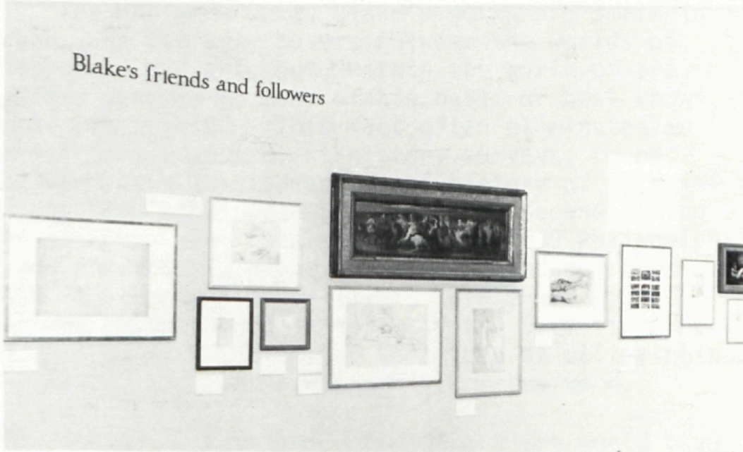
An obvious advantage of having this Blake exhibition at the Tate Gallery was that in the permanent collection one could study paintings by Fuseli, Stothard, Flaxman and Mortimer, and also additional works by Blake and his followers. Directly outside of the Blake exhibition itself was a display of works by his contemporaries, including Stothard’s version of Chaucer’s Canterbury Pilgrims, and works by the younger circle of Blake’s admirers, as well as later
Every exhibition reflects to some extent the taste and biases of the person who selected it; everyone else who sees the exhibition probably draws a desiderata list of what they’d have included. One can be rather certain in this instance, however, that many works one missed were missing because of institutional lending policies, as in the case of works from the Huntington Library, or restrictions attached to certain collections such as works from the Grenville Winthrop Collection at the Fogg Museum. Other loan requests would have been turned down for any number of reasons. For example, many
Given what Martin Butlin aptly refers to as the flood of Blake literature, one can sympathize with his decision to avoid crowding the entries of an exhibition catalogue directed to the general begin page 53 | ↑ back to top public with specialized scholarly information available elsewhere (exhibition history, listings of all related works, full provenance, etc.). His well organized bibliography was selected with an acute awareness of the most useful literature, including his own comprehensive catalogue of Blake’s paintings, drawings, and separate color prints which is to be published by Trianon Press for the William Blake Trust (which co-sponsored the Tate exhibition) later this year. This publication will undoubtedly provide a new standard of reference to these aspects of Blake’s oeuvre. In his cogent introductory essay, in the overviews that precede each section of catalogue entries, and in the entries themselves Butlin gives a splendidly complete picture of Blake’s art. The entries were brief and clear enough to be read by scholar and non-scholar alike while viewing the exhibition, as well as re-read and mulled over afterwards. Most of the longer

The catalogue reproduces everything in the exhibition as well as twenty-one illustrations of other works of art which supplement the text and
There was one printing mix-up; the catalogue entry for #67 was repeated for #68. The latter should read: begin page 54 | ↑ back to top
68 God Creating the Universe (‘The Ancient of Days’) c.1794/1824 or 7 (?)
Relief etching finished in gold, gouache and watercolour. 93/16 × 65/3 (23.4 × 16.8).
Signed ‘Blake 1824’ [?, or a clumsy ‘inv’: the end of the inscription is smudged]
Whitworth Art Gallery, University of Manchester
This copy of the print is generally identified as that which, according to J. T. Smith and Frederick Tatham, Blake coloured for Tatham on his deathbed. It is however exceedingly difficult to read the last digit of the date, if indeed it is a date, as a seven. The print is nevertheless typical of Blake’s late rich elaborate colouring, including the use of gold. It seems to be from the later state of the engraving, that actually used in copies of Europe.
Needless to say, all of the old questions about Blake’s art are not answered with the exhibition, and new ones are raised. For example, the three versions of God Creating The Universe, The Ancient of Days do indeed make one wonder if they all could have been printed from the same plate, the relief-printed lines of the clouds so differed from impression to impression; and one does have to be curious about the rather meticulous watercolor study of a serpent which, as Mr. Butlin indicates, corresponds to none of Blake’s serpents. Neither does it seem to correspond in style to any of Blake’s other studies.
For the most part, Blake’s works are small in scale. He not only hovers between the worlds of literature and art, but, within the world of art, suffers because so many of his best, or best known, works are printed. This fact often eliminates an artist from standard art-history surveys, to be included only in studies of the history of prints—at one time considered by some to be second-string art history. The catalogue for the 1939 Philadelphia Museum of Art’s Blake exhibition introduced the paintings section as follows: “Blake was not a painter in the accepted sense of the term since he never really mastered the technique of oil painting.” “Accepted,” of course, is the operative word.
Developments within the contemporary art world have made Blake more palatable and perhaps more accessible. Boundaries are by necessity being broken down between categories,[e] making color-printed drawings more easily “acceptable” to an art public. None of this alters Blake’s work, but rather presents the possibility that a Blake exhibition in the year 2027 won’t have to be introduced again with the propostion that it aims to demonstrate Blake’s importance as a visual artist. To use the last sentence of Martin Butlin’s introduction, “Of his [Blake’s] greatness as a complete man there can be no doubt; nor, it is here claimed, should there be any doubt about his greatness as an artist.”