
article
begin page 16 | ↑ back to topTHOUGHTS ON THE 1978 TATE GALLERY EXHIBITION
Selecting the large Blake exhibition held at the Tate Gallery last year, and being in the Gallery nearly every day it was on, gave me unprecedented opportunities for repeated comparisons and reappraisals; I was able to worry over particular problems day after day, week after week. Perhaps disappointingly, no drastic new thoughts came to me, but some ideas were reinforced and some new problems raised.
On the whole the various reviews of the exhibition showed a new acceptance of Blake’s qualities as an artist, as did the reaction of the public at large. What criticisms there were in the press sparked off perhaps exaggeratedly protective feelings. Douglas Cooper described the praise of Blake’s work in my catalogue introduction as “smug.” At the other extreme, an American student asked me why I was so defensive. I was also criticized for stating that Blake’s achievement should be judged by only his best works. This I stand by, though accepting the idea that for a full assessment, as opposed to a value judgement, one should take all of his work, however bad, into account.
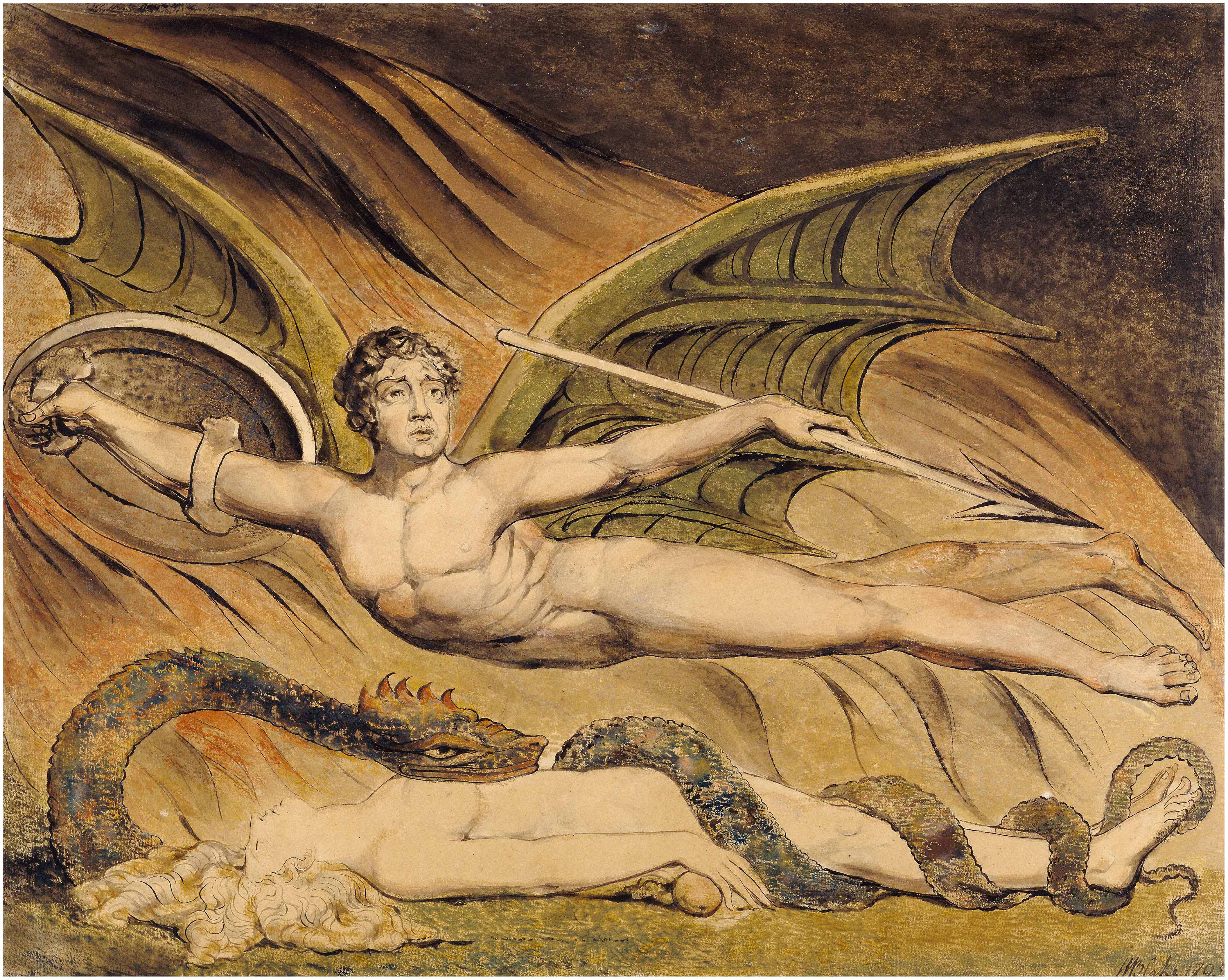
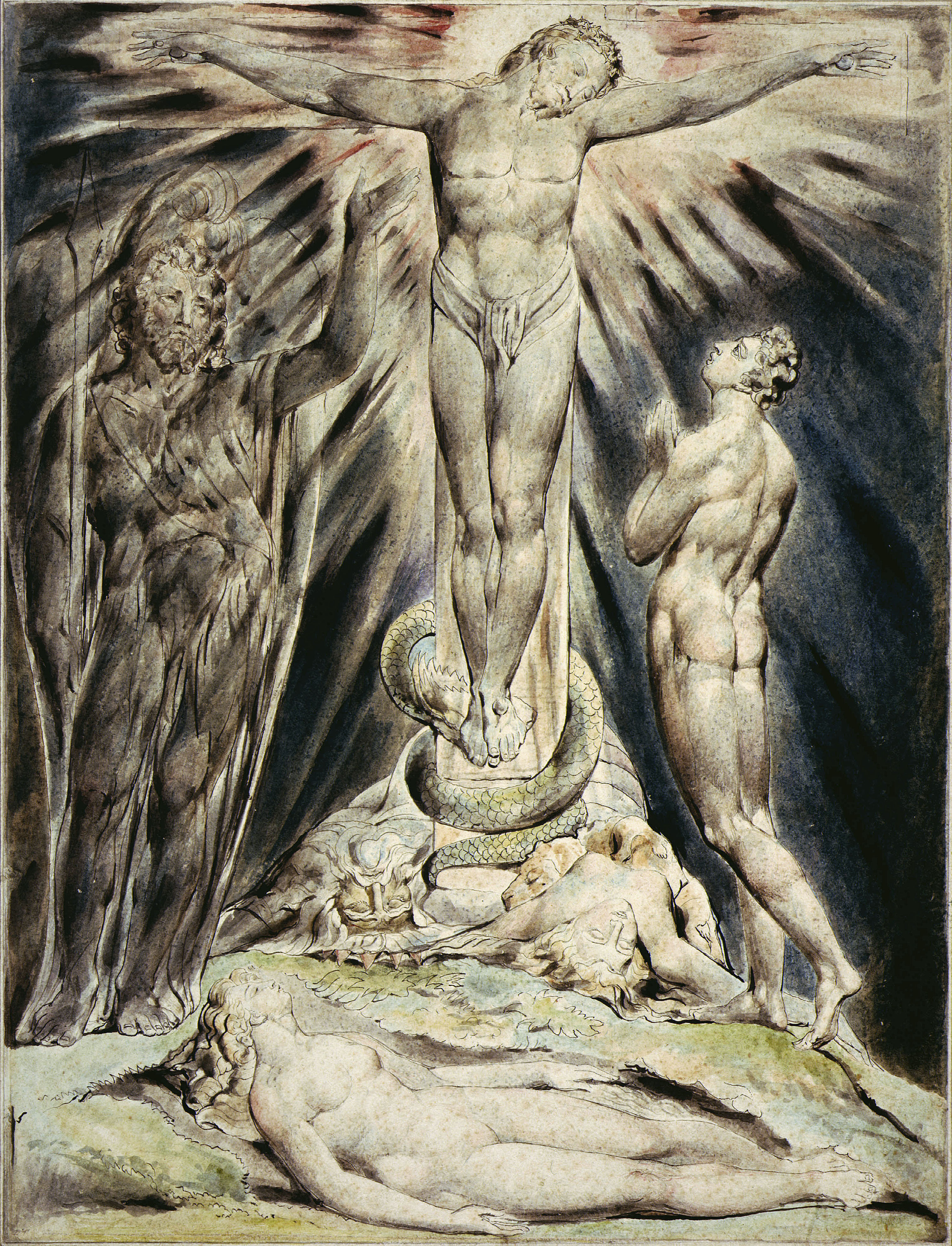
One particular circuit of the exhibition was aroused by the criticism of Blake’s facial expressions as “hardly varying (rarely a smile, or a grimace, to be seen).” This provoked me to discover a great variety of expression, and perhaps more important to confirm, as has no doubt been realized long ago by others, that Blake’s villains are tragic heroes rather than villains as such. Take for example the head of Jehovah-Urizen in “God creating Adam” (No. 85 in the exhibition; such references are given throughout), “God Judging Adam” (87) and the title-page to Urizen (75). This tragic quality is also found in the head of Satan in “Satan hovering over Eve” (86) and the more ambiguous figure of Orc on plate 10 of America (61). Even minor villains such as Job’s Friends in the early large print (31 and 32) have this tragic quality, though Blake was prepared to allow unadulterated villainy to such figures as the assassins at the opening to the Preludium to Europe (64) and in “Malevolence” (141). Perhaps significantly, in “Lucifer and the Pope in Hell” (84) the Pope is shown as an out-and-out villain while Satan has a tragic, almost pathetic expression.
The subtlety of Blake’s facial expressions can be seen by comparing those of Job’s family at the beginning of their experiences and at the end (191 and 196); this subtlety was further developed in the second series of watercolors, done for John Linnell (197), and in the final engravings (200-204). Marvelously expressive are the unfocused eyes of the tempted Eve in “The Temptation and Fall of Eve” from the 1808 Paradise Lost series (224). Even an early drawing such as that of “A Young Woman reclining on a Couch” (13) derives much of its character from the facial expression.
A study of Blake’s heads led to a qualification of the accepted theory that the head of the figure in “Albion Rose” is the same as that in the early Academy study (8), usually and I think convincingly seen as a drawing of Blake’s younger brother Robert. This is so in the case of the color-printed version of the engraving (10) but in the later reworked monochrome version (11) the facial type is quite different, less broad and sturdy, with a narrow mouth and altogether more refined. It would be interesting, should a copy of the putative first state of this engraving ever reappear, to see what the head of that was like.
begin page 17 | ↑ back to topMy study of Blake’s heads and expressions also led to a re-examination of the problems in dating Blake’s works in the 1790s. I was able to confirm to my own satisfaction my relatively late dating for the second “Jane Shore” watercolor (17), in many ways amazingly conservative for a work that I place in the early 1790s. The existence of a drawing that must have been done between the early version (16) and the later suggests that Blake was returning to the subject after a considerable period of time and the heads of the later version are remarkably close in their sensitivity to the engraving of “Edward and Elenor,” dated 1793 (18). The heads in both these works are more sensitive even than those in “The Ordeal of Queen Emma” (19), but all these works are far more sensitive and accomplished than the early series of watercolors of subjects from English history painted in about 1779-80 (16 and 21), than the second “Pestilence” watercolor (22) and than even the three Joseph watercolors of 1785 (28-30) which are magnificent but remain as stereotyped in expression as they are in composition. The drapery folds of the works attributed by me to the 1790s are also much more subtle in their variety than those of circa 1780-85, though Blake had already shown himself master of the immense subtlety of Watteau’s draperies in his 1782 engravings, “Morning Amusement” and “Evening Amusement” (37 and 38).
The presence of all five versions of “Pestilence” (in its first manifestation, the watercolor of circa 1779-80 (21), the specific subject is the Great Plague of London but in the later watercolors Blake seems to have broadened the significance of his composition to embrace the whole theme) confirmed the accepted order and also what can perhaps be termed the “conventional” dating of the three middle ones (22-24) to the early 1780s, the early 1790s and the late 1790s respectively. Those datable to the 1790s neatly bracket Blake’s style and achievement in the watercolor illustrations to Young’s Night Thoughts of 1795-97 (104-124). The developing subtlety of expression, the gradual relaxation of the neoclassical emphasis on profile coupled with the tightening up of the function of line, merely suggested in No. 23, towards the strict bounding outline, all show a gradual development towards the renewed discipline of the biblical watercolors datable to 1805, by which time Blake had developed his aesthetic theories in a similar direction
The Pestilence series also shows a development, if that is the word, in Blake’s use of space. In the early works (21 and 22) the figures are more or less convincingly deployed in a Poussinesque space defined by architectural features seen in
[View this object in the William Blake Archive]

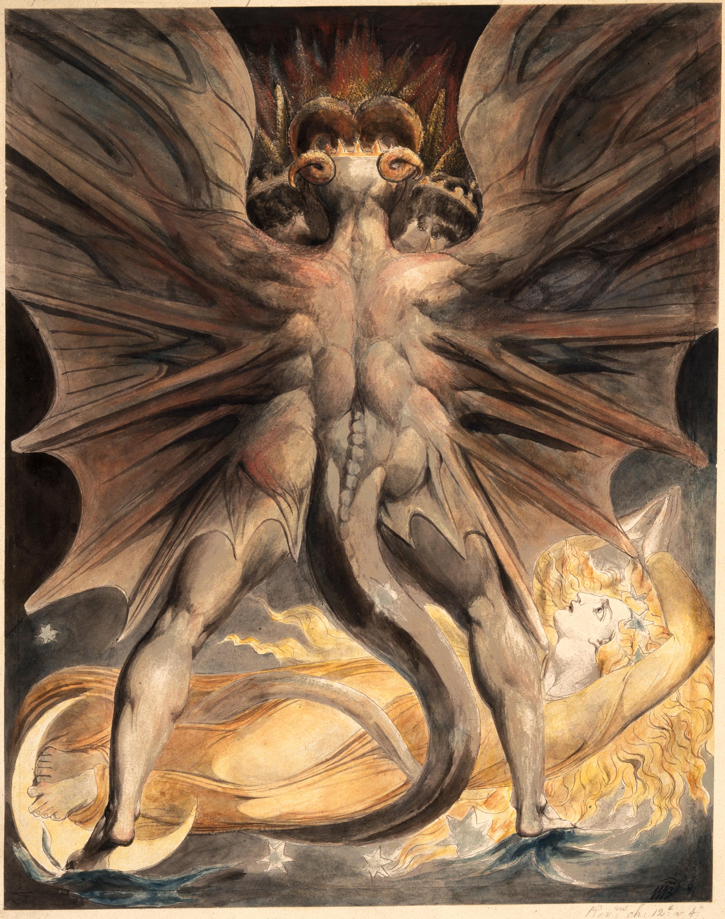
Some Blake scholars have already expressed their doubts over the accepted dating of the various states of the large prints of “The Complaint of Job” and “The Death of Ezekiel’s Wife” (31-33). The date on the later state of the Job print, “1793,” and what is presumed to be a later state of the Ezekiel print, “1794,” have traditionally been accepted as the dates of those actual states, the first state of the Job and the putative first state of the Ezekiel being dated to the mid-1780s. However, Robert Essick has pointed to the significance of the fact that the date on the last state of “Albion Rose” (11), which must have been done about 1800, is that of the putative first begin page 19 | ↑ back to top state, “1780.” Similarly in the case of the print of “Joseph of Arimathea,” dated “1773” on the later state, a date that must again refer to the first state. Following this argument, the dates “1793” and “1794” on the second states of the Job and Ezekiel prints would have to be regarded as “ideal” dates referring to Blake’s first treatment of the compositions. Certainly, it is the first state of the Job print that is closest in technique and chiaroscuro to the “Edward and Elenor” print, dated “1793” (for what this is worth! One suspects that this composition of the 1790s, like the “Jane Shore,” may perhaps be a re-working of an idea first developed in about 1780). The differences between the first and second states of the Job print suggest that the second state was done considerably later, not however at the time of Blake’s greatest revival of neoclassical discipline, 1805, but later still when he worked again on a rather larger scale in the second Paradise Lost series of 1808 (216-227) and the temperas included in or immediately following his 1809 exhibition (205, 206, and 214). The more exaggerated contrasts in lighting of the second state of the Job are found also in “The Fall of Man” of 1807 (212) and the Petworth tempera of “Satan calling up his Legions” (209), and the flash of lightning that so enhances the dramatic effect is remarkably close to that in “The Great Red Dragon and the Woman clothed in the Sun” (187) and that in “The Temptation and Fall of Eve” from the 1808 Paradise Lost series (224).
Against these arguments however are the style of the preliminary drawings for the two compositions (not included in the exhibition) which are fully distinctive of the mid-1780s, and the closeness in power and dramatic expression of the later states of the large prints to the large color prints of 1795 (85-103). After the mid-1790s Blake quite clearly moved away from this peak of dramatic achievement, which is not really matched in the works of circa 1805-10 referred to above. So, for me, the question remains open.
The crucial importance of the three years at Felpham from 1800 to 1803 and of such events as Blake’s visit to the Truchsessian Gallery of Pictures for the evolution of Blake’s mature ideas has long been recognized. The series of watercolors of biblical subjects painted for Thomas Butts spans this crucial period, examples being dated 1800, 1803

The unprecedented reunion of the four watercolors dealing with the beasts of the Apocalypse (186-189) demonstrated that they fall into two pairs. The composition of “The Great Red Dragon and the Woman clothed with the Sun” (186), practically filled by the back of the great standing dragon, is echoed in reverse by that of “The Great Red Dragon and the Beast from the Sea” (188) in which the same dragon is seen from the front, while in the other two watercolors the composition is divided into two, with one figure hovering over another. When hung together, No. 188 could be seen to have the same painterly characteristics of the works of 1803 as does No. 186; hence the re-dating suggested above. Significantly, Blake seems to have enlarged No. 186 begin page 20 | ↑ back to top
[View this object in the William Blake Archive]
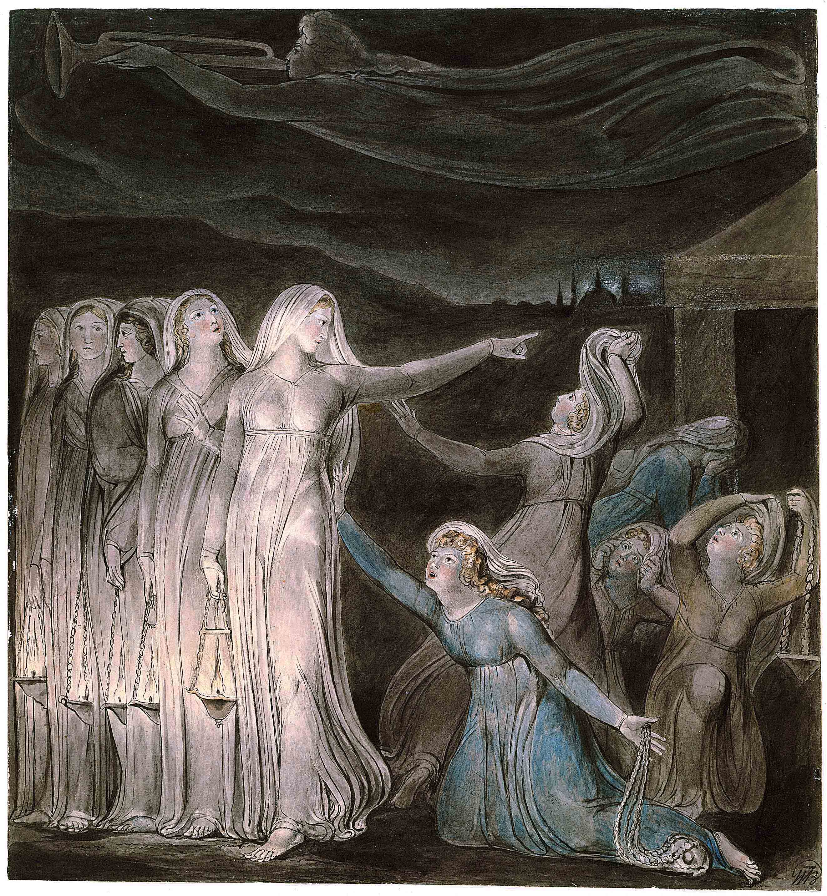
Repeated viewing also confirmed my views on the development of Blake’s late style. The illustrations to Milton’s L’Allegro and Il Penseroso (239-250) reveal a mood completely different from Blake’s earlier works, with a new highly sensuous quality resulting from their relatively small scale and delicacy, their rich colors, achieved partly at the expense of the bounding line, and their very high finish, achieved by a soft, painterly technique including stippling. Some of these factors, the small scale and the impressionistically suggested facial features, are already found in the “Last Judgment” watercolor of 1808 (213), but this still has the very firm modelling of the 1808 Paradise Lost series (216-227) which has completely gone by the later Milton illustrations. This new relaxed style is very close to that of “The Arlington Court Picture” of 1821 (307) and although the L’Allegro and Il Penseroso watercolors are on paper watermarked 1816 there is no reason why they should not have been painted five or so years later. Similar in style, though in monochrome, is the recently identified illustration to Robert Bage’s Hermsprong (255). Rather less sensuous, perhaps because of its content, but still showing many of the same features, is the “Epitome of James Hervey’s ‘Meditations among the Tombs’” (314), which is close in tone and in its use of gold to the late versions of “The Wise and Foolish Virgins” (173). The three Paradise Lost watercolors painted for John Linnell in 1822 (228-230) show the same development within the necessary limitations caused by the retention of earlier compositions. The new mystical quality of “The Archangel Michael Foretelling the Crucifixion” (230) is the result not only of the introduction of the glow of light emanating from Christ’s body but also of the general softening of treatment.
A stage in the development of this late style is to be seen in the illustrations to Milton’s Comus from the Boston Museum (231-238). These are a complete rethinking of the first series commissioned[e] by the Rev. Joseph Thomas in 1801 and are to be
[View this object in the William Blake Archive]
Still later, the watercolor illustrations to Dante of 1824-27 (319-339) show a further relaxation in handling, perhaps partly as the result of their greater scale but also paralleling the reworking of the print of “Mirth” (251 and 252). The more finished examples however show the highly finished sensuous quality of the late Milton illustrations.
I have always been careful to leave detailed discussion of iconography to the experts (even so, begin page 22 | ↑ back to top my caution over “The Arlington Court Picture” was rewarded by an onslaught of complaints from Kathleen Raine and her followers!). However, I do believe that iconographic interpretation must take into account the visual qualities of the works under discussion (though Roe’s utterly convincing interpretation of “Beatrice addressing Dante from the Car” (334) as an attack on Dante’s idea of the Church is a warning that one cannot always accept the sensuous quality of a Blake work at its face value). In particular, I have always felt that a guide to the content of the great series of 1795 color prints can be found by matching them up compositionally. The exhibition, in which all twelve designs were represented, at last gave one a chance to do this in front of the actual works. Given the pairings that have already been accepted—“Nebuchadnezzar” (91) with “Newton” (92); “Pity” (95) with “Hecate” (99); “Lamech” (93) with “Naomi entreating Ruth and Orpah to return to the Land of Moab” (94); and “God Creating Adam” (85) with “Satan exulting over Eve” (86)—one can, I would suggest, go further and match “The House of Death” (101) with “Christ appearing to the Apostles” (103). These two static compositions can be very broadly interpreted as showing two aspects of God in his relationship to mankind, the destructive Jehovah-Urizen being contrasted with the forgiving Christ. This leaves “God Judging Adam” (87) under the terms of the single law of the “Book of Brass” as the pendant to “The Good and Evil Angels” (102), which illustrates the error of applying one law to the various different aspects of the divided man—perhaps!
Repeated looking at the works led also to various minor, unconnected observations. The horses drawing the Sun’s chariot in the illustration to Night III of Night Thoughts, page 12 (Night Thoughts no. 87; exhibition No. 107) have the same exaggerated eyelashes as the horses in the Philadelphia copy of “God Judging Adam” (89), the coloring (at least) of which has been suspected as not being by Blake. To me, although the degree of finish is perhaps suspect, the coloring of this copy differently from the other two (87 and 88), and the echoing of the lines in Urizen relating that there was “no light from the fires, all was darkness / In the flames of Eternal fury,” show a degree of creative imagination that can only be Blake’s own.
Close examination suggested that the biblical reference written on the original margin of “The Hymn of Christ and the Apostles” (175) is in exactly the same ink, and apparently the same hand, as Blake’s own “WB inv” monogram signature. This supports the view that at least in some cases it was Blake himself who first thus identified the subjects of the watercolors. Similar inscriptions, perhaps also in Blake’s hand, appear on some of the old mounts; other early mounts seem to bear inscriptions copying Blake’s originals, lost through the trimming of the original paper.
The juxtaposition of the two temperas of “Satan calling up his Legions,” that from the Victoria and Albert Museum (208) being the one shown in Blake’s exhibition as an experimental and over-labored composition for the other “more perfect Picture” painted for the Countess of Egremont, which was lent from Petworth (209), made it possible to identify at least some of the figures that are now more or less destroyed in the former. On the whole, the disposition of the figures seems to have been the same, but the female figure among Satan’s legions to be seen at “9 o’clock,” who has a crescent moon on her forehead in No. 209, seems always to have lacked this feature in No. 208; the figure at “4 o’clock” looks female in No. 208 but is not so in No. 209; and the angles of the heads are often different. The same composition reappears, simplified and rearranged, in the first of the Paradise Lost illustrations (216).
On the whole, with obvious exceptions among the temperas, it was aimed to confine the exhibition to works in good condition. Even such masterpieces as “Satan in his original Glory” and “The River of Life” in the Tate Gallery lose considerably because of the fading of their original blues. It has long been questioned whether the large 1808 Paradise Lost series has faded and the presence in the exhibition of all twelve designs with the exception of that in the Huntington Library (216-227) made it possible to compare those nine that remained together and are now in the Boston Museum with two of the examples that were sold off separately by Thomas Butts Jr. in the middle of the 19th century (216 and 225). In fact there seemed to be nothing to choose between the Boston watercolors and the others. Blue, always the first color to fade, is to be found, though to a very limited degree, in many of the examples. In “The Creation of Eve” (223), for instance, there is none in the sky but there are touches on the flowers; it can hardly have faded from some parts of the design and not from others. The serpent in “The Judgment of Adam and Eve” (225), now in the Houghton Library, is paler than that in “Satan watching the Endearments of Adam and Eve” (219), one of the watercolors in the Boston Museum, but no more so than that in “The Expulsion of Adam and Eve from the Garden of Eden” (227). The local color in, say, “Raphael warns Adam and Eve” (221) is in fact fairly strong but its effect is reduced by the brownish tone of the paper. Discoloration of the paper can indeed have as radical effect on the general effect of the colors as the fading of the colors themselves, as is shown by other examples of Blake’s work: the recent bleaching of the paper of the Joseph watercolors of 1785 (28-30), like that of the Tate Gallery’s “Oberon, Titania and Puck with Fairies dancing” of much the same date, has restored these works to more or less their original brightness of hue.
Moreover, a similar rather subdued coloring is found in certain other works of the same period, in particular the two “Lost Judgment” watercolors of 1806 and 1808 (211 and 213). Again it seems that discoloration of the paper is to blame. In addition it may be that Blake in all these works deliberately aimed at a comparatively subdued, ivory-like finish; this attunes well with the firm modelling of the figures.
begin page 23 | ↑ back to topClose examination did show that one or two other works had faded to a slight extent. A slightly darker border showed that this had happened to “The Angel of the Revelation” (185), and one was also led to suspect that the second beast in “The Number of the Beast is 666” (189) must originally have been as blue as that in the companion “Great Dragon and the Beast from the Sea” (188).
Constant exposure to the exhibition confirmed one’s original faith in Blake’s greatness as an artist (at times of strain during the preparations one had begun to doubt!). The exquisite quality of Blake’s line, closely allied to its economical use in tightly defining the forms, in such works as Nos. 109, 110, 125, 161, and 174, all in addition masterful as compositions, was seen not to have been overrated. Nor has the inspired literalness of Blake’s illustration of Shakespeare’s lines in “Pity” (95), or his depiction of the threshold of the Gate over which the Sun steps in the illustration to Milton’s L’Allegro (241). More surprising perhaps, given Blake’s strongly held aesthetic theories, is the highly sensuous quality of much of his work, not only in his late years as in the later Milton illustrations and those to Dante, nor yet in the rich textures of the large color prints of 1795, before Blake had fully evolved his artistic theories, but even in such subtleties as the fall of light from the lamps of the wise virgins onto their legs in the watercolor of “The Wise and Foolish Virgins” delivered to Butts in 1805, at the height of Blake’s aesthetic self-discipline (172); even at this period much of the sensuous quality of the later re-workings of the subject (such as 173), is anticipated. Not withstanding the fact that much of Blake’s work is of a much lower quality he must be seen as among the greatest of the visual artists that Britain has produced.
As a footnote one should perhaps add that the second printing of the catalogue, in paperback only, incorporated certain corrections including one or two alterations to dates as mentioned above. Information about the visibility or otherwise of inscriptions was brought up to date, the misprint by which the text for No. 67 was repeated under No. 68 was corrected, and a few dimensions of engravings were corrected. In this last connection it is perhaps worth remarking that the measurements as given in the standard
[View this object in the William Blake Archive]
Copies of the second printing of the catalogue, in paperback, and of the first printing in hardback are still available from the Tate Gallery Publications Department at £2.95 for the paperback, plus 80 pence postage and packing (for both U.K. and overseas), and £4.75 for the hardback, plus £1.00 postage and packing.