
REVIEWS
Songs of Innocence and Songs of Experience. Manchester, England: Manchester Etching Workshop, 1983. “Facsimile Edition” limited to 40 copies each with 17 prints, 16 hand colored, boxed with leather portfolio ($800) or boxed in wrappers ($700). “Monochrome Edition” limited to 35 copies each with 19 plates, 2 hand colored, boxed in wrappers ($450). Each edition accompanied by a 25-page pamphlet, The Art of William Blake’s Illuminated Prints, by Joseph Viscomi.
[Editor’s note: According to the publishers, colored copies of the Manchester Etching Workshop’s facsimile are no longer available, except for four “artist’s proof” copies ($1200 each). The monochrome edition, which now comes with four colored trial proofs, is still available. Send inquiries and orders to Manchester Etching Workshop, 3-5 Union St. (off Church St.), Manchester M4 1PB, United Kingdom.]
Facsimiles of the illuminated books have played an important role in the history of Blake collecting and scholarship. The various techniques used by facsimilists in their attempts to capture Blake’s unique effects can be as mystery-laden a subject as the study of Blake’s own graphic methods. Some of the earlier efforts provide a context for understanding the special properties of the new facsimiles under review.
The Victorian publisher John Camden Hotten was the first to initiate a series of high-quality color reproductions. In about 1867, he announced “a few facsimile copies (exact as to paper, printing—the water-colour drawings being filled in by an artist) of the ORIGINAL EDITIONS of the Books written and illustrated by William Blake. . . . The first volume, ‘MARRIAGE OF HEAVEN AND HELL,’ 4to, to be ready by Jan. 15, 1868.”1↤ 1 The substance of this small advertising flyer was repeated in Hotten’s list of new and forthcoming volumes bound at the end of some of his publications. Only this one title was published as a color facsimile, apparently produced by Henry J. Bellars, an expert copyist in Hotten’s employ.2↤ 2 See Morton D. Paley, “John Camden Hotten, A. C. Swinburne, and the Blake Facsimiles of 1868,” Bulletin of the New York Public Library, 79 (1976), 259-96, esp. pp. 279, 284. Proofs of the Hotten/Bellars plates, as well as uncolored areas in the published volume, indicate that the pages were printed lithographically[e] begin page 40 | ↑ back to top in brown ink. These were subsequently hand-colored in imitation of copy F of the Marriage, then in the collection of Lord Houghton and now in the Pierpont Morgan Library. Hotten and Bellars selected a paper with color and texture similar to the Edmeads & Pine wove stock of the original. Attention to paper is essential for good facsimile work, but unfortunately their choice was not pure rag and has become badly foxed in many copies.
William Michael Rossetti believed that Hotten intended “to bring out a photographic copy of Blake’s Jerusalem, and I think some of the other books.”3↤ 3 As he entered in his diary on 3 June 1867; see W. M. Rossetti, Rossetti Papers 1862 to 1870 (London: Sands & Co., 1903), p. 234. If Bellars used photography for the Marriage facsimile, then he encountered one of the chief difficulties confronting later facsimilists. Technically, the colored illuminated books are composites of an image printed from a metal plate and an overlay of other media—water color, drawing with pen or brush, perhaps pencil in a few cases—applied by hand to the impression after printing. To replicate this basic division of processes requires the facsimilist to recreate the underlying printed image. This can be extremely difficult when no uncolored copy is available. The analysis of a colored image into its constituent elements, printed and drawn by hand, cannot be done by photomechanical processes alone. The photographic image must be “corrected,” either in the negative or after transfer to the printing body (stone or metal), to remove some of the effects of coloring. These complexities are multiplied in the case of Blake’s color-printed works, such as copy F of The Marriage of Heaven and Hell. Perhaps the computer techniques developed by the Jet Propulsion Lab for enhancing video images would overcome these difficulties. Lacking such space-age tools, the color facsimilist must either use completely photomechanical techniques lacking Blake’s basic division between printed and non-printed media, or introduce his own hand and eye at a very early stage of production, long before coloring begins. The first alternative offers exceptional fidelity to outline; the second inevitably disturbs such accuracy in an attempt to recapture some of the more distinctive and subtle qualities of the originals by using processes similar to Blake’s own.
In about 1883, William Muir embarked on an ambitious project to publish hand-colored facsimiles of most of Blake’s illuminated books. By 1890, he had produced fourteen titles.4↤ 4 Not including “Little Tom the Sailor” and a single plate of “The Act of Creation” (i.e., the frontispiece to Europe). Geoffrey Keynes, Blake Studies, 2nd ed. (Oxford: Clarendon Press, 1971), p. 109, states that the “Little Tom” facsimile was produced “by the firm of Emery Walker & Boutell.” However, it is listed as one of Muir’s “Works in Preparation” in the Quaritch advertisement of November 1886 (see below), as one of Muir’s published works in Quaritch’s sale catalogue of February 1891, item 118, and as one of Muir’s productions on the printed front cover of his facsimiles of Europe (September 1887) and The Song of Los (November 1890). Further, I have in my collection impressions in light brown ink of the “Little Tom” head and tailpieces (the latter hand-tinted in gray and black) acquired as part of a batch of Muir’s trial proofs, including plates from his There is No Natural Religion facsimile used as backing sheets for the “Little Tom” prints. Perhaps Muir was hired by Emery Walker to produce the lithographic facsimile, first published in The Century Guild Hobby Horse, 1 (October 1886), and Muir subsequently printed it “on old hand-made paper” (Quaritch’s November 1886 advertisement) for sale as part of his own series. For a discussion of the various issues of Muir’s “Act of Creation,” see Essick, The Separate Plates of William Blake: A Catalogue (Princeton: Princeton Univ. Press, 1983), pp. 258-60. The first printed notice of Muir’s plans would appear to be an undated “Proposal for the Publication of the Prophetic Books and the Songs of Innocence and of Experience, by W. Blake,” issued by the Pall Mall bookdealer John Pearson. Neither Muir nor any other facsimilist is named, but the list of works “Now Ready” (Visions of the Daughters of Albion, The Book of Thel) and “In Preparation” and their prices clearly indicate that these are Muir’s volumes. A second edition of the “Proposal” adds Songs of Innocence and “The Act of Creation” (i.e., the frontispiece to Europe) to the “Ready” list.5↤ 5 I am grateful to Raymond Lister for supplying me with photocopies of these two Pearson prospectuses in his collection.
Little is known about Muir and why he labored so long and hard on Blake facsimiles. Sir Geoffrey Keynes, who knew the man, told me a few years ago that Muir was a commercial lithographer, a profession which may have provided his first intimate contact with Blake’s works and an interest in their technical features. In 1877, Pearson had published an uncolored lithographic facsimile of Jerusalem, bound in blue paper wrappers and numbered upper left on the front cover.6↤ 6 No publisher or facsimilist is named, but on the cover of his Song of Los facsimile (1890), Muir states that he has not “issued Jerusalem because Mr. Pearson’s excellent facsimile can be had by all.” Further, E. W. Hooper, who purchased copy D of Jerusalem (now in the Harvard University Library) from Pearson, wrote that it was the original from which the bookdealer had made a reproduction. See Morton D. Paley, “A Victorian Blake Facsimile,” Blake/An Illustrated Quarterly, 15 (1981), 27. Muir consistently issued his volumes with the same type of binding, similarly numbered. Perhaps Pearson employed Muir to prepare the photolithographs for the Jerusalem volume, much as Hotten had hired Bellars. Pearson’s failure to mention Muir in his prospectuses for the facsimile series might have resulted from the bookdealer’s perception of their relationship as that of a publisher to a hired journeyman, not that of a publisher to an author or artist. Pearson retired from business in March 18857↤ 7 According to Muir in a letter of 28 December 1885 to the Editor of The Athenaeum, as quoted in G. E. Bentley, Jr., Blake Books (Oxford: Clarendon Press, 1977), p. 488. and Muir took his project to the dealer Bernard Quaritch, who in May 1885 issued a four-page advertising flyer for “William Blake’s Original Drawings . . . and Mr. William Muir’s Admirable Facsimiles of Blake’s Works.”8↤ 8 The flyer was reissued, with more titles listed as “already issued,” in November 1886. According to Geoffrey Keynes, A Bibliography of William Blake (New York: Grolier Club, 1921), p. 295, there is also a flyer dated May 1887, but this I have not seen. Quaritch also advertised Muir’s facsimiles in his general catalogue of February 1891, items 107-19, and Muir produced Quaritch’s 1927 facsimiles of The Songs of Innocence and The Songs of Experience. Muir was no longer an anonymous hireling.
The first Pearson prospectus for Muir’s facsimiles contains the following paragraph on their technical merits:
The methods employed for these reproductions will be the same as those by which Blake himself produced the originals, with such variations only as may be required to maintain fidelity to his results. All will be carefully produced, not in ordinary type, but, as Blake himself printed them, and they will be coloured by hand with colours of the same description and vehicles of the same nature as those used by Blake. Neither photography nor chromolithography will be employed in any of the works in the list attached hereto.The emphasis is placed on recapitulating Blake’s own techniques, not just accurate reproduction of the finished products. However, the promise that photomechanical processes would be eschewed entirely was slightly modified in the first Quaritch advertisement, which states more modestly that “almost all the labour is hand work.” Compromises to “maintain fidelity,” or simply to keep the project within practical limits, were unavoidable.
Pearson’s and Quaritch’s claims might suggest that Muir produced relief-etched books, but this does not seem to be the case. Except for the intaglio plates of The Gates of Paradise, all his facsimiles appear to be printed lithographically. For most titles, Muir worked from colored originals, and thus like Hotten and Bellars he had to recreate the underlying printed images by eliminating those portions of the designs created by subsequent coloring. This requirement may explain the begin page 41 | ↑ back to top existence of monochrome wash drawings by Muir corresponding to what one might reasonably determine to be the printed images of the originals. Muir also prepared a few color facsimiles completely drawn and painted by hand, and these may have begun their careers as master guides for hand-drawn lithographs and coloring when the originals were not available to Muir for extended loan periods.9↤ 9 In my collection are Muir’s monochrome drawings for eighteen plates from Songs of Experience and a completely hand-drawn color facsimile of The First Book of Urizen. Raymond Lister owns Muir’s hand-drawn and colored facsimile of The Book of Thel. This fragmentary evidence does not of course prove that Muir made monochrome drawings and/or color mock-ups for all his facsimiles. Except for the Gates, all titles were regularly issued with hand-tinting, in some cases quite elaborate. Even the monochrome facsimile of America, based on untraced copy R,10↤ 10 Bentley, Blake Books, p. 89 and in subsequent notes on coloring, describes copy R as “water-coloured by Blake or by his wife” because of the appearance of the “BM copy” of Muir’s facsimile (p. 90, n. 15). However, the original issue of the Muir facsimile, dated January 1887 on the printed front wrapper, is printed in greenish blue and uncolored. The later, colored copies, such as the one at the British Museum, have their colors based on those in America copy A (as Bentley correctly notes, p. 489). When Quaritch offered copy R for £36 in his General Catalogue of 1887, item 10251, he described it simply as “18 designs printed in blue.” Quaritch was too sharp a dealer not to describe the book as “splendidly colored in brilliant hues by Blake himself” (or some such piece of puffery) if it had the least hint of color. All evidence recorded by those who actually saw copy R, untraced since 1887, indicates that it was printed in blue or blue-green ink and was not colored. It is so described in Geoffrey Keynes and Edwin Wolf 2nd, William Blake’s Illuminated Books: A Census (New York: Grolier Club, 1953), p. 48. shows extensive hand-work over printed areas of the designs with the same blue-green color as the ink.
When not neglected altogether, Muir’s work has generally been criticized. There is no defending his works against the charge that they vary in outline and color from the originals, often in obvious and awkward ways. Indeed, copies of the same facsimile title vary considerably one from another, particularly in the placement of colors. Clearly, Muir’s facsimiles cannot be trusted as accurate reproductions of the sort needed by modern Blake scholars. Yet these problems should not blind us to the best features of Muir’s works. They maintain a truth to Blake’s processes, if not to his images, by continuing the basic combination of a printed monochrome image and hand coloring. Muir’s productions capture something of the spirit of the originals, their various textures and hand-made craftsmanship, better than any photographic reproductions. Even Muir’s limitations give his work a certain companionship with Blake’s. Both have been criticized for diverging unduly from a preestablished norm, both have been faulted for failing to accomplish something (for example, naturalistic representation or mechanical reproduction) they may not have been trying to do, and both have been found wanting in precision, clarity, and consistency. Now we are intrigued by these very qualities in Blake’s illuminated books, but disparage Muir’s work on the same grounds. We may be right to judge the original artist and the facsimilist differently, but this forces the latter into the paradoxical position of having to assume a most un-Blakean aesthetic and mode of production to satisfy our requirement that his products look exactly and consistently “like” one of Blake’s. Perhaps by thinking of Muir’s books not as facsimiles but as recreations—or, in Coleridge’s terms, as “imitations” rather than “copies”11↤ 11 A copy is an attempt to impose the appearance of one medium on another, whereas an imitation “consists either in the interfusion of the SAME throughout the radically DIFFERENT, or of the different throughout a base radically the same. “See Samuel Taylor Coleridge, Biographia Literaria, ed. James Engell and W. Jackson Bate (Princeton: Princeton Univ. Press, 1983), II, 72. —we can perceive their honors as well as their taints.
Muir and his colleagues did produce at least one masterpiece, the 1890 facsimile of the color-printed Song of Los, limited to about half the usual number of fifty copies of each title.12↤ 12 Muir’s facsimiles seem to have been projects for family and friends. The printed front wrapper of The Song of Los facsimile credits its production to “W. C. Ward, E. Druitt, H. T. Muir, S. E. Muir, and Wm Muir.” In my collection are very skillful hand-painted copies of the frontispiece to Visions of the Daughters of Albion from the “Large Book of Designs” (copy A) and the design only of plate 3 from the same book in the “Small Book of Designs” (copy A), both in the British Museum since 1856. Each is signed “E. [i.e., Elizabeth] Druitt” and dated 1884. Three completely hand-executed copies of designs from Visions of the Daughters of Albion in the Beinecke Library, Yale University, are signed by William Muir. I know nothing about the abilities of the other participants or how the work was divided among them. In a letter of 12 July 1891 to the Editor of The Athenaeum, Muir claimed to have rediscovered Blake’s own method of color printing after many failed experiments: ↤ 13 Muir’s letter is now kept with the copy of his Song of Los facsimile in the Newberry Library, Chicago (case Y 185.B579.vol. 2, #4).
At last one day I got an idea from a mathematical paper of Lord Ragleighs[?] on capillary attraction and fluid surface tension and on getting home that evening I mixed what proved to be the first bottle ful of what we have ever since called “the Blake Medium” and I do verily believe that it is just what Blake used[.] I dont mean that Lord Ragleighs[?] paper contained any recipe but its principal observation on its subjects gave me a clue which I followed up.13Muir does not explain what his “Medium” is, although I doubt that it was identical to what Blake actually used. The method of printing and/or blotting the colors is just as important as their chemical composition. But whatever the exact nature of Muir’s methods and materials may have been, his Song of Los is uniquely successful in giving one a sense of the deep tones and reticulated surfaces of Blake’s color printing.
Two individual publications deserve mention in this thumbnail history of hand-colored facsimiles. In 1893, Quaritch published a Facsimile of the Original Outlines Before Colouring of The Songs of Innocence and of Experience Executed by William Blake. In the Introduction, p. xviii, Edwin J. Ellis gives the lie to the book’s title: “Those pages where a little shading of a mossy kind is to be seen are photographed from copies already coloured by Blake, and the results printed in monochrome. In these cases no uncoloured original was accessible for reproduction. The shading is due to the fact that a little of the colour-effect always united itself to the outline.” The frequently muddy designs, probably printed from process blocks,14↤ 14 For a description of photographic line block processes, see Geoffrey Wakeman, Victorian Book Illustrations: The Technical Revolution (Detroit: Gale Research Co., 1973), pp. 130-40, 163. The shaded areas in the Quaritch/Ellis plates are not composed of dots, as in halftones, but are unevenly mottled surfaces, probably the unfortunate result of using a black/white line process for reproducing a colored print with many intermediate tones. are just what one would expect from such a cavalier approach to the central problem of reclaiming the printed image from hand-colored plates. These printed reproductions become less disturbing in the fifty copies hand colored in imitation of copy U, then in Quaritch’s possession, and issued under a new title: Facsimile of What is Believed to be The Last Replica [i.e., copy] of The Songs of Innocence and of Experience Executed by William Blake.15↤ 15 Only the uncolored issue and its title page are recorded in Bentley, Blake Books, p. 436 no. 173. In his revised Introduction, Ellis describes its production:
The plates, after they were printed, were given to Mr. Laing, of Latchmere Road, Lavender Hill, a professed “colourist” who makes a business of tinting illustrations wholesale by hand for the trade. I feel that special acknowledgment is due to him for the care with which he followed the originals, a task rendered peculiarly difficult from the sketchy, dotty, and subtle nature of the work which is so unlike the customary hand-done diagrams of the day. Mr. Laing’s colourings being delivered to me I went over each one at leisure with the original on the table, reducing tints with a soft sponge to the required transparency, adding the black lines, and here and there a touch of stronger colour till they were all as like the original as I could make them. (p. xix)The results are as mixed as the mode of execution. The colors are close to Blake’s but generally too bright in spite of Ellis’s sponge baths. Laing’s brush was too wet and he tended to apply his colors in thicker, more even washes than those in the original. It seems as though begin page 42 | ↑ back to top Laing’s methods of charging and applying his brush were antithetical to Blake’s style. We should, however, credit Ellis with an awareness of these difficulties and an attempt to add the ink outlining so important to the definition of forms in the illuminated books. He also surpasses Hotten and Pearson in honesty by naming, even thanking, his fellow colorist.
A similar, but more successful, pair of Songs facsimiles was published in 1923 by the Liverpool book-dealer Henry Young & Sons. The three-page “Publishers’ Note” claims that the “edition has been produced in the same laborious way as Blake produced his, viz., the designs have been bitten out of metal plates by acid, printed in a press with the same tints as Blake used, and (in the case of the coloured copies) painted by hand with water-colours and gold which are as nearly like those of the original as a clever and devoted copyist could make them.” The description of the graphic process is so brief and general that it could fit common line blocks (see note 14) just as well as relief etching as Blake practiced it. Further, the publisher fails to mention how the image was executed on the metal before etching. Several details indicate that copy T of the Songs was photographed and printed on the metal. Either the negatives or the images on the plates seem to have been hand-corrected. This work eliminated the fuzzy passages of the Quaritch/Ellis volume; but in the case of the color-printed plates in copy T (actually a composite of a hand-colored and a color-printed copy), the reproductions show major variations from the images on Blake’s own copperplates.16↤ 16 My standard of comparison here and elsewhere is posthumous copy h of the Songs which, though poorly inked, gives a good indication of the relief forms on the plates because of high printing pressure that embossed the relief plateaus into the paper.
The publisher’s description of the hand coloring of a few copies of the Young facsimile contributes a moment of pathos to the history of Blake reproductions:
The colouring and gilding have been done by Mr. Samuel Hurd, of London, who worked from Blake’s original in the British Museum [i.e., copy T].Although his basic techniques were similar to Laing’s, Hurd was more skillful in replicating the placement and layering of colors in the original. To reproduce the effects of color printing on twelve plates in copy T, Hurd laboriously applied tiny dots of color in stipple-like patterns. In a few areas, such as the tree in “The Tyger,” the dots cluster into maculated patterns that capture a sense of color printing almost as well as Muir’s Song of Los. The now quite rare colored versions of the Young facsimile are very beautiful books with a truth to Blake’s materials, if not to the details of his outlines and tones, surpassing any entirely photomechanical reproduction.
Mr. Hurd promised to colour 100 copies, but the work proved to be so much more arduous than he had anticipated or could endure, that he felt compelled to call a permanent halt when, after a struggle lasting eight and a half years, he had finished, to his own satisfaction and ours, 51 copies.
New high-quality reproductions of the illuminated books will inevitably be compared to the Blake Trust color facsimiles produced by the Trianon Press under the direction of Arnold Fawcus. They are far more accurate in tone and form than any of their predecessors, even though their mode of production is more distant from Blake’s own. Like earlier facsimile techniques, the Trianon’s method depended on the analysis of the originals into constituent parts, but the divisions were based on differences in color and tone not necessarily related to the basic distinction between what was printed and what was drawn in the originals. Great accuracy was achieved not by imitating the distinctions between media in Blake’s work but by greatly multiplying the number of divisions. The larger segments, representing both printed and painted passages in the original, were printed in collotype.17↤ 17 For a description and early history of this process, see Wakeman, pp. 111-18. Collotype is a relief process and produces a slightly grainy, non-glossy surface ideally suited for the reproduction of Blake’s reticulated inks (see discussion below) and dry watercolor washes. The actual process does not of course parallel the methods or materials of relief etching. The role of hand work in the Trianon’s publications also varies from what we have seen in the work of Bellars and Hurd. Rather than coloring the prints freehand, the Trianon’s craftsmen continued the schematic division of the image by cutting stencils corresponding to the various colors Blake used and the areas to which he applied them. Great manual skill, as well as an acute eye for colors, was required for cutting the stencils, for they played the key role in the development of the facsimile beyond its photomechanical base. The actual application of water colors through the stencils demanded more precision than artistry.
The collotype and stencil process was ideally suited for reproducing late copies of the illuminated books, such as copy Z of the Songs, in which Blake applied his tints in overlapping layers. Every technique, however, has limitations attending its virtues. Close inspection of the Trianon’s best work reveals distinct boundaries among different shades of the same color. In the originals, the transitions from one shade to another are more gradual and continuous. This is a small price to pay for facsimiles that equal photographs in accuracy of outline and still retain something of the tonal values and textures of hand painting. Serious difficulties emerged only when the Trianon extended its sophisticated processes beyond their natural scope and attempted to reproduce Blake’s color printing in the Europe facsimile of 1969.
The new edition of the Songs by the Manchester Etching Workshop is an important contribution to the list of hand-crafted Blake facsimiles. Rather than continuing the complex integration of modern techniques characteristic of the Blake Trust volumes, the Manchester facsimiles harken back to the traditional methods of Bellars, Muir, Laing, and Hurd.
From the beginning of the project, the Manchester group set out to keep every step in the production of the facsimile as close as possible to Blake’s own procedures.18↤ 18 Facts about production procedures not evident from the finished prints are taken from the four-page prospectus or Viscomi’s pamphlet. Instead of attempting the impossible task of fully excavating the printed image from a hand-colored original, the Workshop printmakers turned to the electrotypes begin page 43 | ↑ back to top of the Songs plates in the Victoria and Albert Museum, made from the set used in Alexander Gilchrist’s Life of Blake, 1863 and 1880. This choice necessarily limited their publication to sixteen plates rather than a complete facsimile of the Songs. The small selection may be regrettable from the collector’s point of view, but it may have helped the project stay within manageable bounds. Samuel Hurd’s fate offers ample warning to all overly-ambitious facsimilists.
The Manchester prospectus explains that “a set of relief etchings” on copperplates was made from the electrotypes. This could have been accomplished by hand-copying, tracing, or counterproofing, thereby avoiding the introduction of modern techniques. Whatever method was used, the facsimiles show a fidelity to the electrotypes equivalent to that produced by photo-etching.19↤ 19 This is the method used for the Songs plates printed in Essick, William Blake’s Relief Inventions (Los Angeles: Press of the Pegacycle Lady, 1978). The electrotype title-page for Experience was not used because it seems not to have been made directly from Blake’s plate but crudely copied by hand. The new facsimile plate (also hand drawn?) is much closer to the original.
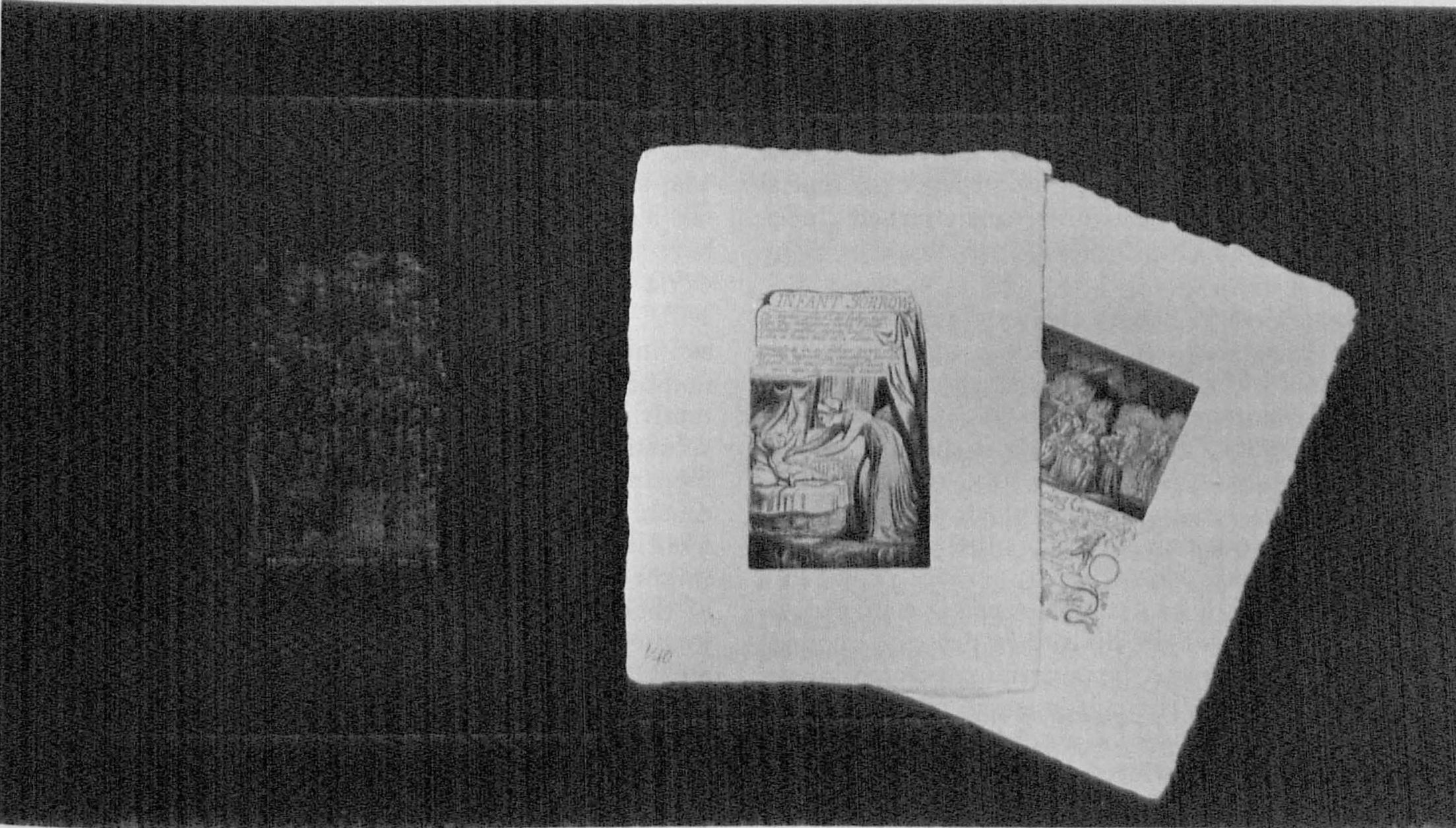
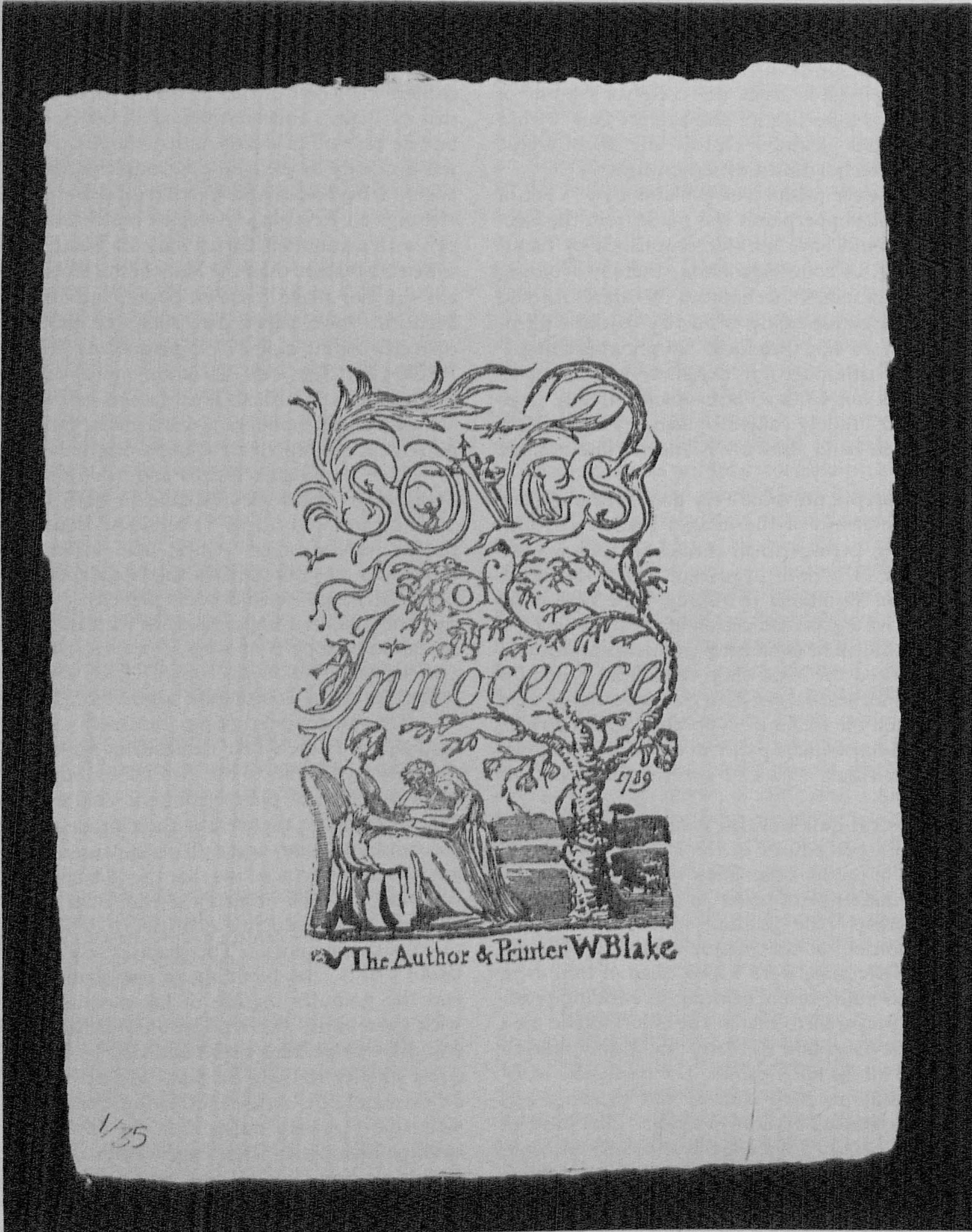
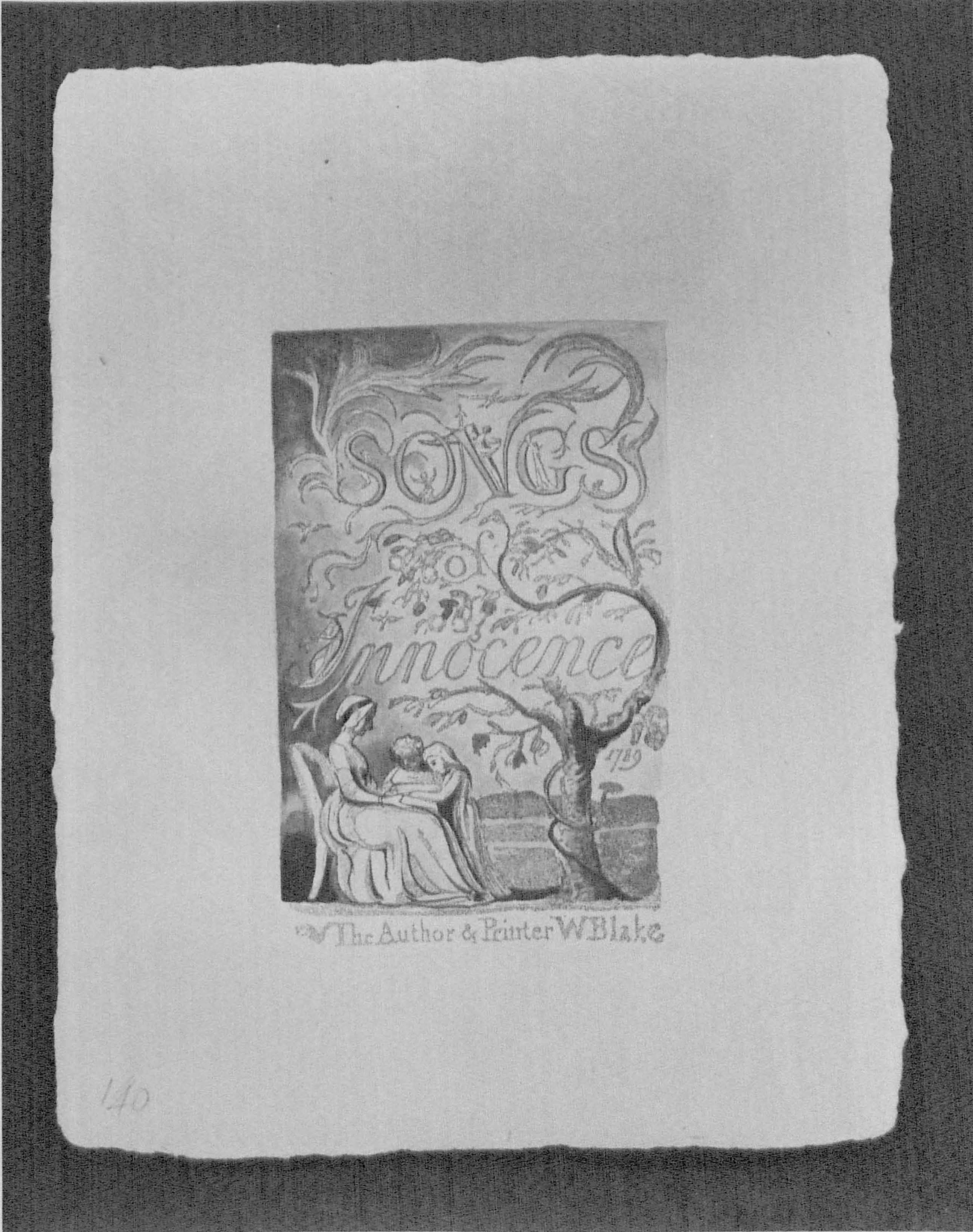
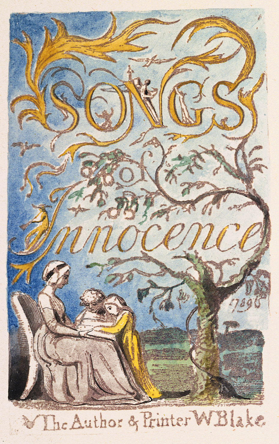
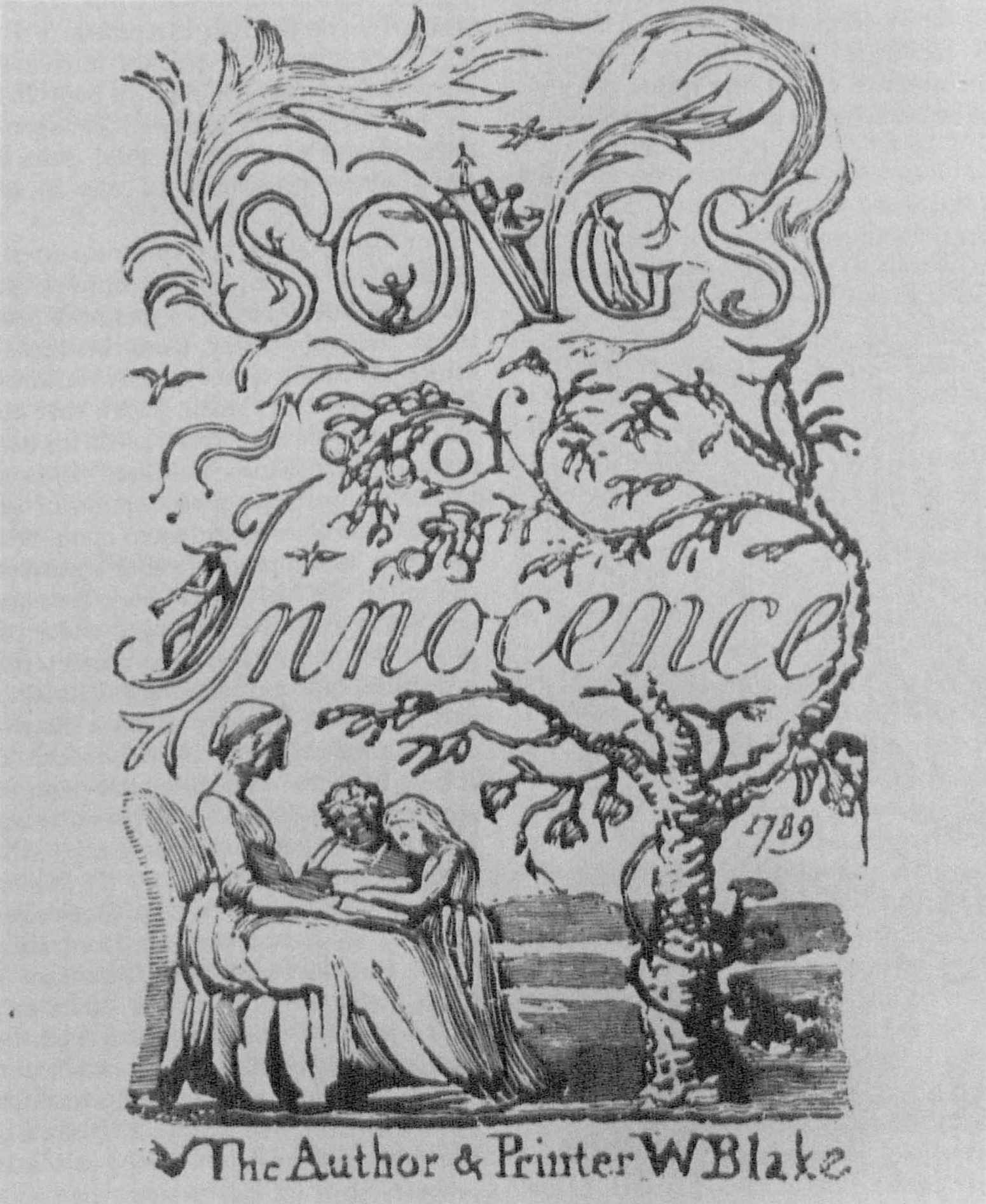
The electrotypes provided very good (although not perfect) representations of the images Blake etched on his plates—better, perhaps, than uncolored copies printed by Blake (Q and BB, both in private American collections) because of variations in inking. The best post-humous pulls give a good indication of the plate images; but perhaps technical or ownership problems prohibited their use, if indeed the Workshop considered that possibility. The minor textual errors in the electrotypes were hand corrected on the facsimile copperplates, 20↤ 20 These variants are listed in Essick, William Blake Printmaker (Princeton: Princeton Univ. Press, 1980), p. 95. and these were printed on hand-made paper in a dull, light brown ink for Innocence (illus. 1) and a golden yellow ink for Experience.
The prospectus indicates that great pains were taken to match Blake’s procedures in the crucial inking and printing stages of production. These were supervised by Paul Ritchie, “master printmaker” at the Etching Workshop and apparently the guiding spirit of the entire project. The borders of the plates, created by Blake’s dike method of etching, were wiped clean of ink, as in Blake’s pre- 1800 pulls, before printing in a rolling press. The inks were prepared to match the colors Blake used in copy B of the Songs and to retain the grainy texture characteristic of all his relief prints. The results are wonderfully successful on both counts, but printing and paper vary from Blake’s typical practices. Like most of the illuminated books, Songs copy B is lightly printed, showing only very slight indentations of the edges of relief plateaus into the paper. The facsimiles show more prominent indentations resulting from less dense paper than Blake’s stock, damper paper, and/or greater printing pressure. I rather doubt that this variation from Blake’s habits was merely an oversight; perhaps it was necessary to achieve a clear, sharp impression with a tacky, granular ink on paper with a mottled, uneven surface. The individual pure rag sheets, approximately 21 × 16.5 cm., were manufactured by the Workshop with an Innocence or EXPERIENCE watermark and Blake’s Night Thoughts monogram embossed into the lower right corner. The color of this facsimile paper is very close to that of Blake’s unwatermarked leaves in Songs copy B, but its texture is clearly much rougher. I wonder if it was necessary to go to all the trouble of making a special paper. I have achieved good results by printing relief etchings on Rives heavy-weight mold-made ivory, a paper with a color similar to most of Blake’s and a much smoother texture than the Manchester stock. Blake, after all, did not make his own paper, but used “the most beautiful wove paper that could be procured,” as he correctly claims in his 1793 prospectus “To the Public.” Perhaps Ritchie and his (anonymous) associates were motivated by the Blake Trust facsimiles, with their special paper and monogram watermark, rather than a requirement prompted by Blake’s originals.
Like the Quaritch/Ellis and Young facsimiles, the Manchester plates are available in both colored (illus. 2) and uncolored (illus. 1) versions. In addition to the sixteen monochrome plates, the latter includes an impression in smooth black ink of the first plate of “The Little Girl Lost” with borders printed. Also present are two hand-colored impressions of the same plate, one in imitation of copy B of Songs of Innocence and of Experience and the other following copy T. Both show all the excellencies of the completely hand-colored issue.
The Manchester group returned to the freehand methods of Blake’s first facsimilists for the coloring of their plates. Thanks to Mr. Ritchie’s kindness in lending me a selection of plates from the colored issue, I was able to compare them with their models in copy B of the combined Songs in the British Museum. This pleasant exercise convinced me that the Manchester facsimiles combine the color accuracy of the Blake Trust volumes with the unreproducible qualities of delicate washes applied without stencils. The shading and transparency of Blake’s tints, the blending of one shade into another, and the granular texture of his medium are captured with great skill. The replication of Blake’s delicate pen and ink—or perhaps brush and ink21↤ 21 Much of what has generally been called pen-and-ink work in Blake’s watercolor drawings and prints may have been executed with a small, pointed brush, called a “pencil” in the eighteenth and early nineteenth centuries. This possibility was suggested to me by Ruth Fine, Curator of the Rosenwald Collection at the National Gallery of Art and an artist in her own right. —outlining shows equal fidelity to copy B. Blake applied his colors with an extremely dry brush, following the old tradition of watercolor drawing rather than the newer art of watercolor painting with large, wet washes allowed to spread over the paper. Unlike Laing and Hurd, the Manchester artisans do not appear to have been burdened with the conventions of commercial print colorists and could respond directly to these important characteristics of Blake’s prints. Even the maculated textures in some of the Experience plates of copy B are well represented. These were created in the facsimile by applying washes while the begin page 44 | ↑ back to top
[View this object in the William Blake Archive]
There are of course differences between copy B and the facsimile. The colors are not identical in every case, the pen and ink lines swell or narrow in slightly different ways, and margins of some washes do not correspond exactly to the original.22↤ 22 A few examples of differences in coloring follow: Innocence title-page. Blue between legs of piper in I of Innocence not in facsimile (see illus. 2 and 3). Perhaps one of the few cases in which the variation resulted from an oversight rather than the limitations of hand coloring as a reproductive technique. “On Anothers Sorrow.” Dark olive green in lower right corner becomes dark brown in facsimile. Experience title-page. Shadow over lower legs of prone figures little too purple in facsimile. Slight differences in location of dark colors, lower right. “The Human Abstract.” Black below figure more maculated in original. “Infant Sorrow.” Very thin, pale ivory wash upper left not in facsimile. Mottled texture on floor along lower margin and left of woman becomes fuzzy or continuous wash in facsimile. “The Little Girl Lost,” first plate. The subtlety of Blake’s tones here defeats any facsimile process. Tone of peach color left of girl’s left hip too deep, bold in facsimile. In facsimile of copy T included in “Monochrome Edition,” framing lines not quite orange enough. “The Little Girl Found,” second plate. Brush-stroke pattern of blue above base of tendril, lower left, varies from original in placement. Pen and ink outlining sharper, narrower in facsimile (see note 21 for a possible reason for this difference). “My Pretty Rose Tree.” Shadow lower left corner becomes part of vegetation in facsimile. Broad line (wash applied with a brush?) on right outline of bowed figure’s head rendered as narrow pen and ink line in facsimile. “Ah! Sun-Flower.” Reticulated olive left and below title too smooth, light, and green in facsimile. Complete halftones of Songs copy B appear in David Bindman, The Complete Graphic Works of William Blake (London: Thames and Hudson, 1978), pls. 214-68. A color microfilm, with poor color fidelity, was produced by Micro Methods Ltd. some years ago. Cataloguing these minor variants would serve little purpose, for we cannot expect any hand-made facsimile to match an illuminated book brush-stroke by brush-stroke, reticulation by reticulation, begin page 48 | ↑ back to top and magically convert similitude into identity.
A more significant family of variants is an inevitable result of the chosen mode of production. The Manchester Songs is a composite facsimile in the sense that the printed images were taken from one source (the electrotypes) and the coloring from another (copy B). The printed images in copy B differ—like every illuminated book—from the etched images on Blake’s copperplates (once again because of inking and printing variations) and hence from the electrotype images. Consider, for example, the descending tendril or leaf printed immediately to the right of “1789” on the Innocence title-page in Songs copy B (illus. 3). This motif does not appear in either the colored facsimile (illus. 2) or the uncolored issue (illus. 1). The absence is not the result of carelessness or a flaw in the Manchester group’s photography,
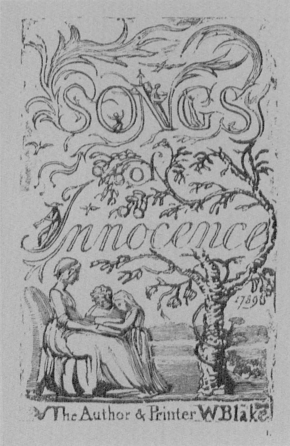
Clearly, there are some features of Songs copy B revealed by a simple monochrome reproduction in a magazine but missed by a facsimile produced with enormous care and artistry. Does this mean that the Manchester publication is an expensive failure? Not in the least. We are, however, made aware that this new facsimile shares some generic traits with its hand-crafted predecessors. Like Muir’s volumes, it is a recreation of a process as well as a reproduction of images; as much a new edition of an illuminated book, with its own unique qualities, as a reproduction of an existing copy. Like all facsimiles, the Manchester Songs does not escape a graphic equivalent of the Heisenberg effect: the closer the reproduction approaches one characteristic of Blake’s illuminated books, the more it distorts another. Yet some variants are of the very sort we discover by comparing one original impression with another. The leaf or tendril absent from the facsimile title-page of Innocence barely appears in Innocence copy S, prints as only two tiny fragments in the combined Songs copy AA, and disappears completely in Innocence copy U. We are brought to an odd but fortuitous reversal of Heisenberg’s principle: by differing in certain respects from its prototype, a facsimile can draw closer to important characteristics of Blake’s media—in this case, variation itself.
Viscomi’s essay, included with both issues of the Manchester facsimile, is an important step in the recovery of Blake’s relief-etching technology. He also has some fine things to say about Blake’s changing conceptions of an illuminated book; as Viscomi phrases it, a progression from books with the “print-as-page” to an emphasis on the individual “print-as-painting.” The author is also a skilled graphic artist, and thus a practical perspective, oriented toward process and materials, comes naturally to him. He rightly avoids making Blake more innovative than necessary. Much of the appeal of relief begin page 49 | ↑ back to top etching for the artist using it depends on the direct, straightforward nature of the process. Blake’s training in reproductive etching and engraving was an essential prelude to his graphic experiments, but these resulted in simplifications of conventional techniques. (If anyone doubts this, just try engraving and inking an intaglio plate.) In accord with this general approach to the subject, Viscomi comes down firmly on the side of those who believe that Blake wrote his texts backwards on the copperplates. Scholars still holding out for a transfer method will have to come up with some new arguments or evidence if the debate is to continue.25↤ 25 In William Blake Printmaker, p. 90, I argued for reverse writing directly on the plate, but allowed for the possibility that Blake might have transferred his texts to the plates in chalk or pencil by one of the conventional methods before working over the letters in acid-resist. I now think that even this type of transfer is highly unlikely. As Viscomi notes, a chalk or pencil residue on the copper would have inhibited the firm bond between metal and resist essential for etching.
While many of Viscomi’s studio experiments and readings in eighteenth-century engraving manuals reconfirm recently published studies of Blake’s techniques, at least in general outline, he does contribute several important insights. He finds that the infrequency of platemakers’ marks in Songs of Experience indicates that Blake cut his own plates (at least the smaller ones) to size rather than buying them already cut, in which case each plate would bear a mark on its back. Viscomi assembles several good arguments for Blake’s use of a simple-solution varnish to paint and draw images on the copper. The older tallow-and-oil solutions do not harden enough to permit the fine white-line work found even in Blake’s earliest relief prints. The arguments for Blake’s use of a pen, rather than brush, to write in acid-resist are slightly less convincing, but certainly worthy of careful consideration in future studies of the calligraphy of the illuminated books.
Viscomi suggests that Blake’s mordant was nitric acid, not one of the weaker sorts of vinegar-based acids buffered with a salt. He claims that Blake needed a “strong acid” for a “long bite” (p. 3) since the plates “had to be bitten deeply” (p. 10). This may be true for some of the earlier relief plates, but the only direct evidence we have about Blake’s depth of bite—the America copperplate fragment—and the indirect evidence of foul inking of whites indicate a very shallow etch. Further, the weaker acids produce relief edges that are less striated or pitted than edges bitten with nitric. The America fragment shows similarly smooth escarpments around relief plateaus. A serious problem in relief work is lifting of the ground around small relief areas, such as letters, during etching. An acid that deposits a salt as it reacts with the metal causes less lifting than one that generates bubbles of gas, as does nitric. Viscomi allows for the possibility that Blake diluted nitric acid with “oil of vitriol (sulfuric acid)” and considerable amounts of water. This would produce, in effect, a weaker acid, possibly with biting characteristics very close to the vinegar-based mordants. The present balance of evidence renders the Scottish verdict of “not proven” appropriate in the case of Blake’s acid. The microscopic comparison of the America fragment with plates bitten by various solutions may offer a better verdict. And Viscomi is the right person to make such experiments.
Perhaps Viscomi’s most interesting contribution is his statement that Blake used intaglio ink to print his relief plates. This is the sort of proposal that seems so right at first glance that one wonders why it had never been made before. Intaglio ink is much thicker than relief inks, used for type or woodcut printing, and produces, even when printed on dampened paper, the reticulated surfaces so characteristic of Blake’s impressions. The textural excellence of the Manchester facsimiles, printed with intaglio ink, as well as my own experiments prompted by Viscomi’s essay, convince me that he has discovered an important fact about Blake’s techniques.
The appearance of a first-rate scholarly essay as part of a high-quality facsimile publication calls to mind the relationship between these two types of endeavors. The activities necessary for producing a facsimile can themselves lead to insights about the originals. In a footnote, Viscomi mentions that Paul Ritchie came upon his wet-ink method of creating reticulated colors by studying the mottled black areas of “Infant Sorrow” and “London” in Songs copy B. He found that they lie on top of ink-printed surfaces, and thus could not have been printed in the same pull with the basic ink image. Indeed, Blake himself may have applied washes over wet impressions to produce small areas of reticulated textures generally assumed to be definitive evidence of color printing.26↤ 26 Besides washing over wet ink, other alternatives to color printing productive of similar effects are printing size-colors over ink with a second pull through the press (although this seems very unlikely in copy B) and blotting size-colors first applied directly on the impression with a brush. Further, the scholar need not limit his use or evaluation of facsimiles only to their utility as (ultimately unsatisfactory) substitutes for the originals. They can remind us of the inherent differences among media and the importance of the physical properties of an image in the production of meaning. The relationship between a facsimile and its prototype involves us in the same complex issues of identity and difference, production and reproduction, we encounter in the study of “different” copies of the “same” illuminated book. Like Blake’s illustrations to other poets’ texts, facsimiles are visual commentaries on the works they reproduce. Like other critics, they offer intriguing combinations of truth and error, insight and blindness, sometimes calling into question what we mean by each term in such polarities. The history of facsimiles of the illuminated books is an integral part of the more general history of Blake criticism.
A financial end-note is called for by the price of the Manchester facsimiles, enough to give pause to even the wealthiest rare book librarian. Someone building a comprehensive collection of Blake facsimiles must of course acquire copies of both issues. Less ambitious collectors or institutions concentrating on books for scholars and students could do without the “Monochrome Edition,” although that means missing the lovely facsimile of the first plate of “The Little Girl Lost” from copy T, not included in the colored issue. Monochrome begin page 50 | ↑ back to top impressions of the original electrotypes (as distinct from the Manchester group’s relief-etched facsimiles of impressions from electrotypes of the original electrotypes mold-made from Blake’s plates) are available in Gilchrist’s Life of Blake, 1863 and 1880. Acceptable copies of Gilchrist are still available on the antiquarian book market for less than $450. The “Facsimile Edition” is a far more important work. I have emphasized here its slight variations from the original to exemplify some general observations on media and the replication of images—not to dissuade potential purchasers. The Manchester colored issue is in many ways one of the most accurate facsimiles ever published and beyond question the most accurate hand-colored reproduction of plates from an illuminated book. To my eyes, it is also one of the two or three most beautiful facsimiles when considered as a work of graphic art independent of its relationship to its prototype. These exceptional qualities justify its considerable cost. Some money can be saved by opting for the issue without the full-leather portfolio which, with its three covers, rounded hinges, dark brown leaves, and tip-in mounts, reminds me of an old family photo album. The gold-stamped decorations—the Innocence title page on the front cover, Experience on the inner cover—are well done, but a bit over-done for my tastes. When Viscomi’s pamphlet is inserted in the pocket apparently provided for that purpose, the portfolio is a little too thick to permit closing completely its nicely restrained, cloth-covered box. Two hundred copies of the pamphlet were printed, which I hope means that some copies will be distributed independent of the Manchester volumes. It deserves a wider audience than the seventy-five lucky owners of the facsimiles and should be read by anyone interested in the art and craft of Blake’s illuminated books.