
review
begin page 132 | ↑ back to topThe Notebook of William Blake, a Photographic and Typographic Facsimile. Edited by David V. Erdman. with the assistance of Donald K. Moore. Clarendon Press, 1973. Pp. xiii + 105 + 120 plates + 120 pages of transcription. £16.00 U.K., $45.00 U.S.A.
All previous editions of Blake’s Notebook, including Keynes’ 1935 printing with a photographic facsimile, have been reading texts with the manuscript analyzed into its constituent works and fragments. As its sub-title indicates, this new edition is a photographic facsimile with a typographic transcription following the original with great fidelity. As such, it commands scrutiny by serious students of Blake. But interest in this book should go beyond the circle of Blakeans, for the labors of Erdman, Moore, and the Clarendon Press have resulted in a great work of textual scholarship and a masterpiece of the typographer’s art. In this case, the study of Blake is in the very forefront of literary scholarship.
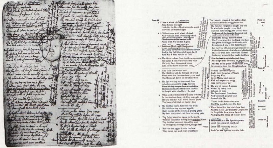
The most striking characteristic of the book is its typography, exemplified by the page reproduced here [illus. 1]. At first it can be disconcerting, particularly in those pages towards the end of the Notebook printed upside-down, but a comparison with the facing-page photographs soon reveals the utility of this new species, the “typographic facsimile.” As far as I am aware, all earlier facsimile transcriptions of a difficult manuscript have had to rely on a complex series of signs and symbols to indicate erasures, deletions, palimpsests, and so forth. The results were often clumsy and looked nothing like the original. In this volume the typography bears a direct relationship to the appearance of the manuscript itself. When Blake wrote a note vertically in the margin, it appears in the same place and direction in the transcription. When he erased a line which is still visible under close inspection, it is printed with an overlaying screen to indicate the erasure. Even lines and carets are preserved by the typography, as the reproduction shows. Stages of revision are indicated through reduced type sizes, while italics indicate pencil writing. The system is simple, efficient, and visually pleasing—all of which belies what must have been an enormous amount of work for Donald Moore, whose “professionalism at the composing machine” is acknowledged in the Preface. This facsimile transcription includes some minor corrections of Erdman’s earlier text and thus must be considered the standard edition, at least until Erdman can include the new readings in begin page 133 | ↑ back to top a revised edition of The Poetry and Prose of Blake.
Thanks to the generosity of David Erdman, I was allowed to compare a selection of his facsimile proofs with the original manuscript in the British Museum. Blake’s Notebook is no longer generally available to ticket holders because of its fragile condition and the publication of this new edition. The comparison convinced me that the British Museum is justified in believing that the reproductions accompanying Erdman’s text can effectively replace the original for almost all scholarly requirements. In the pages checked I could find only one feature in the Notebook not visible in the facsimile—the partially erased number “27” below the drawing on page 49. But of course this number is duly recorded in Erdman’s transcription, so the problem is negligible. The facsimile was made before new leaf numbers were added by the Department of Manuscripts to the original, but these serve no real purpose and their absence here is not to be regretted. Infra-red photography, used on 75 of the Notebook’s 120 pages, brings up to the threshold of vision fine lines of text and design not recorded by regular photography, but it does cause some distortion. Infra-red “sees” not only what is on the surface but also the dust imbedded in the paper. Thus on page 64 the chain lines in the paper and the countermark are clearly visible, much more so than in the original or in the fine standard photographic facsimile kept with the original in the British Museum. Infra-red also distorts the relative darkness of pencil and ink. On page 50 the photograph brings out the erasures in the text, but makes the pencil drawing much darker than it actually is. Smudges and off-setting from facing pages are also magnified by infra-red, as in the design on page 51. On page 59, “Prints” in the penultimate line is clearer in the original, or in a standard photograph, than in the facsimile because infra-red has increased the darkness and opacity of the lines of deletion. On the other hand, infra-red can make very slight sketches more visible than in the original itself; for example, the vague pencil lines in the lower third of page 55 not mentioned by Erdman in his notes. Both standard photography and infra-red record the shadow of the facing page along inner margins (page 55), and shadows from the clips used to hold down the pages (lower left margin of page 52 and lower left corner of page 54). All and all the original is somewhat cleaner than the facsimile would suggest, but this is primarily an aesthetic rather than a textual distortion and should cause no difficulty as long as one remembers the limitations (as well as the virtues) of infra-red photography.
In his introductory essay, Erdman establishes the original order of the Notebook’s pages based on the first genuinely thorough examination of the manuscript as a physical object. Every detail, including the position of mould and felt sides of the paper, has been recorded in the introduction and
The presentation—one might almost say discovery—of a series of 64 emblems in the Notebook will be for many readers the most exciting and useful section of introductory material in this edition. Erdman has deduced that the emblems actually comprise four interwoven series, all but the first identified by numbered sequences. Not only are these emblems important in themselves and as the immediate source for The Gates of Paradise, but they are also crucial as preliminary sketches for many designs later used in the illuminated books. We can now see Blake’s creative processes as a pictorial artist more clearly than ever before. One can further sense here an underlying continuum between Blake’s works as a poet, draughtsman, intaglio engraver, and relief etcher; and between his interests in the Bible, English history, Shakespeare, Milton, emblem books, and his own developing mythologies. Below are a few additions and corrections to Erdman’s catalogue of the emblems, pages 15-31 of the introduction.
Emblem 3 (Notebook p. 16). The cross-reference should be to Appendix II, Fig. 1, not Fig. 3, and thus to a detail rather than a tracing of the sketch.
Notebook p. 20. Erdman does not include this Job sketch among the emblem series because it is on a verso and its “symbolism of gesture seems more highly symmetrical and ‘coded’ than in the emblems of 1793 and earlier” (p. 17). However, other emblems are on verso pages, and the sketch is about the same size and style as other emblems. I’m not sure what “coded” symbolism is, but the most dramatic gestures are the hand positions, and they are of the same general type as the gestures in emblems 2, 5, and 9. Erdman also associates this Job sketch with the late Job series rather than the early drawing and separate plate, but in William Blake’s Illustrations to the Book of Job, Bo Lindberg argues convincingly that this Notebook sketch is “obviously the first study for the engraving Job of August 1793” (p. 11) and includes it in the emblem series.
Emblem 6 (Notebook p. 22). The very useful Appendix II includes detail photographs and tracings of the more obscure drawings. Many of these, including both a detail (Fig. 2) and a tracing (Fig. 3) of emblem 6, are not cross-referenced in the catalogue.
Emblem 7 (Notebook p. 23). The reference should be to Appendix II, Fig. 40, not Fig. 38.
Emblem 10 (Notebook p. 27). An illuminating comparison can be made between this design and the two versions of “A Breach in a City” (which Erdman compares to emblem 11) and the very similar but later “War” in the Fogg Museum. Certainly the subjects are basically the same, as Erdman’s conjectural title (“War”) for the emblem allows. The right side of all four compositions are alike—a building or wall of some sort, with two figures standing before it gazing on one or more prone figures. The right side similarities are more obvious, but to my eye no more real, than those on the left—a broken wall, a group of corpses before or within the break (the emblem is particularly similar to “War” in this respect) a small figure seen in the distance through the break and walking to the left, and an eagle at the far left perched on the wall. The eagle’s beak and left wing are particularly clear in the emblem, and in the same position as the three watercolors. This arrangement at least seems more likely than Erdman’s “lightning strikes the neck of a woman whose slippered leg is extended at left” (caption to Notebook, p. 27). A leg of such dimensions would be twice the size of the other figures at an equal distance from the viewer.
Emblem 13 (Notebook p. 31). The figure does not appear to be descending towards us as Erdman notes, but rather rising through a celestial doorway to be greeted by two, perhaps three, other figures. Note the bottom of the central figure’s left foot, a sure sign that he is moving inward; and his arm position indicating that we are seeing his elbow from behind, as in emblem 2 (Notebook p. 17). Emblem 13 can then be seen as a companion, and antithesis, to emblem 2 where the traveller finds Death waiting at an earthly doorway.
Emblem 14 (Notebook p. 33). The object lower right is too small for an adult’s coffin, and its trapezoidal left side is a very odd shape for any coffin. Perhaps it is a cradle or basket for the babe in the woman’s arms.
Emblem 20 (Notebook p. 40). A reference should be included in this list of emblems, p. 20, to Gillray’s print showing a ladder reaching to the moon, Appendix II, Fig. 38.
Emblem 31 (Notebook p. 52). This picture of an old man clipping a youth’s wings is a variation on the traditional emblem of Time clipping the wings of Love. See for example Otto van Veen’s Amorum Emblemata (Antwerp, 1608), p. 236.
Emblem 40 (Notebook p. 61). The design, used for The Gates of Paradise, plate 13, is very similar to “The Spirit of a Just Man Newly Departed Appearing to his Mourning Family,” an early wash drawing now in the Royal Library, Windsor.
Emblem 50 (Notebook p. 77). As Erdman points out begin page 135 | ↑ back to top in his caption beneath the facsimile page, the sketch below the emblem shows an “insouciant infant, not flat on his back as the ones in America 9 or Europe 6.” A similar child, however, does appear in the Night Thoughts engravings, Night II, p. 23, with his legs crossed as in the Notebook sketch but with both arms thrown above his head. Curiously, the Night Thoughts watercolor is very different, showing only the back of the child. Perhaps the memory of this sketch, or even a chance return to it while using the Notebook for other purposes, stimulated Blake to revise his Night Thoughts design.
Emblem 59 (Notebook p. 93). The footnote, p. 29, should appear with emblem 29, p. 22, where Erdman first refers to the recto-verso group of sketches at Harvard described in the note. In June 1973 Erdman learned that the Harvard sketches were not by Blake, but rather copies of Night Thoughts designs made by D. G. Rossetti. Unfortunately the text could not be altered at that late date, but the situation is described in an erratum, p. 105.
Throughout the introductory materials Erdman wears his scholarship lightly. The prose is always direct and lively, never labored or pedantic; some may even find the interpretive sections on the emblem series rather too breezy. Textual scholarship flows gently into criticism. Perhaps at times too gently, for the reader must be careful not to confuse critical speculation, however well-informed and convincing, with the factual record. Certainly some of the narrative structures Erdman finds in the emblem series are open to alternative interpretations. In The Gates of Paradise the “elemental” designs, plates 2-5, represent eternally existing states rather than stages in a linear narrative, and very likely other Notebook emblems are equally non-sequential in their relationships with other emblems. Is Blake constructing an anthology of designs, as in a typical Renaissance emblem book, or a Hogarthian progress?
The least successful portions of the introductory material are Erdman’s excursions into art history. A few paragraphs, pp. 10-11, are devoted to the list of twenty topics, p. 116 of the Notebook, for designs on the history of England. Erdman worries over the fact that only a few drawings in the Notebook can be identified with these topics; but the presence of the list does not indicate that the drawings must also be there, any more than the text of a poem in the Notebook means that its illustrations must be present. Erdman refers to four drawings from the British history series of 1779-80, but does not mention the five other compositions in this group, at least two of which are on topics listed in the Notebook. Erdman calls these “paintings,” but they are drawings with some water colors added—very likely preliminaries for a series of prints which finally matured into “The History of England, a small book of Engravings” Blake advertised in his Prospectus of 10 October 1793. The Notebook list probably represents an intermediate stage between a group of separate drawings (the 1779-80 series plus others) and the engraved book, a trial table of contents rather than a list of works actually in the Notebook. Erdman’s comments should be read in conjunction with David Bindman’s fine essay, “Blake’s ‘Gothicised Imagination’ and the History of England” in the festschrift for Geoffrey Keynes edited by Paley and Phillips.
Erdman’s discoveries of supposed sources for Blake’s designs are less convincing than his bibliographic scholarship. He compares the sketch of a man and woman in a bedroom in the Notebook, p. 14, to Gillray’s “The Morning after Marriage,” and uses the parallel to date Blake’s sketch after 5 April 1788 when the print was published. But the only similarity here is in the general situation and the fact that one of the figures in each work is putting on stockings (the man in Blake, the woman in Gillray). The position and posture of the figures is very different, as are the beds and other objects in the room. In particular, the traditional posture of male sexual fatigue central to the print’s humor is not found in Blake’s sketch. It is convenient to have a dated source, but one can sense here a spontaneity and concern for three-dimensional realism characteristic of portrayals of actual events that sets this sketch off from the flat, iconic emblems on contiguous pages.
Equally disconcerting are Erdman’s association of Blake’s traveller in the Notebook, pp. 15-17, with Stothard’s illustrations to Pilgrim’s Progress and the suggestion that Blake might have “helped his recent collaborator with some of these designs” (p. 9). The visual parallels between Blake’s sketches and the prints after Stothard (one is reproduced in Appendix II) rest solely with the similar hat and staff and with the fact that in the emblem on Notebook p. 71 the old man entering the tomb uses a crutch as does Stothard’s pilgrim when approaching the grave. That Blake’s traveller evolved out of the iconographic traditions of Bunyan illustration is a good point, but the pictorial evidence is not sufficient to specify Stothard as the immediate source. It is even more unlikely that Blake could have influenced Stothard. Indeed, the edition of Pilgrim’s Progress published by Hogg in 17781↤ 1 Bunyan, The Pilgrim’s Progress (London: Alexander Hogg, 1778), plates facing pp. 4, 16, and 48. has plates with Christian similarly adorned with broad-brimmed hat and walking stick. The crude woodcuts in an edition of 17912↤ 2 Bunyan, The Pilgrim’s Progress (London: Millar, Law, and Cater, 1791), woodcuts on pp. 13, 25, 36, and 42 (Christian approaching Castle Beautiful). contain these same motifs, and in the illustration of Christian’s approach to the lions before Castle Beautiful he has his hand raised and fingers spread out as in the Notebook sketch, p. 17. My point here is not to add more specific sources to Erdman’s, but rather to indicate that the pilgrim’s hat and staff are part of the eighteenth-century artists’ stock-in-trade for Bunyan illustrations. The switch from staff to crutch is clear in Stothard, but less distinctive in Blake since the traveller on Notebook begin page 136 | ↑ back to top pp. 15-17 may not be the same character as the old man at the grave many pages later. Further, crutches are a traditional—and rather obvious—emblem for old age (see for example Geffrey Whitney’s A Choice of Emblemes [Leyden, 1586], p. 167), and the fact that two late eighteenth-century artists used this motif is insufficient evidence to indicate that one is borrowing from the other. After looking at Blake’s designs for a few years it is easy to see his sources or influences everywhere, viewing all art through Blake-colored glasses. It would be wrong to restrain the fun of discovering such parallels, but source hunting should be guided by a wider sense of the pictorial traditions that shape late eighteenth-century art.
No reviewer of this book should end on a negative note. It is a splendid production for which all should thank Erdman, Moore, and the Clarendon. Its very presence contributes to, in a way silently comments upon, several trends in Blake studies. The recent predominance of scholarship over interpretation is strengthened, for no more than a few of the critical articles and books written in the last ten years will have the permanent value of the Concordance, Bentley’s Blake Records, the Blake Trust facsimiles, or this edition of the Notebook. Erdman’s insistence on giving equal attention to the Notebook as an artist’s sketchbook as well as an author’s manuscript once again asserts the interdependence of word and picture in Blake’s life and work. I suspect that little of any real importance will be produced on Blake in the future which does not take into account both media. The author of a survey of Blake’s reactions to nature published in a recent issue of PMLA3↤ 3 Barbara F. Lefcowitz, “Blake and the Natural World,” PMLA, 89 (1974), 121-31. commented upon two approaches to Blake, the chronological and the thematic, and chose the latter. It is a bad selection. We will come to know more about the how and why of Blake’s eternal forms only when we see them evolving as productions of time. The grand continuity of Blake’s vision is not stasis; rather, it is evolution within a framework of personal development and historical change. The Clarendon edition of the Notebook will offer many insights into that process of creation for years to come.