article
begin page 4 | ↑ back to topRecreating Blake’s Illuminated Prints: The Facsimiles of the Manchester Etching Workshop
Robert Essick’s review in this issue of the Blake facsimiles recently published by the Manchester Etching Workshop, with its “thumbnail history of hand-colored facsimiles” and insightful comments about the place of facsimiles in Blake studies, is characteristically complete. It leaves nothing for me to say about these new, beautiful prints except what Essick could not have known: their origin and evolution and a few details about their production. The history of the Workshop’s facsimiles is not especially complex or long—or not, at least, when their three years of preparation and printing are compared to Samuel Hurd’s eight and a half years of work on the Young & Sons 1923 facsimile of Songs (T)—but it is curious, the project actually beginning more by chance than design. And I think the mode of production is also worth recording in some detail, not because it is so simple and straightforward, and, as Essick points out (and as the notes to the present article hopefully show), because “the activities necessary for producing a facsimile can themselves lead to insights about the originals.”
The Manchester Etching Workshop, located on the top floor of a Victorian clothes warehouse in a now unfashionable area of Manchester, England, was set up in 1978 by Paul Ritchie with some assistance from the Arts Council of Great Britain. Formerly of Peacock Printmakers, Aberdeen, Scotland, Ritchie studied advanced printmaking at the Manchester Polytechnic and Croyden College of Art, and since 1977 has exhibited widely throughout Great Britain, with one-man shows in Aberdeen and Amsterdam, and with works in many public collections, including the Victoria and Albert Museum and the Scottish National Gallery of Modern Art. His most recent sets of etchings, produced in small editions, are concerned mainly with landscapes and interiors, with color used in the manner of monoprints; unlike Blake’s, these plates are very large and lightly etched, allowing the coloring, wiping, and plate tones to be flexible and thereby—as in Blake’s prints—critical to each separate impression. To execute such large but subtle prints, and to employ fully the creative possibilities of continually and radically reworking plates, in the metal, the inking, and the interaction of ink with paper, it was necessary for Ritchie not only to have his own workspace, but also to design and build his own presses and papermaking equipment.
Though built to answer the specific needs of one graphic artist, the Manchester Etching Workshop supported itself at first by renting its studio space and equipment to other artists and printmakers. It became financially self-sufficient when Ritchie, with the help of up to a dozen parttime assistants (printers, colorists, papermakers), produced three portfolios of etchings, two by Philip Snow, a contemporary artist, each consisting of six bird colorprints, and one by Alfred Coffrey, the late Australian etcher. The Blake portfolio, as Ritchie recalls, “rather happened and grew instead of being planned. I had attended a printmaking conference at Bradford, and after the conference, over a British Rail cheese sandwich at the station, met a curator of prints at the Victoria & Albert Museum. I later wrote to her asking if they were interested in a joint publication project using any plates they might have. They agreed to let me borrow some plates, amongst which were the Blake electrotypes.”1↤ 1 Private correspondence.
For reasons more practical than aesthetic, Ritchie decided to print the electrotypes. Because they are in relief, electrotypes are easier to ink and thus take less time to print in large editions than intaglio plates. At first, Ritchie intended to print 500 sets of monochrome impressions on moldmade commercial paper. The initial proofs, however, printed in black relief ink, were disappointingly stark in comparison to original illuminated prints, resembling more closely the impressions printed by Fredrick Tatham in the 1830’s than any printed by Blake.2↤ 2 Though electrotype and posthumous prints convey the same information, they are easy to distinguish: posthumous prints were usually printed in reddish brown ink and are very noticeably embossed, because they were printed on a rolling press with too much pressure. Electrotypes, like process blocks and type, tend to be flat because they are printed in common platen presses. Like the posthumous prints, these uncolored begin page 5 | ↑ back to top proofs recorded the entire plate image, that is, they showed everything Blake drew on the plate in his “impervious liquid,” as well as the thin borders inadvertently caused by the strips of (acid resistant) wax that were used to dike the plate for acid. The borders, though part of the relief line system, are not part of the printed image (except in late impressions), because Blake wiped them clean of ink before printing the plate. Blake not only deleted portions of the plate image, but also used colored inks and off-white wove paper, and he washed the printed image. Thus Blake’s own impressions actually convey less information about the appearance of plates than do electrotype proofs—which, however, like posthumous prints, give an inaccurate idea of the appearance of illuminated prints.
Blake’s printing process did not end with inking the plate and pulling it through the press—and neither could Ritchie’s. The initial set of proofs, showing too much, but telling too little, quickly revealed that electrotypes could be printed in imitation of illuminated prints only if the paper matched Blake’s in color and receptivity, the ink matched in color and texture, and the impressions were hand painted in water colors. In short, as Ritchie came to appreciate fully the beauty and subtlety of the originals, and, as with his own lightly etched plates, the importance of careful inking and wiping, the electrotypes became anything but easy to print—and the projected edition anything but a one-man job. In addition to requiring a substantially larger bank loan for start-up costs, a facsimile, as opposed to a monochrome, edition would require more time, energy, and artistic help than originally envisaged. The “Manchester Group,” as Essick refers to all of us involved, consisted primarily of Kate Donnelly, who made most of the paper and assisted Ritchie with the printing, Guy Tucker, Jacqueline Marshall, and Paul Taggart, the principal colorists, Paul Heskell at Dorset Bookbinding Company, who made the leather portfolios and cloth-covered conservation boxes, and hand sewed the introductory booklet, and I, who, as technical adviser, wrote the introduction and helped to design the format of the two different editions.3↤ 3 Guy Tucker, an artist and art lecturer at the Manchester Art College, was the colorists’ supervisor and executed the general water color finishing and most of the fine pen line work; Jacqueline Marshall is a textile designer and artist who teaches part time at Stockport Art College; and Paul Taggart is an artist and parttime lecturer, Salford Art College, Manchester, and other colleges in the Manchester area. Others who worked on the coloring to a lesser extent are Colin Rispin, artist/illustrator, Manchester Art College; Andrea Hill, textile designer and lecturer, Stockport Art College; Penny Roberts, textile designer; Christopher Tipping, artist printmaker; Glenda Berg, an English teacher and art lover. The prospectus and booklet, The Art of William Blake’s Illuminated Prints, were designed by Karen Meneghin and set by Mark Decker, both of Gladiola Press, New York, N.Y.
Songs, copy B, an early copy in the British Museum, was chosen as the model because of its delicate washes and accessibility. We came to realize from the subsequent sets of hand colored working proofs in imitation of copy B that the more we incorporated authentic eighteenth-century materials and techniques in the inking and painting stages of the process, the more authentic looking were the facsimiles. For us, reproducing Blake’s illuminated prints came to mean reproducing Blake’s illuminated printing process. But before we could even begin the facsimile-making process, let alone fine tune it, we needed plates that could be handled and printed in the same manner as Blake’s—which ruled out using the very electrotype blocks upon which was based the whole idea of a fine limited edition of Blake facsimiles.
The sixteen electrotypes made by Clay & Son for Gilchrist’s Life of Blake (1863) were cast from ten of Blake’s copper plates, at least six of which were etched on both sides, and mounted type high (.918″) for relief printing.4↤ 4 Life of William Blake (London: Macmillan, 1863), II, 267. The Victoria & Albert set of electrotypes were cast from the original set, now lost, and are also type high and lead based. Their height makes the borders of the blocks more difficult to hand wipe and the blocks themselves far more difficult to print on a rolling press (the kind of press Blake used) than the original relief etchings, which were approximately 1/16″, the standard thickness of a copper plate. Technically, it is possible to print type-high blocks on a rolling press, but only if the rollers are fully raised, which, because it is not the way the press is designed to work, prevents full control over the plate and thus over the quality of the impression. To obtain the control necessary to recreate the tactile qualities of the originals, we needed to print sixteen-gauge relief etchings, not type-high electrotypes. Thus, instead of using the electrotypes to print the impressions for the edition, we used them to print a set of embossed proofs, which were then photographed to make the relief etched copper plates.
The proofs were printed in a black proofing ink on an extremely soft, unsized paper made by Kate Donnelly and Paul Ritchie from “free stuff” (as opposed to “wet stuff,” which produces parchment-like paper). This super-receptive paper picked up virtually all detail, and because it was soft enough to be printed dry, it eliminated the slight distortion in image size normally caused by shrinkage, thereby ensuring that the printed images were the exact size of the plate images. The photographic transparencies were shot directly from these impressions using a large-plate camera, which produced same-size negatives. These same-size negatives were then placed directly onto the sensitized copper plates and printed in reverse so the image is backwards. This contact method eliminates the slight elongation of image that occurs when the image is projected through a camera lens, as in the Trianon’s collotype process.
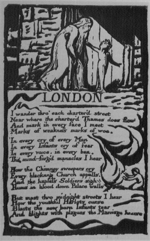
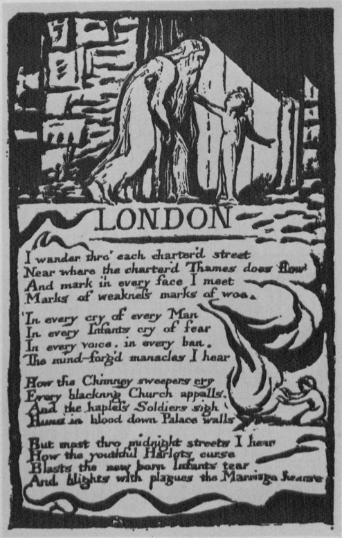
The copper plates were etched by Gilchrist Brothers (!) Ltd., Leeds, with ferric chloride at 30° Baume.5↤ 5 Ferric chloride (perchloride of iron), though used less than Dutch mordant and nitric, is one of the most controllable of acids. Because it leaves a sediment of iron oxide, the plate must be taken out of the bath regularly, washed, and examined; constant checking of the plate, and, equally important, the slow, even corroding action of the acid, greatly reduce the chance of foul biting and pitting of the plate’s surface, thereby assuring accurately bitten plates. As for the kind of acid that Blake used, nitric or the weaker, long out of date, vinegar-based acid, Essick is probably right to keep the jury out (see Essick review, below). In The Art of William Blake’s Illuminated Prints, I state that Blake used the former; I do not, however, merely “allow for the possibility of additives” to the nitric, but strongly suggest it. Biting relief plates correctly is far more difficult than biting today’s “deep etched” plates, which are analogous to Blake’s in that part of the design is in relief and both surface and lower levels of the plate can be printed simultaneously in different colored inks. But open etched plates incorporate accidents in the biting of the plate as part of the evolving image and the overall exploitation of the medium. Blake’s objective, on the other hand, was to reproduce, or rather, to duplicate the details and quality of the marks made on the plate, which made it necessary to reduce the technical distortion resulting from the biting action of the acid—whether, like nitric, the acid bites laterally or not. Much knowledge of additives, as well as skill in the use of acid, is necessary to produce cleanly etched plates. The America fragment, even though taken from a rejected plate, may indicate depth—if it was not a plate rejected for its shallowness—and may also indicate type of acid—if its cleanliness was not the result of its being polished by Blake or Butts. Nevertheless, it could have been bitten—striations and all—just as easily and cleanly with a treated nitric as with the weaker acid. The effects of the weaker, more easily controlled and cleaner biting, acid can be duplicated by adding sulphuric acid and water to nitric, which weakens the nitric acid and causes a cleaner bite, or by adding sal ammoniac, the salt which produced the buffered effect in the vinegar recipe. A clean and controlled bite could also be produced by careful feathering of the plate while it is being bitten. The vinegar-based acid bites cleanly and was, consequently, recommended for etching plates with fine cross hatchings, etc. But relief etching on copper, because of the amount of exposed metal that needs to be etched away, really is different from etching fine lines on copper. To get a printable surface, albeit a shallow one, a stronger acid is, if not absolutely necessary, very useful and, I think, technically as well as financially preferable. Nitric acid was certainly more easily acquired, being a product of commerce and the acid “commonly employed by engraving” in Blake’s day (Dossie, The Handmaid to the Arts, London, 1764, II, 147). The weaker acid, commonly used in the seventeenth century, would have had to have been made from scratch, since it was no longer something the local drysalter would necessarily have stocked ready made. This acid, along with the stopout of oil and tallow, were not so much rejected by Blake as simply replaced in eighteenth-century etching by an acid that worked faster and by the simple-solution varnishes (a rosin suspended in a volatile solvent like alcohol or, more usually and as in Blake’s case, turpentine), which were easier to handle and could be worked over like an etching ground. Using what is on hand, especially when it works, follows Occam’s Razor: “entities must not be unnecessarily multiplied,” which is to say, the simplest, most direct way of doing something is usually the right way. After several trial plates—and Ritchie trying the Brothers’ patience with his fastidiousness and bewildering them with his insistence that they not correct any of the missing characters and punctuation—they produced excellent plates. The comparison between electrotype impression and workshop impression (illus. 1 and 2) shows the accuracy and reliability of this platemaking process. Practically speaking, there is no loss of fidelity between the generations.
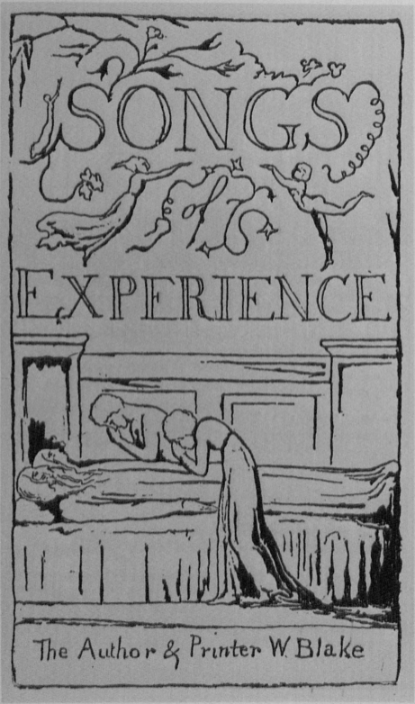
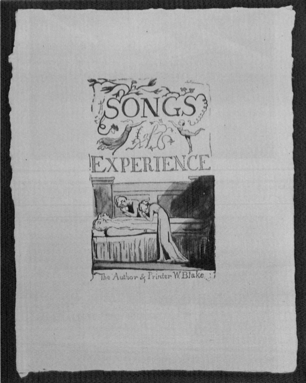
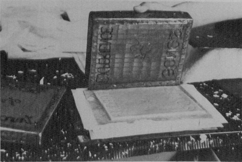
As Essick has pointed out, most of the minor differences between electrotype and authentic impressions begin page 6 | ↑ back to top are, like those between any two of Blake’s impressions, due to different inking and printing methods. Most of these differences we were able to eliminate by using the kind of ink and printing method that Blake used. There are, though, a few letters and marks of punctuation missing in the electrotypes themselves and thus in our set of relief plates, but I’ve counted only seven of the eight Essick lists.6↤ 6 For the list of missing letters and punctuation marks, see Essick, William Blake, Printmaker (Princeton: University of Princeton Press, 1980), p. 95. The mark in the MEW plate that is not missing is the “n” of “rain” in line 14 of “Holy Thursday” in Experience. This may have been “corrected” by the Gilchrist Brothers. Blake touched up or added missing letters in many of his illuminated prints, particularly in the early books, whose plates seem to have been bitten longer and deeper (if the heavily embossed posthumous Songs are any indication of depth) than plates after 1794 and thus were probably more susceptible to foul biting and having pieces of the varnished text and design lift off the plate. In any event, like Blake, we corrected the missing characters in a matching ink on the impressions themselves, rather than correct the electrotypes. The variations in the electrotype of the Songs of Experience title plate, however, were corrected on the plate. This particular electrotype (illus. 3), which appears to have been made from a drawing and not from the original plate, differs from Blake’s by having too many lines in the pillars and too few in the bed’s drapery, afro-like hair for the two young mourners, and no date (1794) in the right pillar (illus. 4).7↤ 7 Besides a visual comparison, there is other proof to support the idea that the electrotype was made from a drawing and not from the original plate. Gilchrist says there were ten original plates from which he made sixteen electrotypes, which implies that at least six of the ten plates were etched on both sides. Yet, according to the sizes for the plates as listed in Blake Books (p. 68), plates 6 and 43, 27 and 33, 34 and 47, 36 and 46, 53 and 48, are exactly or nearly exactly the same size, indicating that only five plates (supplying ten electrotypes) were etched on both sides. These five and the remaining six plates (3, 8, 16, 18, 24, and 29), all of which, according to plate sizes, are on separate pieces of copper, make eleven plates. That there was a plate added to Blake’s ten supports the idea that one of the plates is a facsimile. On the top right corner of plate 29 (the Experience title plate) in Songs, copy U, is a platemaker’s mark, indicating that it is the verso of a plate; since it is 12.4 × 7.2 cm., it could only be the verso of plate 30, which is the same size and the largest of Songs’ fifty-four plates. The electrotype, on the other hand, is 12.2 × 7.1 cm. It has been my finding that electrotypes and posthumous pulls are slightly larger, not smaller, than the originals, possibly because they were printed on dry, and thus nonshrinking paper. The electrotypes reproduce the appearance of the originals, and, for all practical purpose, are the same size, but they do not reveal the depth or substructure of the originals as John Wright has claimed (“Blake’s Relief-Etching Method,” Blake Newsletter, 9 [Spring 1976], 95). The method by which the electrotype is made includes preparing an intermediate matrix and then building up the relief areas of the matrix, so that its cast, the electrotype, is deep enough to be commercially printed. For a detailed description of the discrepancies in depth among the different sets of electrotypes, see Printmaker, pp. 94-95. Because our objective was to create a facsimile of the title page in copy B, that is, as it was printed in this particular copy and not of the plate as it appears in proofs, we decided that making a new plate from an uncolored impression, Songs of Innocence copy U, for example, would be no more effective than “excavating” the lines in the copy B impression and altering the lines in the electrotype to match. An embossed impression was substantially corrected by having its incorrect lines masked out, and thus deleted, and others reshaped and newly added by hand. In a number of places the printing is deliberately broken, as in the tendril of the “T” of “The Author,” and the foul printing is imitated, such as the thin border marks. A contact transparency was then made of the doctored impression and the resulting plate printed slightly more heavily than the others. As Essick points out, “the new facsimile plate . . . is much closer to the original,” with the same high fidelity as those printed from relief plates made from unaltered electrotype impressions.
The paper for the edition was also specially made. Using a small hydropulper and paper refiner that Ritchie designed and built especially for the project, he and Kate Donnelly succeeded in making from 100% cotton linters a very soft and receptive paper (illus. 5). This is essentially the same paper that was used to print the electrotypes, and, although it had to be sized to accept water colors, it remained as receptive as the first batch of paper. Irgalite paper dyes in fairly miniscule proportions were added to the pulp at the refining stage to make its color match that of the original paper. Each sheet (20.5 × 16.5 cm.) was individually made by hand on a wove mold giving four deckled edges, is watermarked Songs of Innocence or SONGS OF EXPERIENCE, and blind embossed with Blake’s Night Thoughts monogram (illus. 6). The watermarked paper will prevent the facsimiles from being mistaken for originals—and prevent the British Museum from having a future headache. For if ever the printroom should be rearranged, the colored copy of “A Cradle Song” that will be found under several tons of solid oak chests will not be thought of as an uncatalogued Blake original, but a facsimile that slipped away from Jacqueline Marshall.
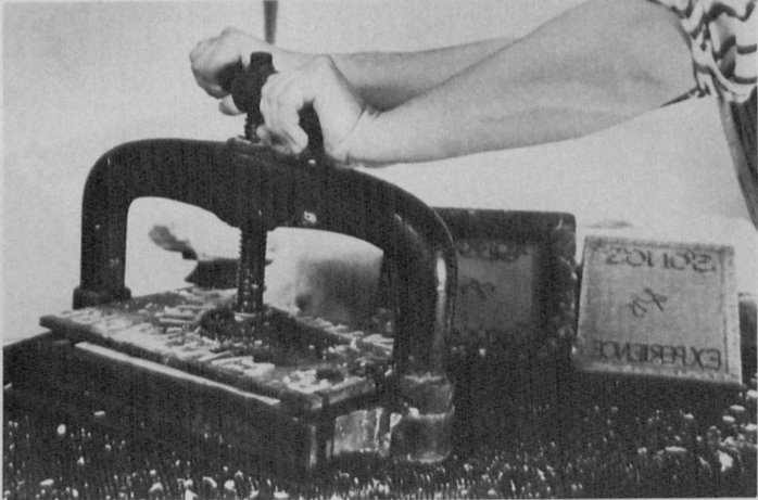
Even after being pressed in a bookpress (illus. 7) and passed through the etching rollers, the paper, because it is only lightly sized, remains slightly rougher and softer than Blake’s Whatman paper, or Trianon’s Arches. And because it is so soft, it is easily embossed, no matter how lightly printed. As Essick points out, most of Blake’s prints do not have a pronounced platemark. There are at least two reasons for this: (1) because the image is on and not below the surface it transfers under light pressure; (2) because Blake’s wove paper is made of “wet stuff” and is sized, and is thus a relatively hard support (even when printed damp).8↤ 8 There may be one or two more reasons why the illuminated prints do not have pronounced platemarks. Blake may have used a stiff backing sheet placed between the thin felt blanket (“size catcher”) and the paper. The wove pattern that is occasionally visible on illuminated prints (Urizen pl. 2 (B), for example), may have been produced by the damp paper being in direct contact with the felt blanket. Blake may also have printed plates face down on paper lying on the press bed, a method used to print engravings on “paper, pastboard, Satin or other thing you print upon” (William Faithorne, The Art of Graving and Etching [London, 2nd ed. 1702], “How to Ink the Plate”). Plates 7-12 in Europe (G) have horizontal and vertical pencil lines (some partly erased) on their face, which correspond to the size of the plates. If these lines are registration marks, then the paper must have lain on the press bed facing up and the plate placed on top of it—otherwise the lines would not have been visible. I have printed many of my relief etchings using this method, and, because I forego the blanket under the paper which Faithorne suggests, I can print the shallowest of relief etching with very clean results. A similar reverse method of printing was used with woodcuts that were printed independent of type. Ink is brushed on a leather-covered block and the woodcut stamped into the ink, “and then lifted up instantly and dropt with some little force on the paper, which is to receive the impression” (Dossie II, 222). As the posthumous prints of Songs clearly show, there is nothing about the plates themselves that prevented them from embossing the paper. Indeed, Blake color-printed The Marriage of Heaven and Hell (F) and Visions of the Daughters of Albion (F) with so much pressure that the figures’ bodies seem cast in relief. These may have been early experiments at color printing, with more pressure than was necessary for the paper to pick up the color from both lower and relief levels simultaneously. On the other hand, Europe, copy G, which is also color printed, is very flat, perhaps because the paper is printed on both sides of the sheet and most of the size-color is from the relief rather than shallow areas—or applied directly to the impressions themselves. See note 16. In any event, our impressions are not as flat as Blake’s—or at least copy B—but neither are Blake’s as flat as the finest collotype and lithographic and photomechanical facsimiles suggest. We could have flattened the impressions after printing to remove their very slight embossment, but this would have been to err in the other direction. It would have been to imitate the surface image and not the tactile quality of the original prints. We have tried, on the other hand, to remind the reader that the poems are pages and the pages are prints, and that as prints, by their tactile as well as illuminated nature, Blake’s poems are “an improvement of sensual enjoyment.”
Essick wonders why we went to all the trouble to make our own paper and suggests that the paper’s rough texture is “unBlakean.”9↤ 9 Essick’s comments about an “unBlakean printing pressure” apparently refer to the impressions in the monochrome rather than the facsimile edition. The former are intentionally more deeply imprinted than the latter since they are not facsimiles of any copy. The idea that Blake’s plates have no embossment whatever, of course, is not true (see note 8), and if the facsimiles have more now, wait two hundred years and they’ll have less. But as mentioned, moldmade commercial papers, including the Rives that Essick suggests, produced disappointingly stark impressions, which is why we decided that a paper especially receptive to relief plates was needed. Blake, as Essick reminds us, used the best “wove paper that could be procured.” This, however, did not mean just any commercially handmade paper, but the best handmade paper of the day, paper that was beautiful in itself and perfectly receptive to the plate. Paper is not merely a vehicle for the image, but interacts with the image and ink and colors. It is part of the print. In this sense, the MEW paper, which is the best printing paper I have ever used for relief printing, is as Blakean in body, giving a feel of the originals, as printing on the best handmade paper that can be procured is Blakean in spirit. The historical and technical precedents of the Trianon Press’s specially made begin page 7 | ↑ back to top paper in no way influenced our decision to make our own paper. But Essick is right to suggest that the exigencies of producing beautiful prints for a special deluxe limited edition overruled the need for exact similitude.
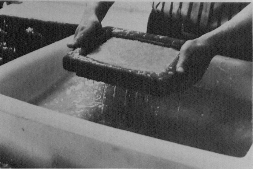
The paper was soft enough to be printed dry, and this is how it was printed for the first few sets of proofs. But because Blake clearly seems to have dampened his paper, we began to dampen ours, and, not surprisingly, we obtained better, more authentic looking impressions.10↤ 10 Intaglio printers dampen the paper so that it is soft and pliable enough to be forced into the incised lines of the plate. In the eighteenth century, however, paper was also dampened for letterpress printing, because there was not enough pressure in a platen press to force handmade ink into the dry fibers of rag paper. Although Blake’s plates were printed on a rolling press, the tacky ink and light pressure would have caused problems with the transference of the image similar to those in letterpress printing. Dampening the paper opens its interstices so that the ink actually becomes part of the paper, thus assuring a solid, rather than a ghostlike, impression. It was standard practice in the eighteenth century to print both relief and intaglio plates on damp paper, but there are three other ways to prove that Blake did so too: (1) the paper of certain color printed impressions, such as those in Visions, copy F, must have been pliant to be so embossed without tearing; (2) the wove pattern on the verso of a number of impressions is an indication that the paper was sufficiently dampened to accept the wove of the felts; and (3) Blake’s prints are slightly smaller than posthumous pulls, which could be printed on dry paper because they were printed with greater pressure and, it seems, with finer, machine-made relief inks. We used light pressure, not much more than the weight of the top roller, with only three blankets (two size catchers and one swanskin) instead of the usual four, and registered the plate on a marked sheet of paper under the plate, thus assuring the proper margins (illus. 8). Producing impressions with the tactile qualities of the originals, however, involved more than getting the printing pressure right; it also involved getting the color and composition of the inks correct, as well as devising an effective and consistent way of inking the plates.
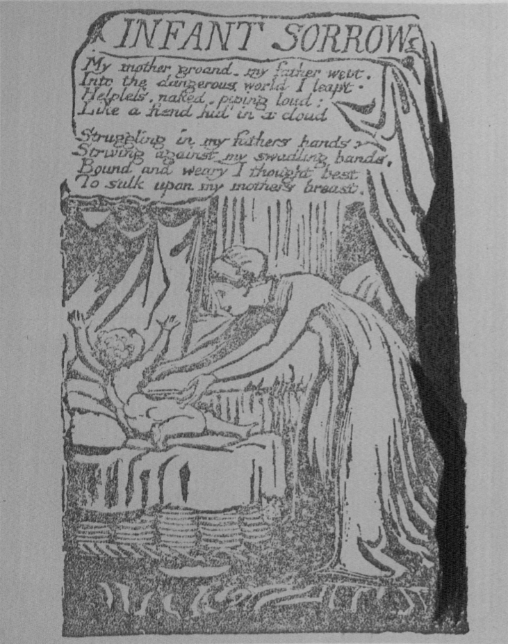
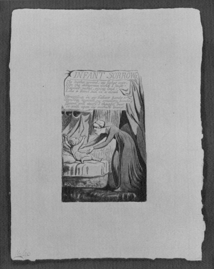
Because of the reticulation and uneven strength of the ink in Blake’s printing, deciding upon the optimum ink color/tone was possibly the most perplexing and time-consuming aspect of the project. Blake Books describes the color as brown, noting that Experience is printed in an “orangish brown” and Innocence in a “flat brown” (Blake Books, p. 373, n. 21). The difference between Bentley’s color definition and ours is largely one of descriptive interpretation; we refer to the “orangish brown” as yellow, though it is really a sort of faded warm ochre, while the “flat brown” is a color midway between brown and the ochre, and could well have been a mixture of the two inks, made either deliberately or accidentally. Even within the sets the shade of color sometimes appears different from one plate to another, possibly due to printing pressure and the amount of ink Blake has applied to the plate; e.g., “Holy Thursday” is very lightly printed, whereas in parts of, say, “Infant Sorrow,” the inking is much heavier. It is possible that a residue of another ink on the dabber has affected the hue on some plates. Because of such variables, we could not use the same ink for all the plates, but had to match separately the color of each facsimile with the original, and, even then, arriving at a color match was maddeningly difficult because test strips would differ and yet, depending on what part of the print was used as the sample, all could be right.
The first ink Ritchie experimented with was a mixture of commercially made letterpress and intaglio inks, but this worked too well. The image transferred from the plate to the paper without the reticulation so characteristic of Blake’s. We reasoned that Blake, like other engravers printing their own plates, would have made his own ink, but that this handmade ink would have been intaglio, not relief, ink. The thicker plate oils (burnt linseed oil) used in the former make it stiffer and more tenacious, transferring evenly only with heavy pressure. We ground the inks on a marble slab, using first grade pigments and oils, carefully matching the colors of the originals. Ritchie applied the ink, however, with a roller, rather than a linen dabber, the tool Blake most likely used.11↤ 11 Essick distinguishes between the “inking ball,” i.e. an engraver’s linen dabber, and a “type-printer’s inking ball,” by referring to the latter as a “dauber” (Printmaker, p. 99). He argues quite persuasively that Blake used a dauber rather than a dabber (p. 101), but, because he also detects signs of a dabber (p. 102), wisely concludes that there may have been more than one inking tool and method. I have inked my own relief etchings and Blake facsimiles with both tools and can attest to the efficacy of the former. Because handmade linen dabbers, about 2½ and 3 inches in diameter, were the inking tools all eighteenth-century engravers made and used to spread etching grounds and inks, I suspect Blake used it, too. Despite its clumsy appearance, the dabber does a fine job of inking the relief surface and keeping the shallows uninked. Its broad, slightly convex bottom is supported by the relief line system of text and borders. In trial proofs, Ritchie also produced good results using an inking dabber, but resorted to using an inking roller for the impressions in both the monochrome and facsimile editions for consistency of effect. We resorted to the “unBlakean” tool (rollers were not invented till about 1813 and not in common use till mid-nineteenth century) because it produced more consistent results. With dampened paper, light printing pressure, and stiff handmade intaglio ink, we succeeded in duplicating the surface texture, as well as the colors of the originals.12↤ 12 That the reticulation of Blake’s ink could be caused by the kind of oil in his ink is supported by studio experiments, but also by the findings of other printmakers: “Strong oil in the ink alone would yield . . . owning to its tremendous grip, a somewhat mottled or granulated tone to the surface unless thoroughly cleaned [wiped off the plate] with whiting”; Ernest Lumsden, The Art of Etching (London: Seeley, Service & Co., 1925), p. 28.
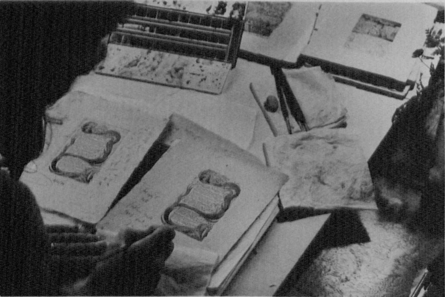
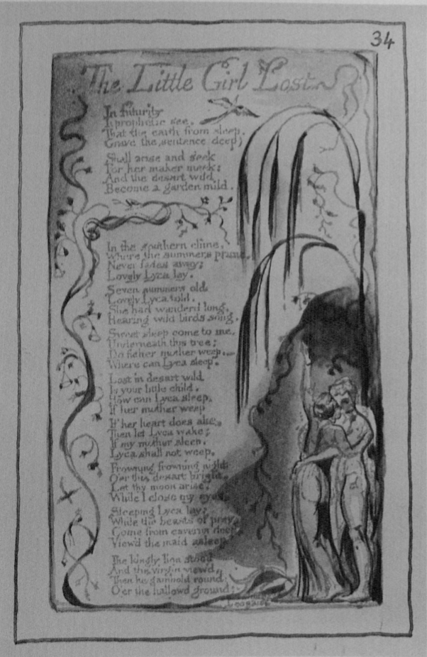
The prints were hand colored by eight different colorists. Jacqueline Marshall, Paul Taggart, and Guy Tucker were the principal colorists, and they were also the artists responsible for the prototypes made in the British Museum from the originals. This took eight weeks and three trial sets (illus. 9 and 10). The colors first used were Winsor & Newton, but we found—as we had with the ink—that we obtained more accurate results in texture and tonality by preparing the colors by hand. The pigments were ground in a vehicle of gum arabic, honey, and glycerine, with a drop of ox gall and phenol, a preserver, which is, except for the last ingredient, a variation of a recipe in Dossie’s The Handmaid to the Arts (1764).13↤ 13 Dossie, I, 177. The main colors were Prussian blue, gamboge, yellow ochre, Indian red, umbers, black, vermilion, rose madder (genuine), and alizarin crimson, all of which, except the last, were used by Blake.14↤ 14 Though our analysis of Blake’s palette was done by eye, our findings match those of analyses independently conducted by Ann Maheux with a polarizing microscope and a “scanning electron microscope with an energy dispersive x-ray spectrometer”; “An Analysis of the Watercolor Technique and Materials of William Blake,” Blake/An Illustrated Quarterly, 17 (1984), p. 127. Maheux examined eight water color paintings executed over a twenty-seven year period and found that Blake’s palette remained very consistent; except for blue verditer, which showed up in one late work, we found the same colors in Songs (B), a series of hand-painted prints executed five to ten years earlier than the earliest paintings she examined. Back in the workshop, the colorists worked from their prototypes and occasionally from slides on a Diastar back-lit projector to produce final masters, which were then checked against the model and finished at the British Museum Print Room (illus. 11). We analyzed Blake’s water color technique with the hope of working up each print as a composite whole, which can be quite tricky when copying, the copier not being the original author of the work. We found it necessary to improve certain details and modeling, as well as slightly strengthen some of the washes. The outlining, mostly done by Tucker, was executed in a diluted India ink with a quill, or lettering, brush—which, as Essick points out, is what was normally used in “pen and wash.” The outlining on the master copy of “The Little Girl Lost,” plate 1, however, was executed by Marshall, whose hand slipped over the printed line of the woman’s hip, only then to discover that she had duplicated Blake’s “error” of 1794!
The coloring was done after the prints were dry, except on those plates which appear color printed, like “Infant Sorrow,” “London,” and “Human Abstract.” As unconventional as Blake’s color prints are, his usual color printing method was a variation of the à la poupée technique used in England to color print mezzotints, stipples, chalk engravings, and aquatints. In this technique, the different colors are applied to the plate with small begin page 8 | ↑ back to top dabbers, or “dollies,” and the plate is printed just once. This technique, though, is difficult and the results are not consistent. So we looked for an easier, more precise technique of imitating the texture of these impressions, one that would enable us to paint the print rather than the plate. We knew that in conventional color printing the colors were oil-based inks, and not size-color as in Blake’s, but that the impressions, like Blake’s, were finished in water colors.15↤ 15 David Alexander and Richard Godfrey, Painters and Engraving: The Reproductive Print From Hogarth to Wilkie (New Haven: Yale Center for British Art, 1980), pp. 41-42. For a more detailed discussion of color printing, see Joan Friedman’s Color Printing in England, 1460-1870 (New Haven: Yale Center for British Art, 1978); Julia Frankau’s Eighteenth-Century Colour Prints (London: Macmillan and Co., 1906); and R.M. Burch’s Colour Printing and Colour Printers (New York: Baker and Tayler Co., 1911). This led us to experiment with different combinations of inks and water colors.
In the earliest trial proofs of “Infant Sorrow,” the mottled texture of the size-color was reproduced by stippling water color with the tip of the brush on the dry ink of the impression. The results were labored and unconvincing. Ritchie discovered, however, that the opaque black at the bottom of these and other plates, which is thought to be color printed (Blake Books, p. 373, n. 21), was washed with a fairly dry brush over the ink on the impression, and not transferred from the plate. He also found that other areas that appeared color printed had the same structure, that is, a water-based color over an oil-based ink. We reasoned that the mottled texture, which made the paint appear to have more body than it did, was not caused by the paper pulling away from a buttery size-color on the plate, but by the water colors interacting with an oily surface and attaching to the exposed paper where the ink had reticulated (illus. 12). We found, however, that we could not reproduce this mottle effect once the ink was completely dry. By using a slightly coarser ink, which was even closer to Blake’s and reticulated more readily, and applying water color washes on top of it while it was still tacky, which in effect was to manipulate the surface tension between oil-based ink and water-based paint, we recreated the color printed appearance of the originals—if not actually discover one of the methods used by Blake (illus. 13).16↤ 16 In color printing, Blake seems to have employed multiple techniques to create similar visual effects, which reveals both his willingness to exploit media and his concern with the painterly qualities of his prints. Such experimentation, however, makes the minute particulars of the process difficult, if not impossible, to fix definitively. Water color over tacky ink may be the earliest technique of color printing or the simplest variation. In any event, our experiments with color printing support Essick’s idea that Blake could have applied size-color with a sponge or brush directly to the impression rather than to the plate (see Essick review, below). A few of the color printed impressions in Europe copy G also support this hypothesis. The black size-color on plate 5, for example, reveals brushstrokes and thus seems also to have been applied directly to the impression. More important are the small hairs, between .3 to 1 cm., in the color-printed areas of plates 8, 12, 14. Though too small to be from brushes used for washing, they may represent water color brushes cut of their points (which makes the bristles stiff, like glue brushes) to enable them to daub paint on the lower and relief areas of the plate in an à la poupée manner. Most of these hairs seem to have been transferred from the plate along with the paint, but on plate 12, which, as mentioned in note 8, has registration-like lines, they seem to have been from brushes manipulating the paint directly on the impression itself. If plate 12 was “stamped” face down, it could pick up pigment from the lower levels only if the pigment had substantial body, which it does not have, or if there was a blanket under the paper making it pliable—which would defeat the purpose of printing in this fashion. The size-color on this particular print, in other words, seems to have been applied to the impression after it was stamped/printed, and its tactile, spongy texture created by brushes manipulating tacky paint over (wet?) ink and not by the paper pulling away from the plate. By daubbing impressions with warm size-color, Blake could simulate the visual and tactile effects of paint applied indirectly. Our experiments, however, showed that whether the impression was a true color print or a print colored in imitation of one, the final product involved at least two steps. Technically, Blake could finish his color printed impressions in water colors because size-color is both water miscible, and thus accepts water colors painted over it, and insoluble once dry, and thus not disturbed by being rewetted. And visually, as the proofs of Urizen plates 1 and 5 in Yale’s Center for British Art and Urizen plate 24 in the Keynes’ collection reveal, he needed to. An unpainted color printed image is literally a series of “blots and blurs.” It assumes its well defined shape when water colors and pen lines are added. The two-step process recalls Turner’s as revealed on Varnishing day, or Cozens’ technique of making ink blots and then outlining on tracing paper the forms the blots suggest (A New Method of Assisting the Invention in Drawing Original Compositions of Landscape, London, ca. 1784). The purpose of color printing seems to have been texture, not color, for there are only a few colors printed from the plate. A large creamy white area, for example, becomes multicolored once it is gone over in water colors. Our experiments have convinced us that Blake combined oil-based inks with water miscible paints, both when color printing from inked plates with size-color, and when washing, painting, or daubbing the printed impressions in water colors. We disagree, in other words, with the idea that Blake’s ink must have been water soluble since oil would have made it too greasy to accept water colors. This idea, first put forth by Ruthven Todd (“The Technique of William Blake’s Illuminated Printing,” The Print Collector’s Quarterly, 29 [Nov. 1948], pp. 25-37), has been recently resurrected by Bo Lindberg (Review of William Blake, Printmaker, in Blake/An Illustrated Quarterly 59, vol. 15, no. 3 [Winter 1981-82], pp. 140-48). Lindberg does not believe Blake, or anyone else, for that matter, used an oil based ink when printing in colors. Because burnt oil, the vehicle of intaglio ink, is black, he reasons that “it is suitable only for blacks and other dark pigments. This is why color printing has been rare in the west until quite recent times” (p. 141). Contrary historical precedent is explained away: “since color printing was practiced in the eighteenth century, printers and engravers must have had recipes—more or less secret ones—for suitable binders” (p. 141). He states that Blake “probably preferred the customary burnt-oil binder . . . for intaglio printing,” but that “it is likely that [he] used aqueous binders for most of his stereotype prints” (p. 141). Assuming an aqueous binder forces Lindberg to assume also that the paper was printed dry, since moist paper would have caused the water-based ink to blur (p. 142), and to explain the reticulation of the ink surface as being caused by the surface of the undampened paper (p. 142). Lindberg’s logic leads to the imaginative, but I believe mistaken, conclusion that Blake printed his illuminated impressions in a secret water-based ink on dry paper, a method like the one used to print Japanese color woodcuts (pp. 141-42). In short, Lindberg’s explanation of illuminated printing is in direct opposition to what we discovered in making our facsimiles. I discuss the probable causes for ink reticulation and the likelihood of using dry paper in notes 10 and 12 of this article. As for burnt oil not being used with light pigments, such as the yellows, light browns, and ochres of Songs (B), and recipes being secret, I refer to William Faithorne’s The Art of Graving and Etching, 2nd ed. 1702: “one may also Print Plates with many other sorts of Colours well ground and delay’d, as well with the same Oyl [burnt walnut oil] of this Black, for brown Colours, and for light ones with other thick Oyls purify’d” (Chapter: “How to Ink the Plate . . . for Printing”). And as for oil being too greasy to accept water colors: “Some put into the boiling Oyl [before setting it afire] either an Onyon or a crust of Bread to make it less greasie” (Chapter: “The Condition of the Nut Oyl, and how to boil and burn it”). Perhaps the most important thing we have learned about Blake’s printing process is that it is not as complicated as once thought. It is, no doubt, inviting to think of Blake, the visionary, as having cunningly contrived all manner of innovative techniques rather than intelligently adapting existing printmaking technology to his own needs. Although non-printmakers attribute the printmaker with devious complexity, in all printing by hand the most surprising—and unintentional—results frequently occur without any conscious innovation. As Ritchie discovered, “simplicity of technique frees the artist to get on with his job of being creative.” If this was the method used in Songs (B), then Blake would have had to paint these impressions soon after printing, rather than wait until he had a buyer, as he is known to have done with a few copies of the illuminated books. Illumination, in other words, was not an afterthought.
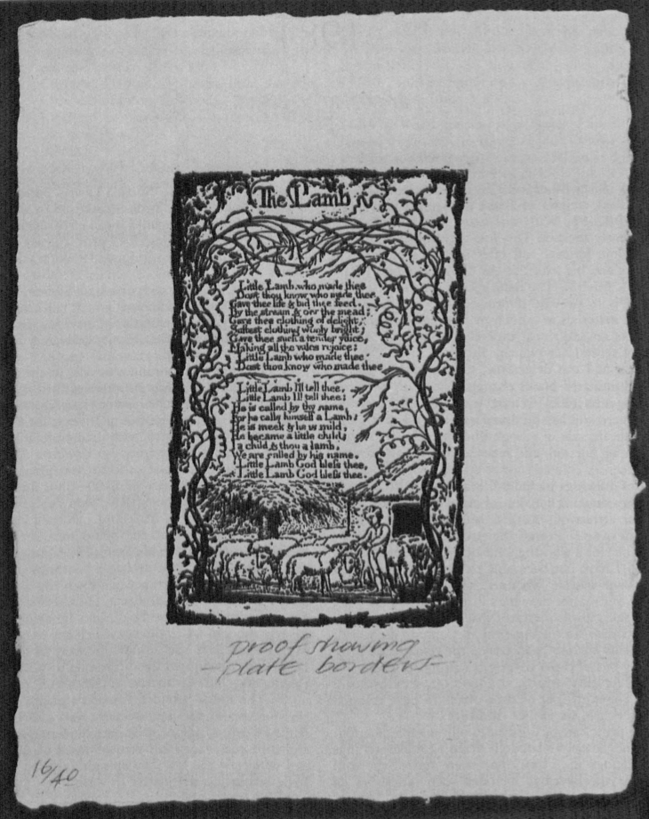
We have recreated, intentionally and inadvertently, as many of Blake’s printing methods as possible to create high fidelity facsimiles. Our objective, however, was not only to reproduce the appearance of Blake’s prints, but the feel of them as well. Our mode of production, as Essick notes, has its weaknesses as well as its strengths: no one copy looks exactly like its model in every respect, no two copies of the edition are exactly the same—and no copy is not labor intensive. The original plan of five-hundred monochrome copies quickly became seventy-five after the amount of time and labor was known, and these seventy-five copies were divided into the facsimile edition, limited to forty copies, and the monochrome edition, limited to thirty-five copies. The monochrome sets, which have been printed in a light brown ink without borders and on the same paper as the facsimile edition, consists of the sixteen Innocence and Experience impressions printed without plate borders, a proof with borders of the “The Little Girl Lost,” and two hand-colored impressions of the same, one in imitation of copy B, and one in imitation of copy T (illus. 14), an elaborately painted late copy with frame lines. Each print is inserted in an acid free folder and the entire set of prints is enclosed in a cloth-covered box. The facsimile edition has one extra print, a proof with borders of “The Lamb,” printed in black proofing ink (illus. 15). The facsimiles are loosely mounted in corners on pages of a portfolio hand bound in full morocco, which is enclosed in a cloth-covered box. Both editions include two blind embossed frontispieces, one to Innocence and one to Experience, consisting of the title extracted from Blake’s own title plates, underneath which is “Published by Manchester Etching Workshop 1983” in a simple, conservative typeface.
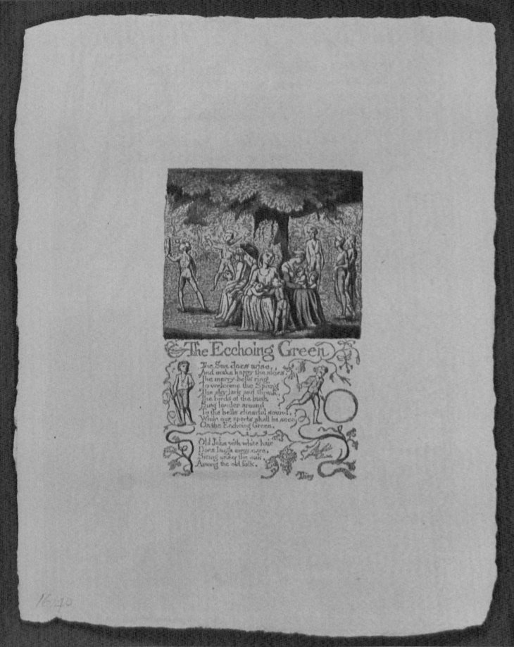
The prints are presented in the order of copy B. Thus there are eight Innocence and eight Experience prints, with “Little School Boy,” which later became part of Experience, still part of Innocence. The number of the edition is penciled in on the lower left corner, and the prints are numbered 1-16 on the verso so that they can be removed from the portfolio or box and returned to the same order. Both editions are accompanied by The Art of William Blake’s Illuminated Prints, a hand-sewn booklet of twenty-five pages explaining the technique of illuminated printing. To make the booklet more widely available—and affordable to scholars—125 numbered copies have been issued separately with a monochrome impression printed without borders in light brown ink; print and booklet are enclosed in a dark brown cloth-covered folder with Blake’s monogram stamped in gold on the front cover and cost $35. Like the editions, the booklet can be ordered from the Manchester Etching Workshop, 3-5 Union Street (off Chruch Street), Manchester M4 1PB.
We presented the prints as prints, and not as bound pages, to make it possible for museums, libraries, and collectors to show them as a group, for, as M.H. Abrams states in the Prospectus, these impressions “are also, in their own right, delightful works of art for public or private exhibition.” And we divided the seventy-five copies into two complementary editions to reveal the evolution from plate to illuminated print. Like the multiple impressions of “The Lamb” and “The Little Girl Lost,” monochrome and colored impressions of the same plate clearly reveal what Blake could do to alter the image, and address the issue Essick raises about different versions of the “same” illuminated book. Perhaps the most enduring educational value of the prints, though, begin page 9 | ↑ back to top is their beauty. They celebrate Blake, whether they missed a tendril or not, whether the green is too dark or too light on this or that impression. Here at Cornell and anywhere but the British Museum print room, students and lovers of Blake will not be comparing them to copy B, but to Blake’s originals in general. What they will experience is copy B2. But Essick says this better: the Workshop’s facsimiles are “a recreation of a process as well as a reproduction of images; as much a new edition of an illuminated book, with its own unique qualities, as a reproduction of an existing copy.”
begin page 12 | ↑ back to top